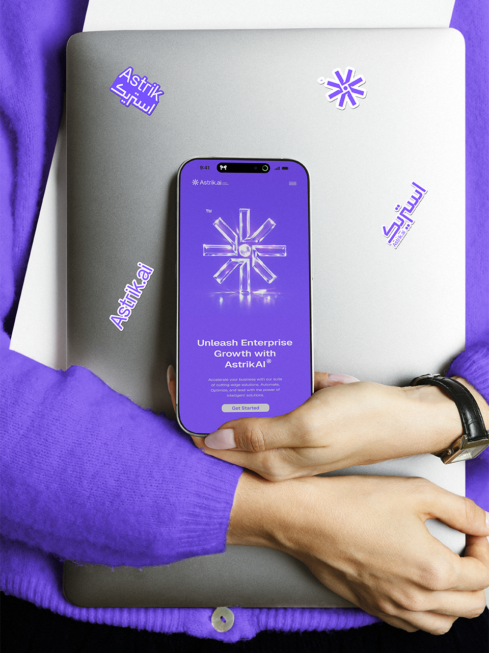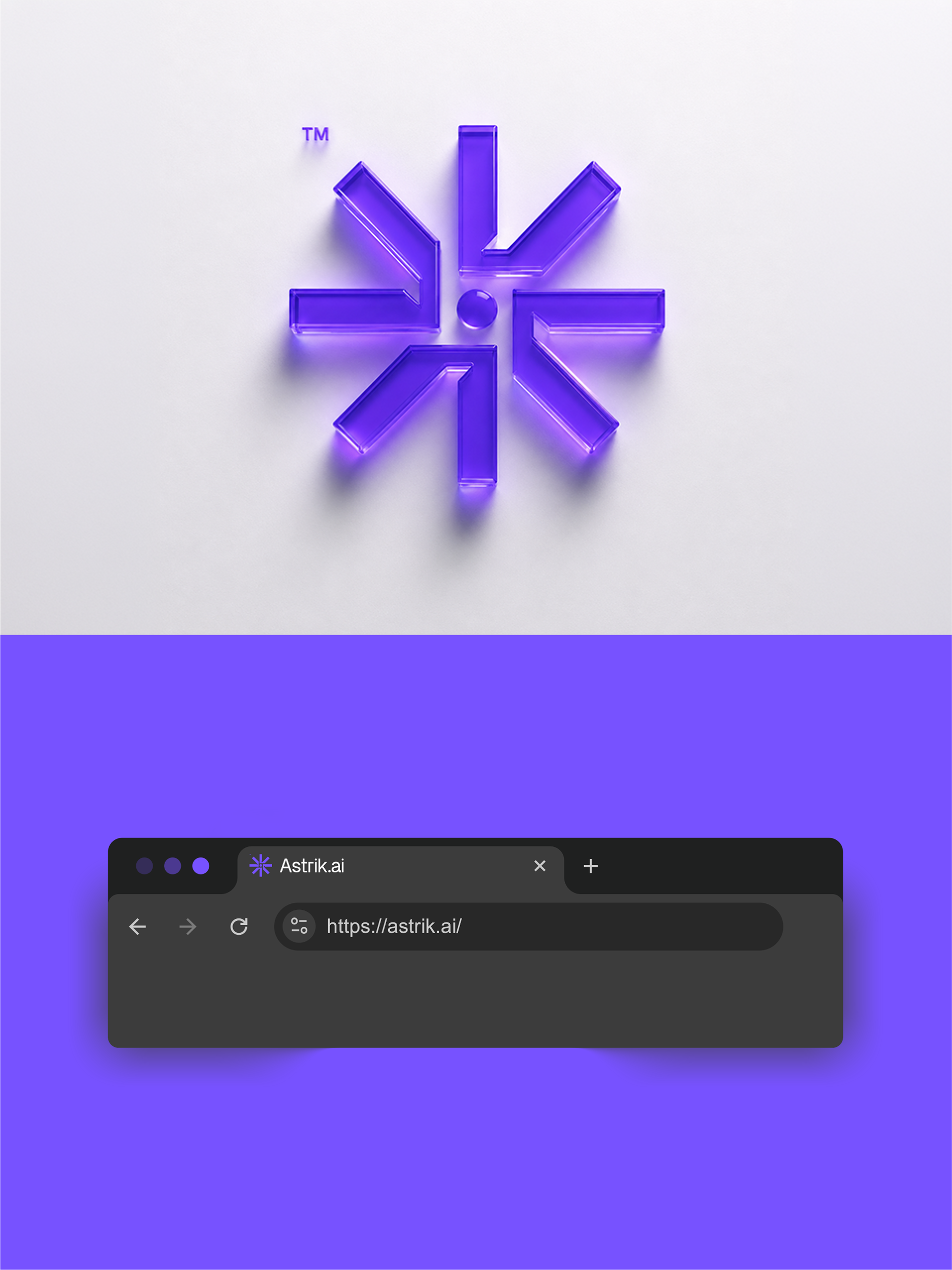
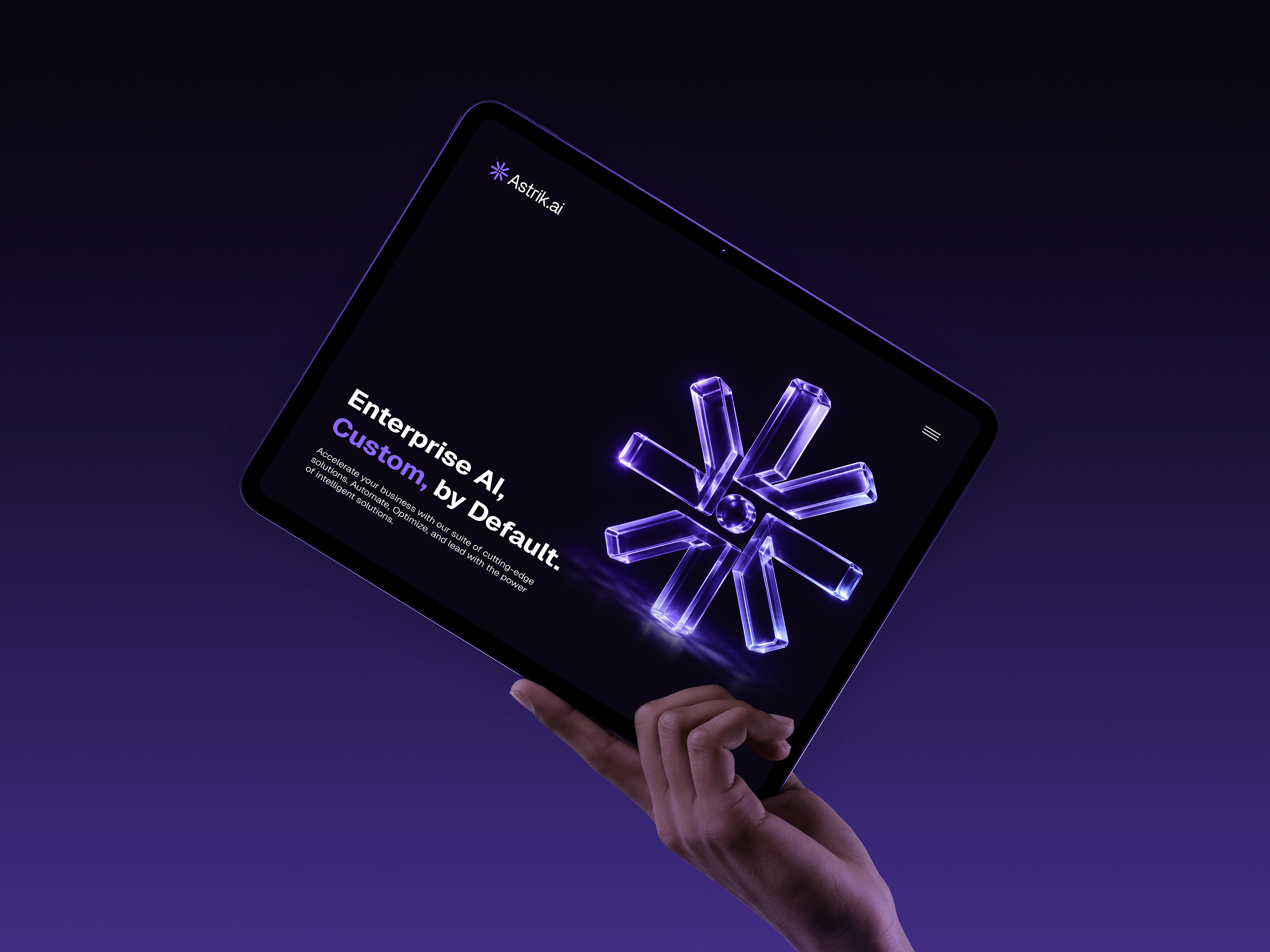
AstrikAi™
Case
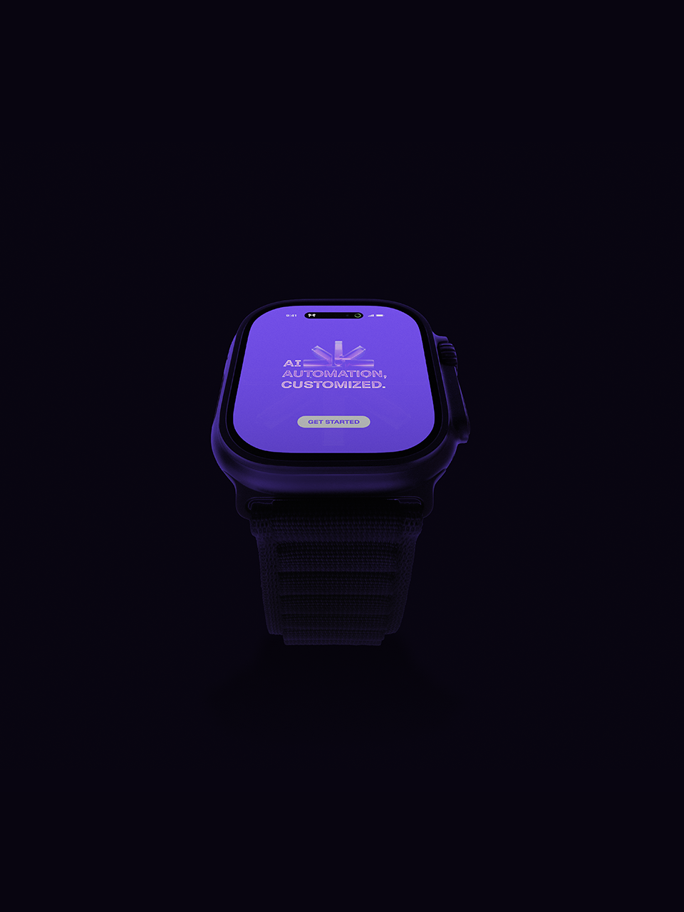
Astrik.ai is a startup AI-driven platform designed to help businesses automate their operations through intelligent, fully customized solutions. Built with flexibility at its core, the platform adapts to different industries, workflows, and operational needs. Ensuring that AI feels relevant, efficient, and ready from the very beginning.
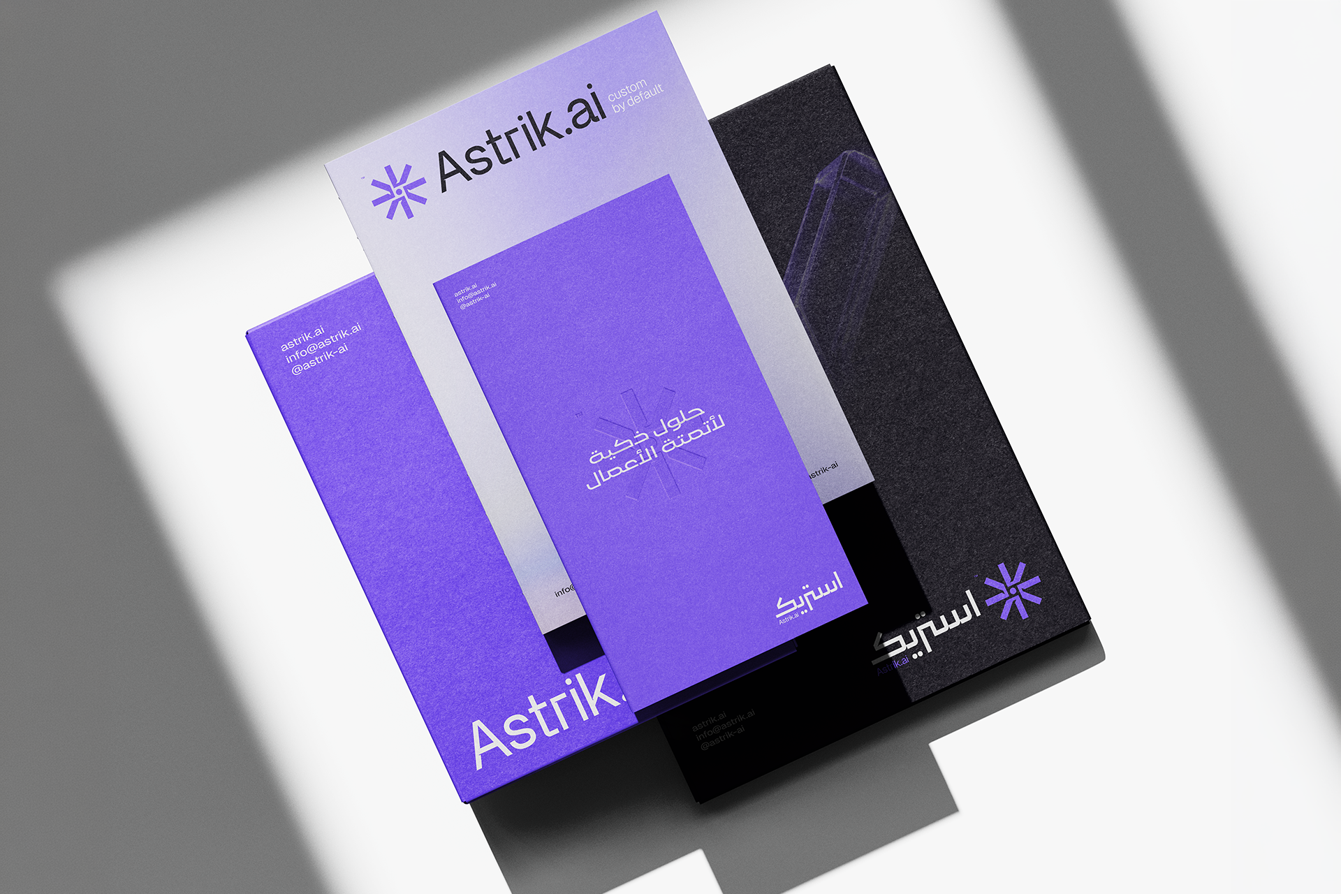
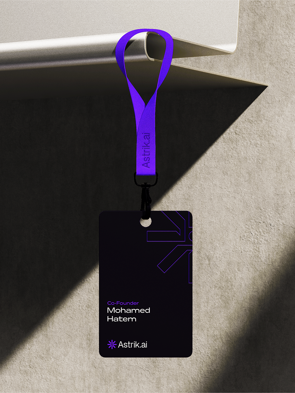
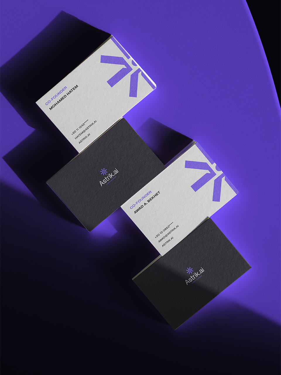
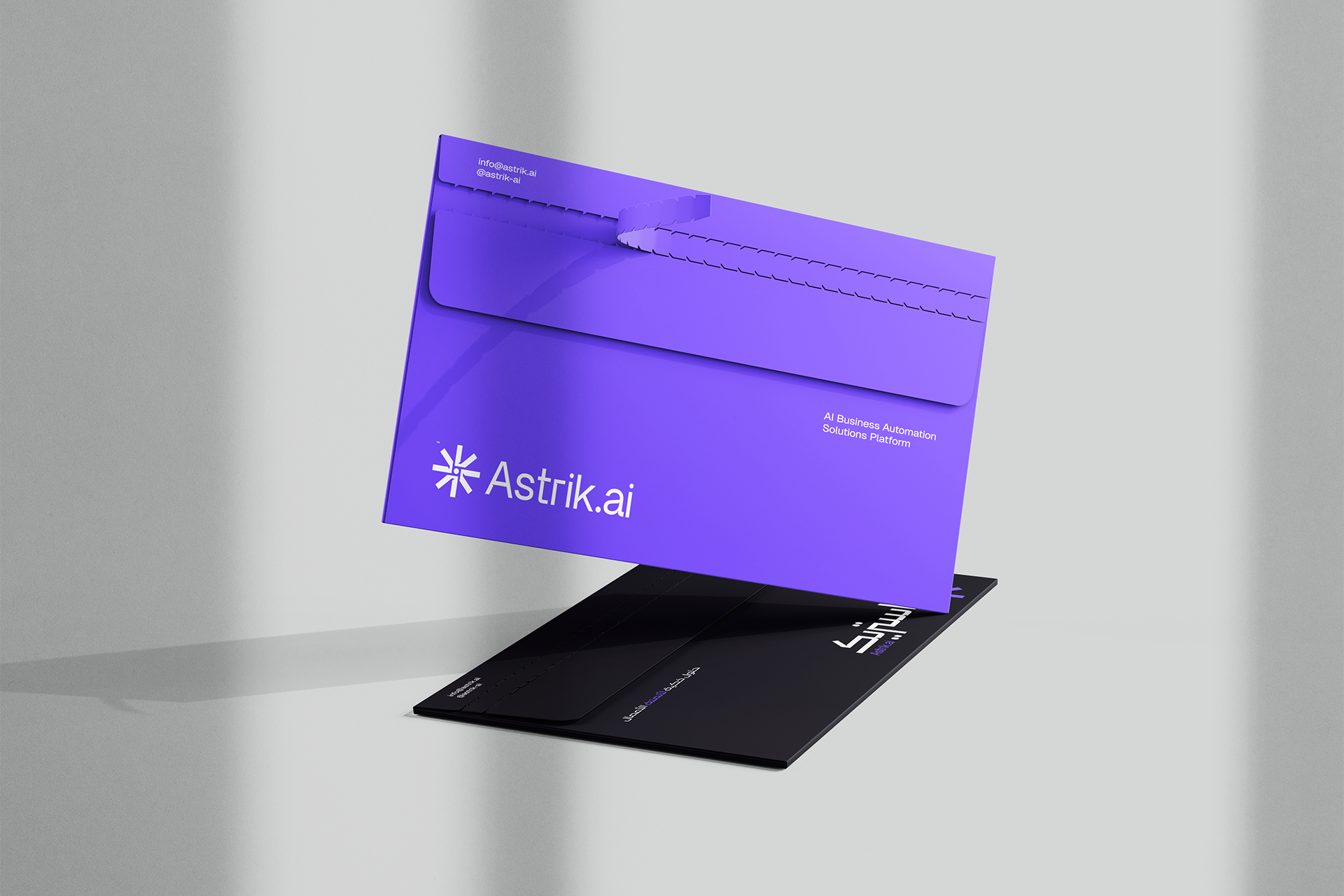
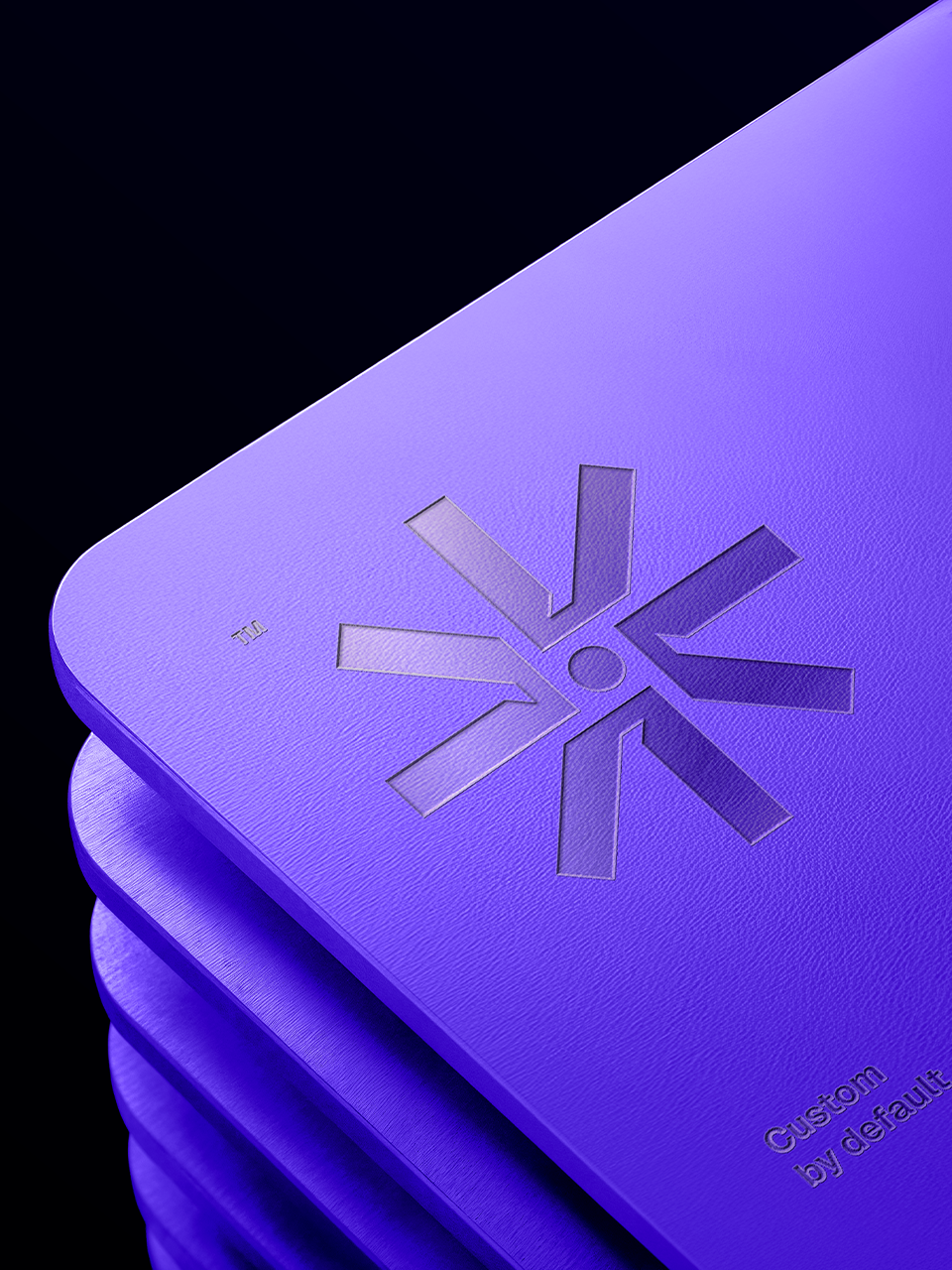
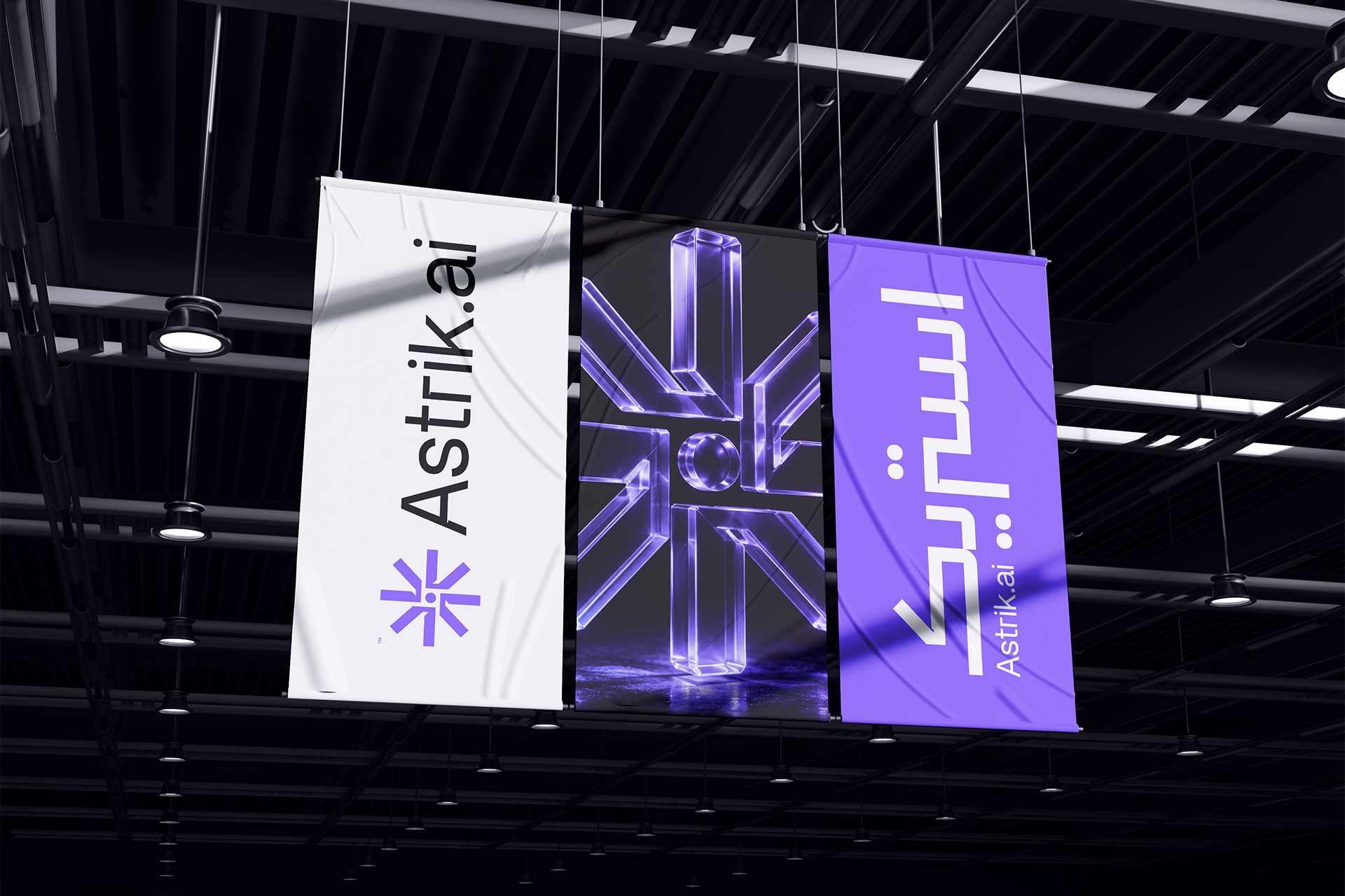
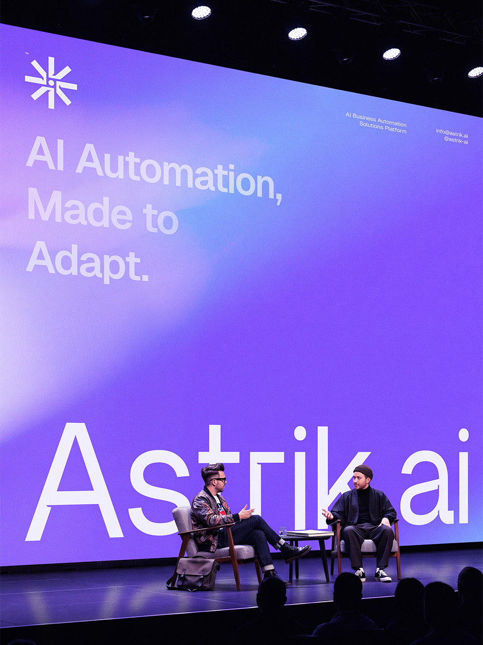
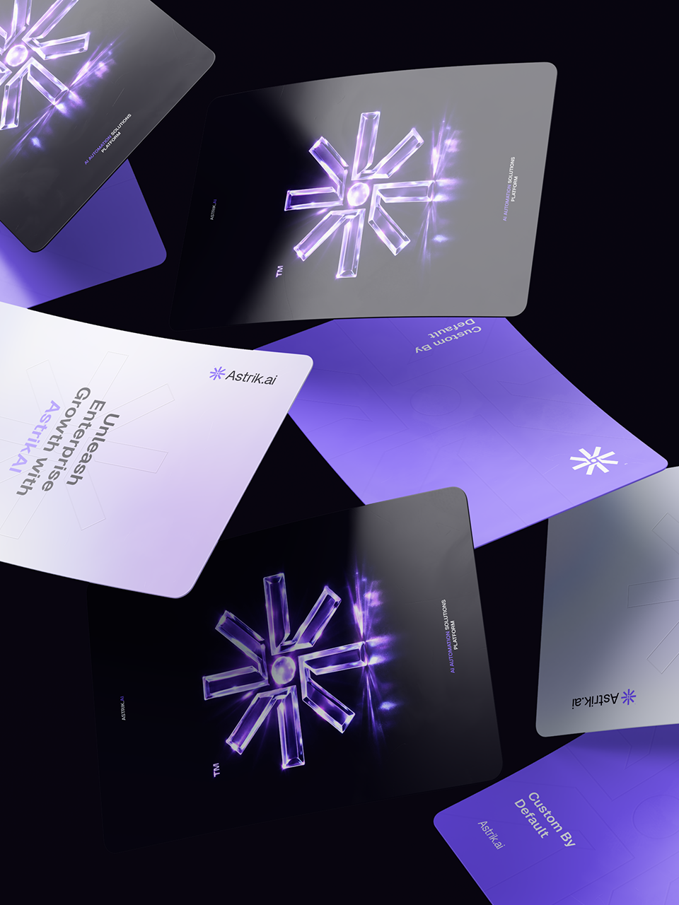
I was responsible for developing the complete visual identity system for Astrik.ai, including the logo, typography, color palette, patterns, and brand assets.
Challenge
The challenge was to create a brand identity that communicates advanced AI capabilities without intimidation. The identity needed to express customization, modularity, and clarity, while remaining approachable, modern, and distinct within an increasingly saturated AI landscape. It also had to function as a flexible system, capable of scaling across digital products, interfaces, and future expansions.
Solution
The solution was to design a modular brand system built around the idea of intelligent customization. At the core of the identity is a flexible symbol that represents adaptability, systems thinking, and purposeful expansion — reflecting how Astrik’s AI solutions adjust to different business contexts.
Client: Astrik.ai™
Location: Egypt
Industry: AI Automation Platform
Services: Branding, Visual Identity, Guidelines.
© Khaled Moawad, All Rights Reserved.
Brand Name Story
The name Astrik is derived from a deliberate reinterpretation of the word Asterisk — both in pronunciation and meaning. In computing and programming, the asterisk (*) functions as a wildcard, representing flexibility, possibility, and open-ended selection.

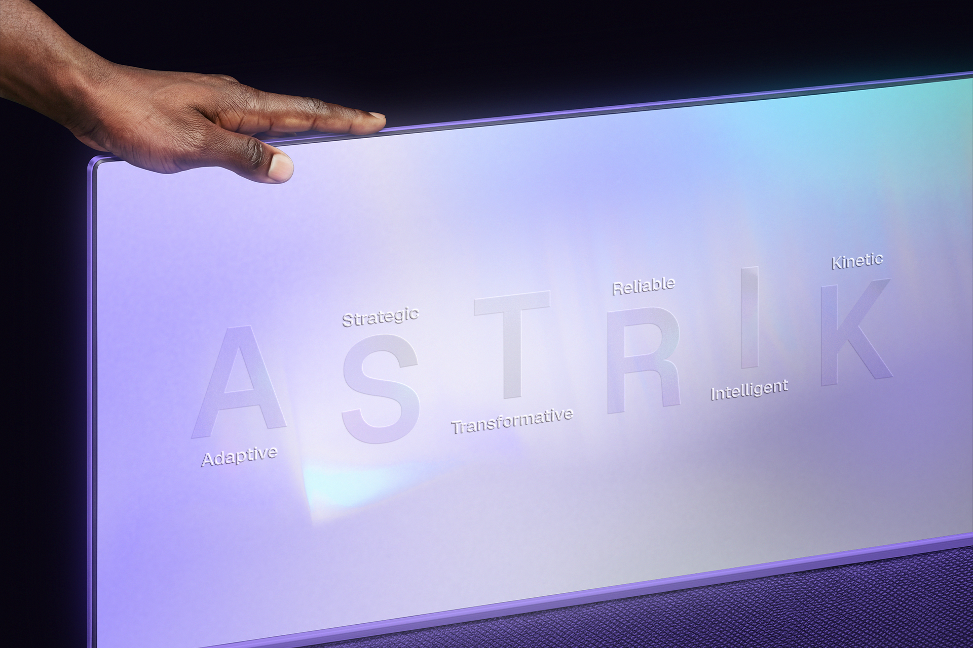
Brand Attributes
Derived from the brand name “ASTRIK”, these attributes form the foundation of the brand’s strategy and visual identity.
Logomark Rationale
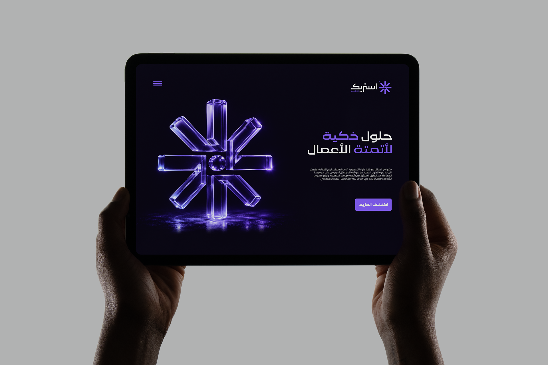
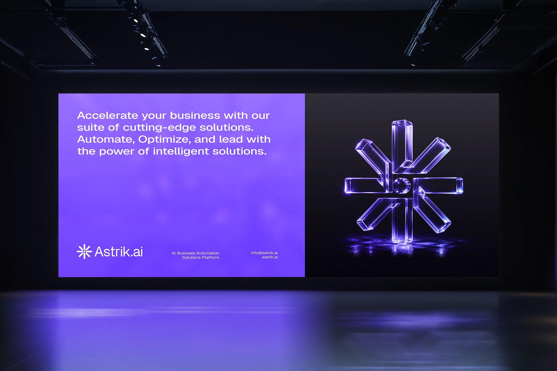
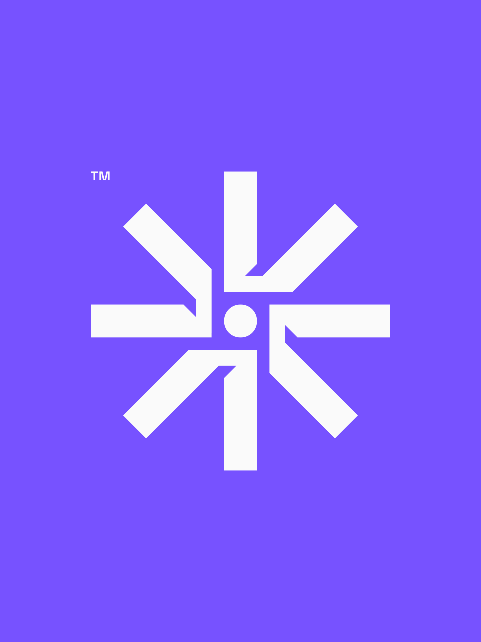
The Astrik logomark transforms the programming wildcard (*) into a modular identity system. Built from repeated A-inspired modules around a central Intelligence Core, the symbol represents how multiple AI capabilities connect through one adaptive engine. Together, the name and the mark communicate flexibility, intelligent automation, and limitless possibilities.
Designed to Adapt. Built to Scale.
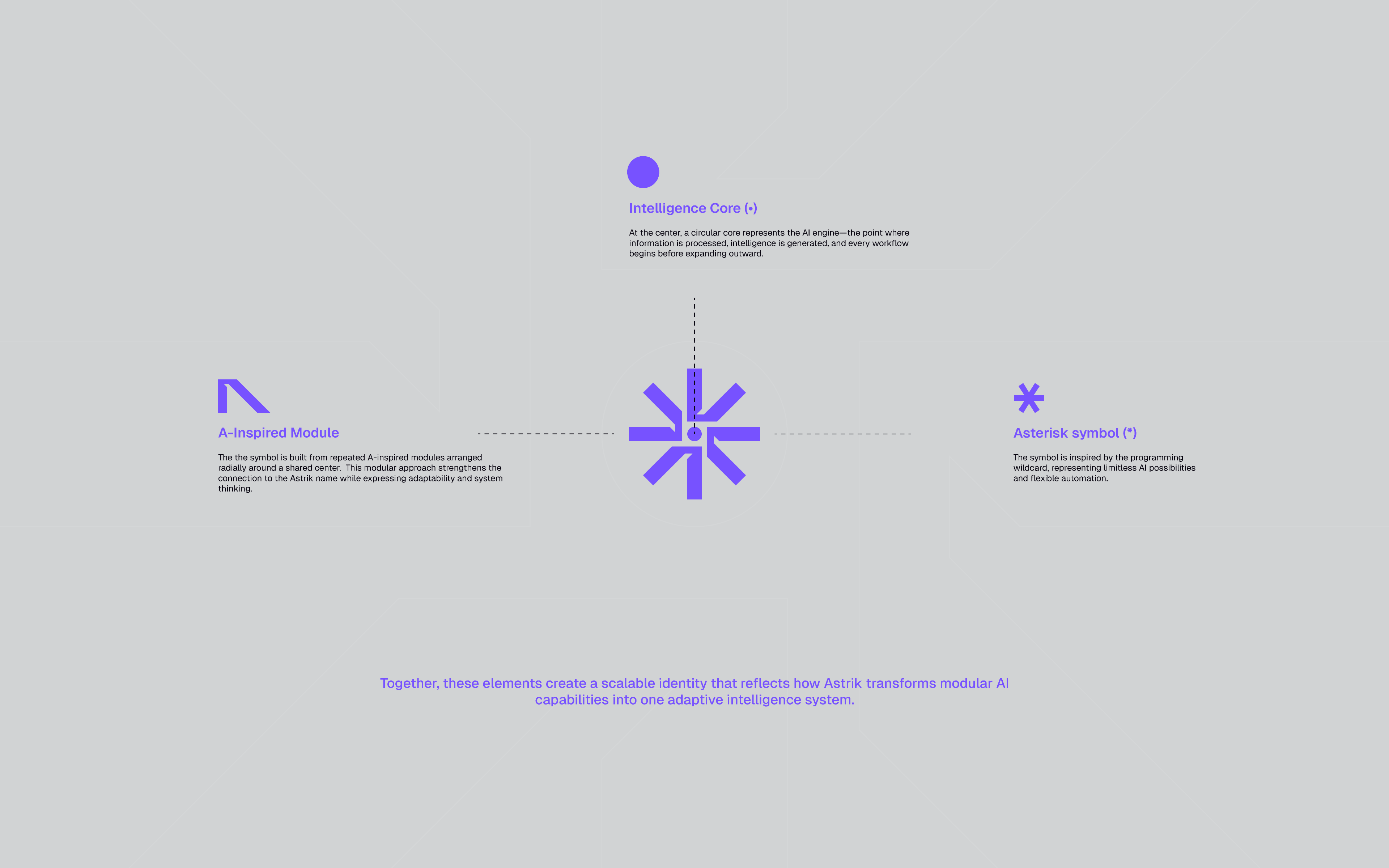
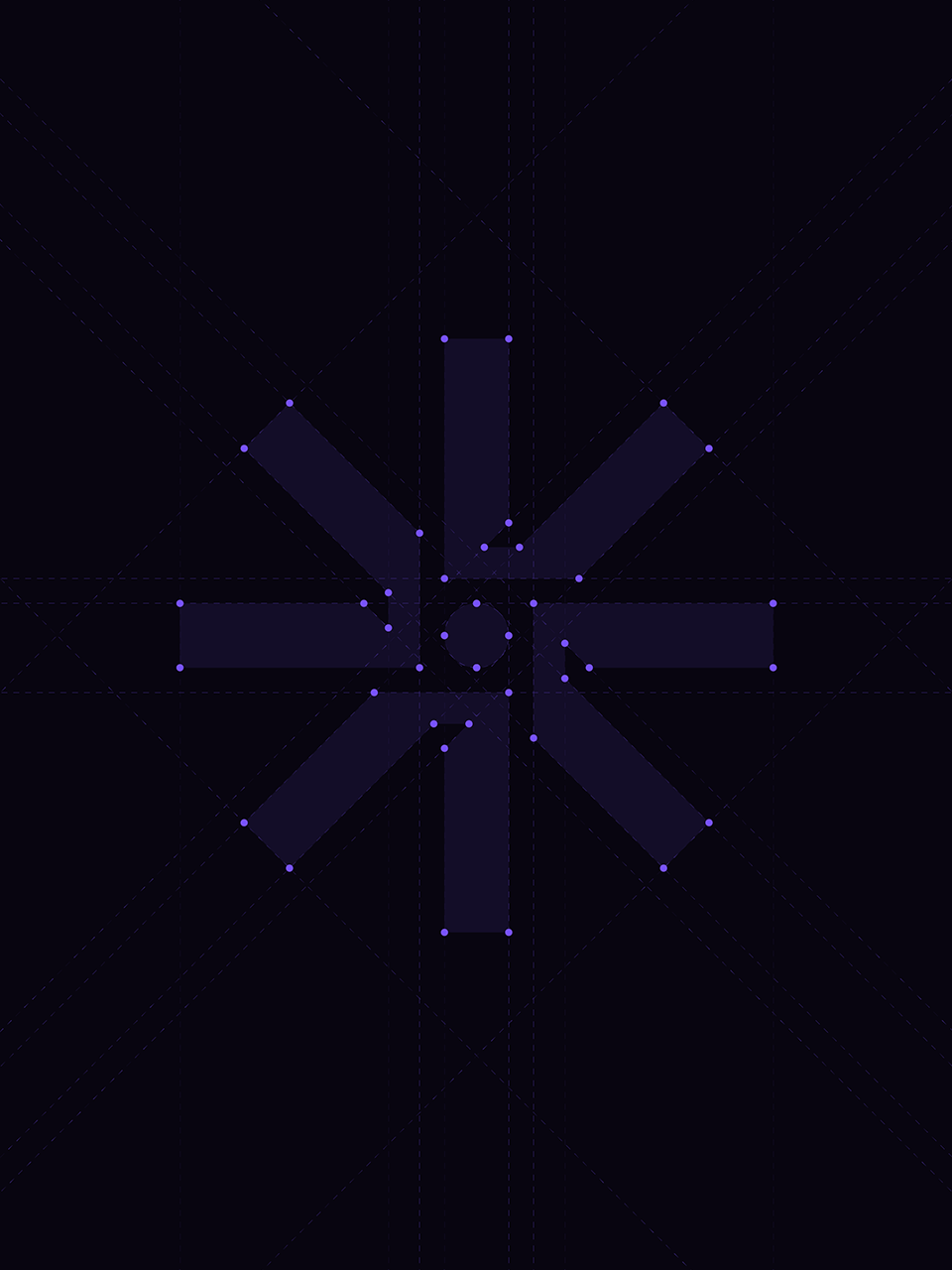
Logomark Geometry & Construction Logic
The symbol is constructed on a precise radial grid using repeated A-inspired modules arranged around a shared center. This modular geometry ensures balance, consistency, and scalability while enabling the mark to expand naturally into patterns, motion, icons, and digital interfaces without losing its recognizability.
Brand Color Philosophy
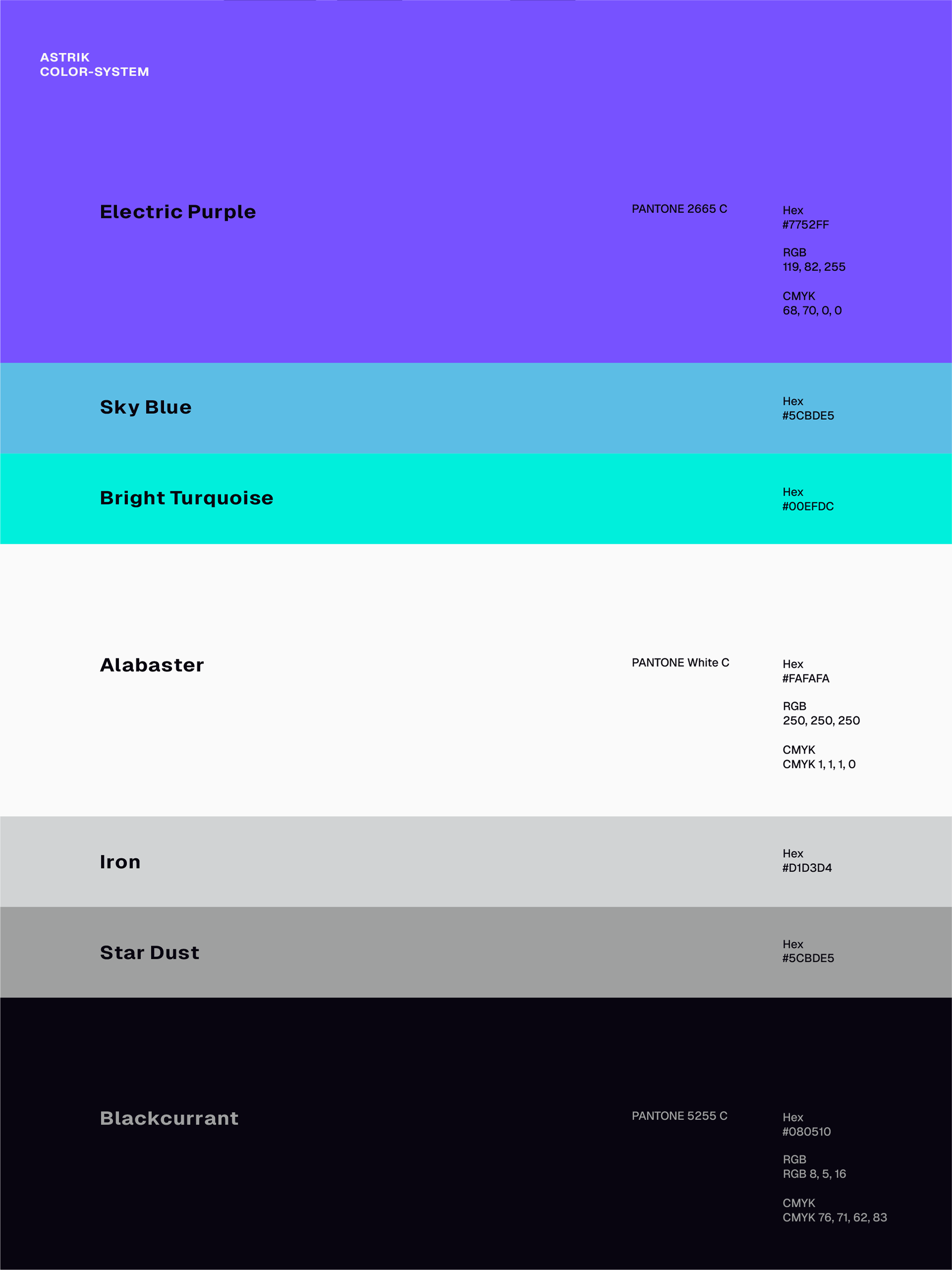
Astrik’s color system is designed to balance intelligence, energy, and clarity. The palette combines a bold primary tone that represents innovation and forward momentum with supportive accent colors that add flexibility and visual depth. Dark and light neutrals ground the system, ensuring contrast, legibility, and focus across digital environments.
Brand Typography Philosophy
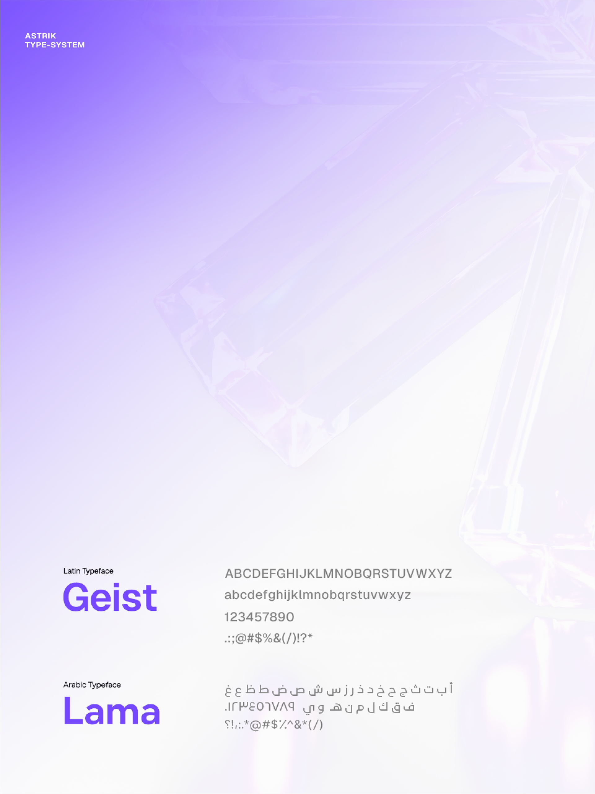
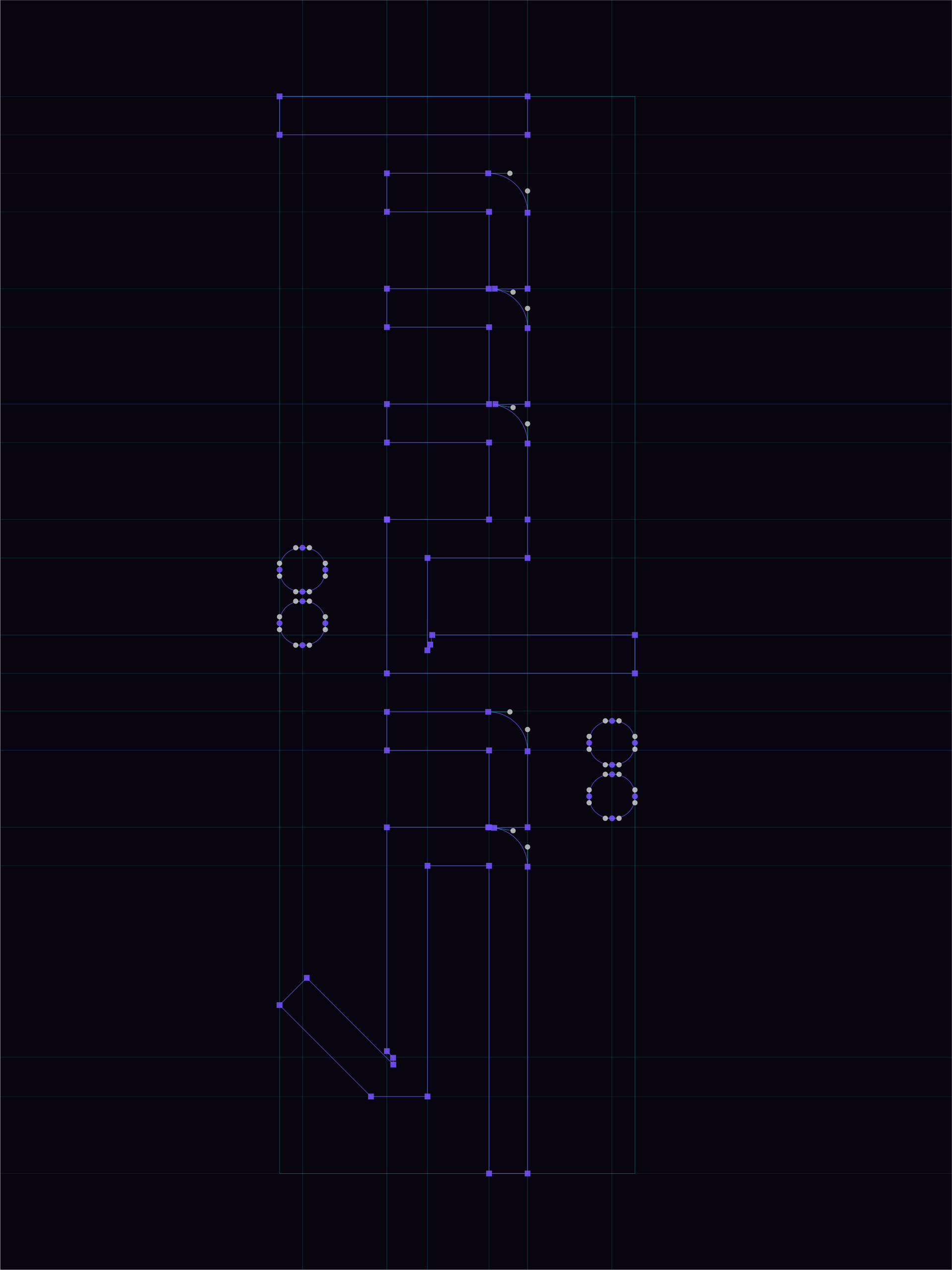
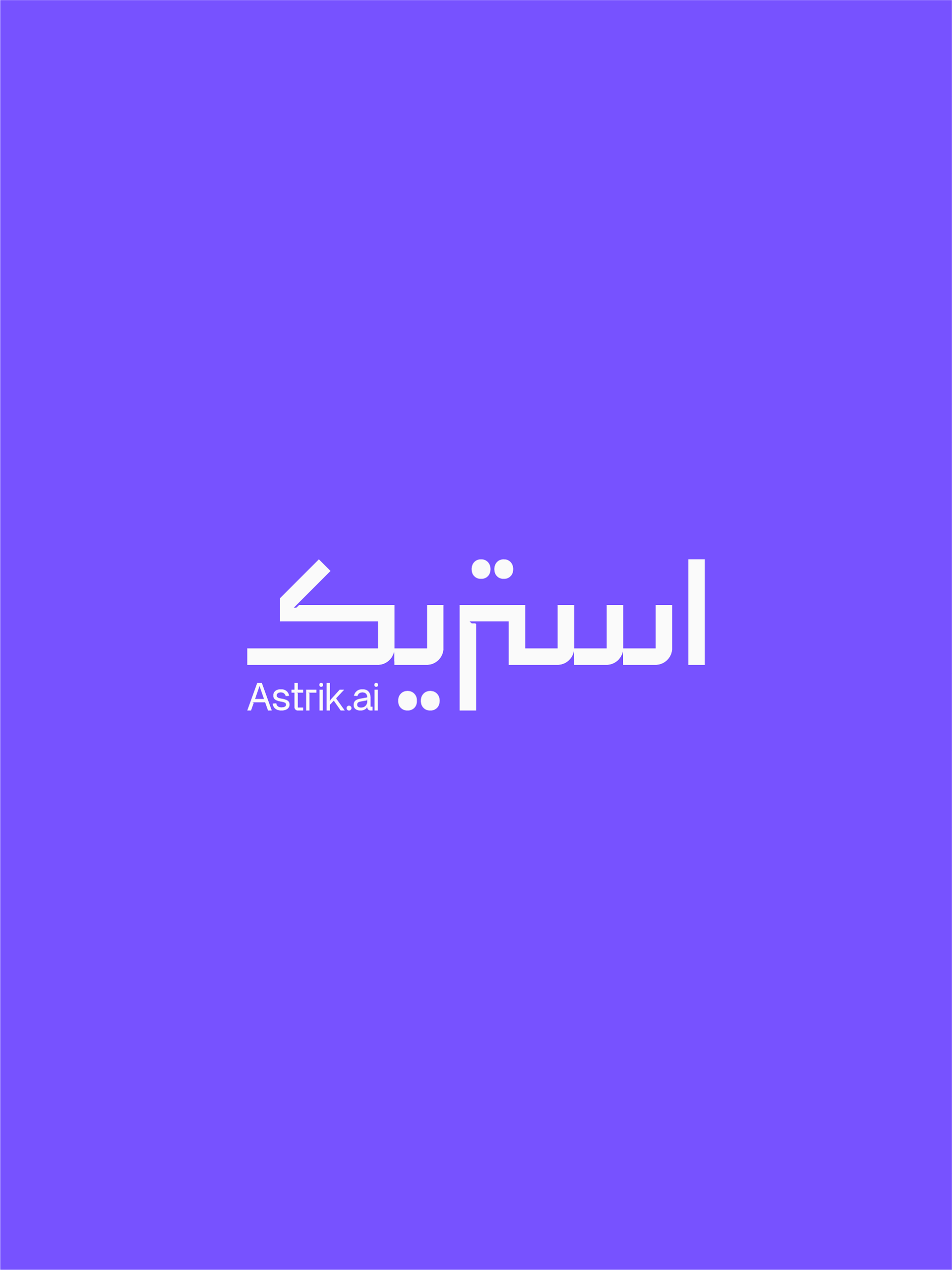
Astrik’s typography system balances clarity, flexibility, and multilingual performance, ensuring a consistent and scalable voice across digital interfaces and markets.