ABOUT ARKA Development
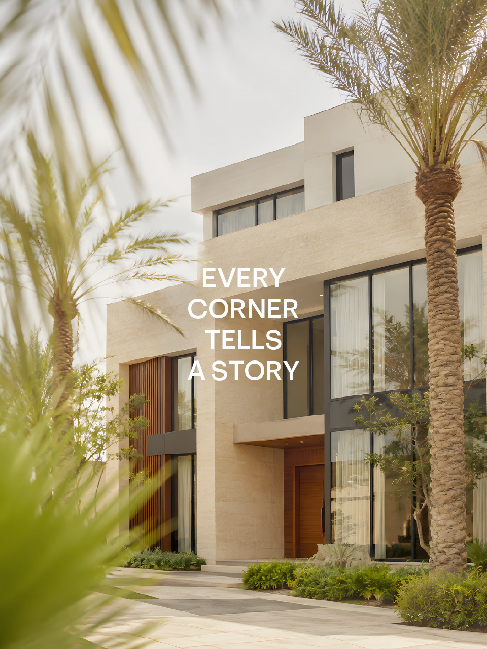
ARKA is a Jeddah, Saudi Arabia-based real estate development company creating contemporary residential environments shaped around comfort, quality, and everyday living. With a thoughtful approach to design and development, ARKA builds more than properties. It creates places where families can grow, connect, and make lasting memories.
THE CHALLENGE
Entering Jeddah’s competitive real estate market as a new name, ARKA needed to earn trust from the start. The challenge was to create a brand that could feel credible to investors, relevant to future residents, and distinctly Saudi without relying on familiar real estate clichés. It had to express ambition and progress, but with the clarity and restraint expected from a serious developer.
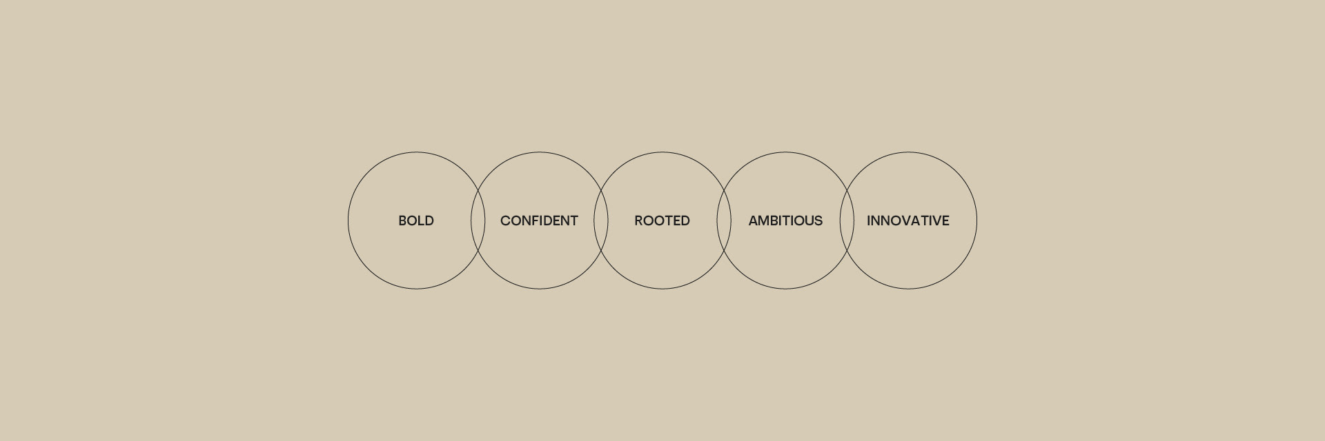
THE STRATEGIC DIRECTION
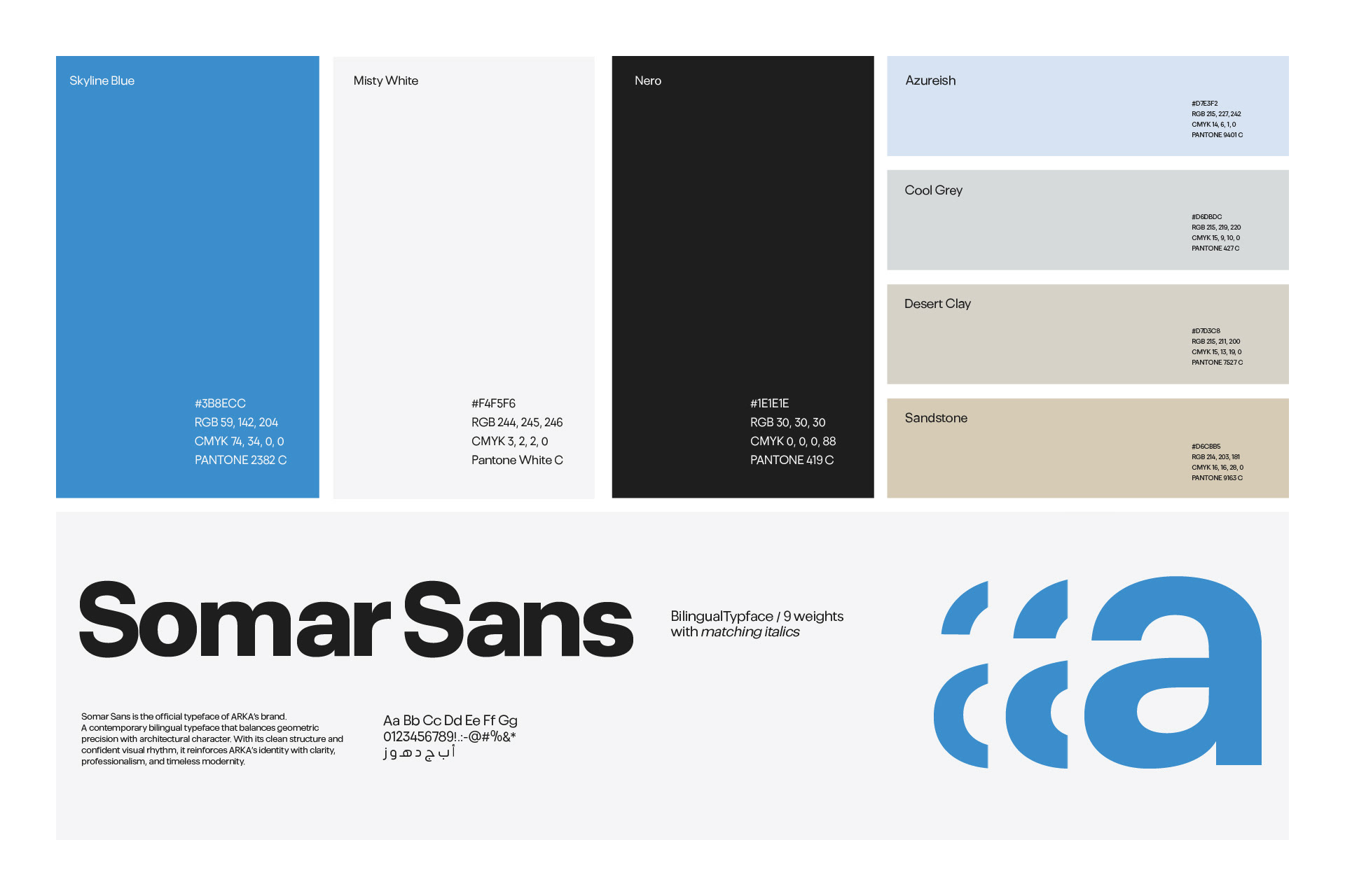
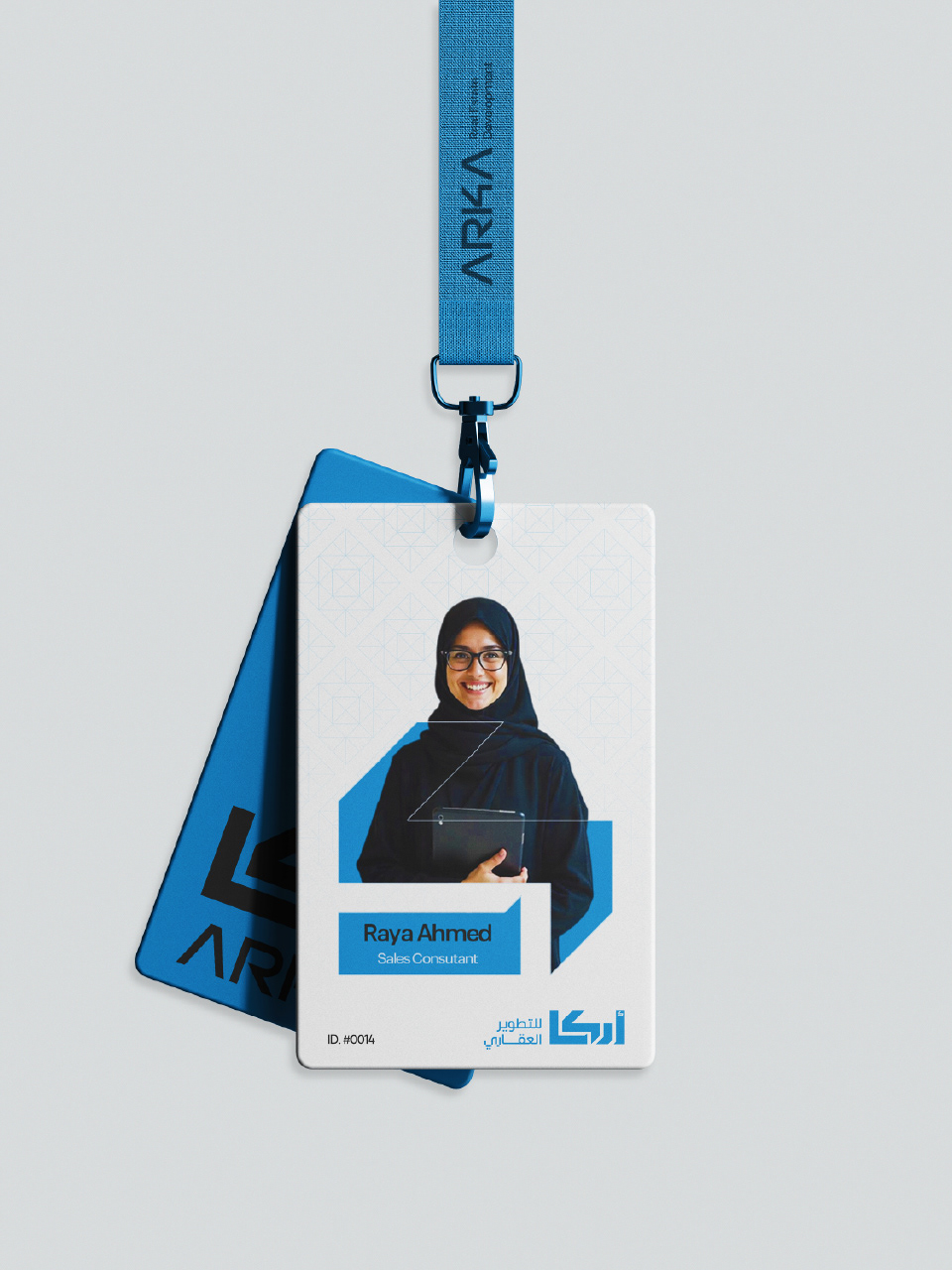
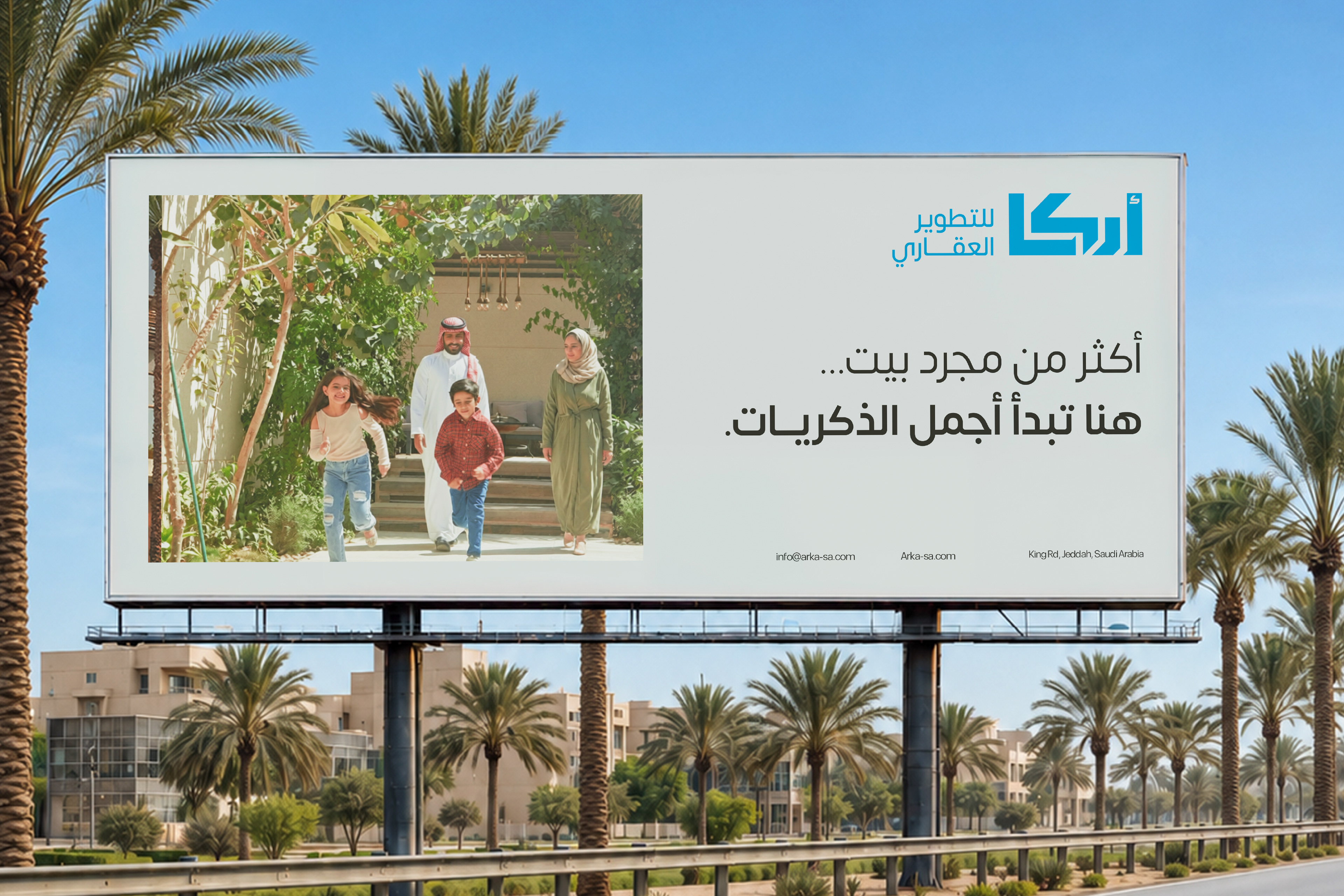
The direction grew from a simple architectural idea: the corner as a point of structure, foundation, and forward movement. From this, I developed a bilingual identity built around precise geometry, a clear visual hierarchy, and a palette inspired by Jeddah’s blue sky and sand-toned architecture. The result is a flexible system that feels modern and confident while remaining grounded in its local context.
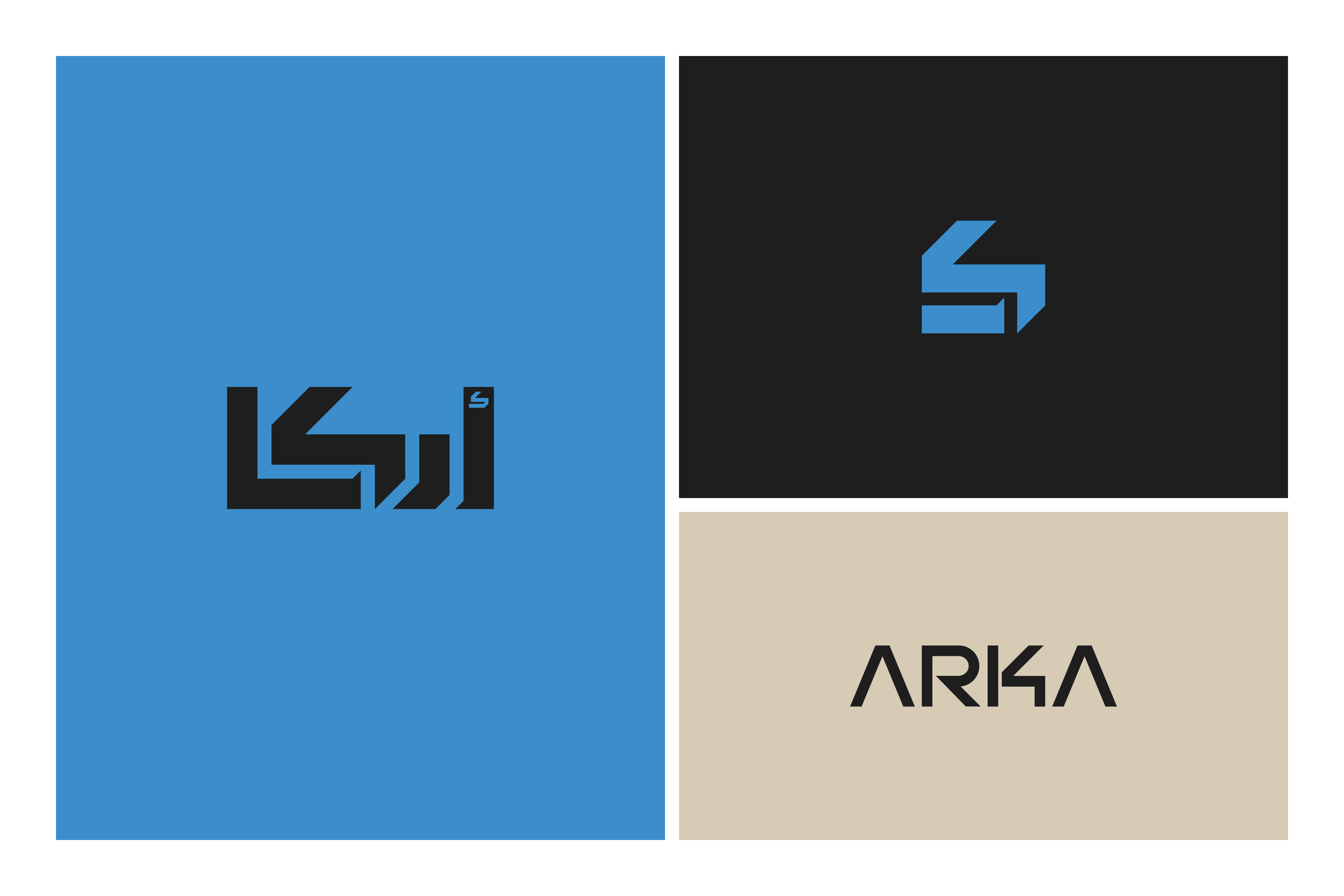
LOGO CONCEPT: BUILT FROM THE CORNER.
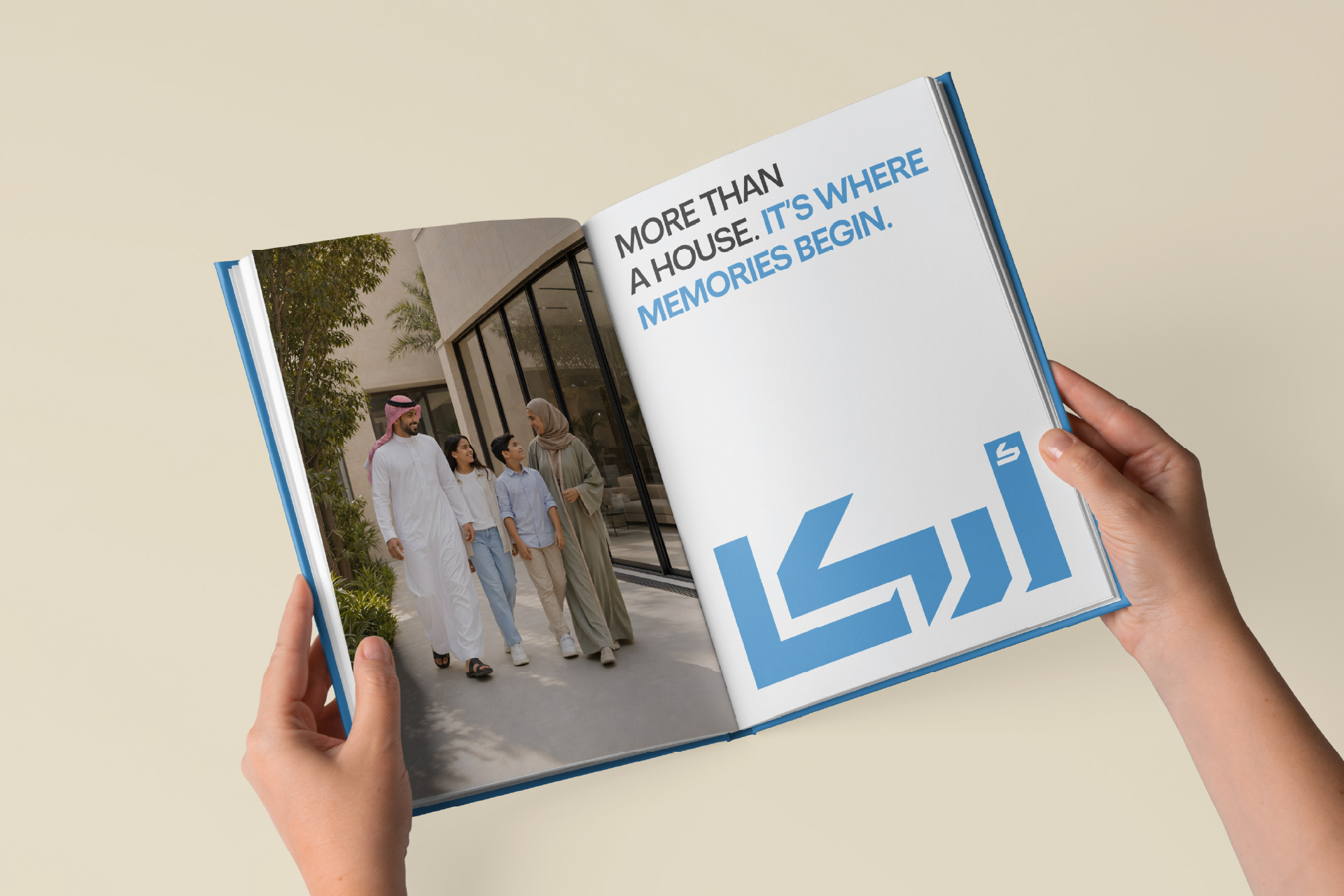
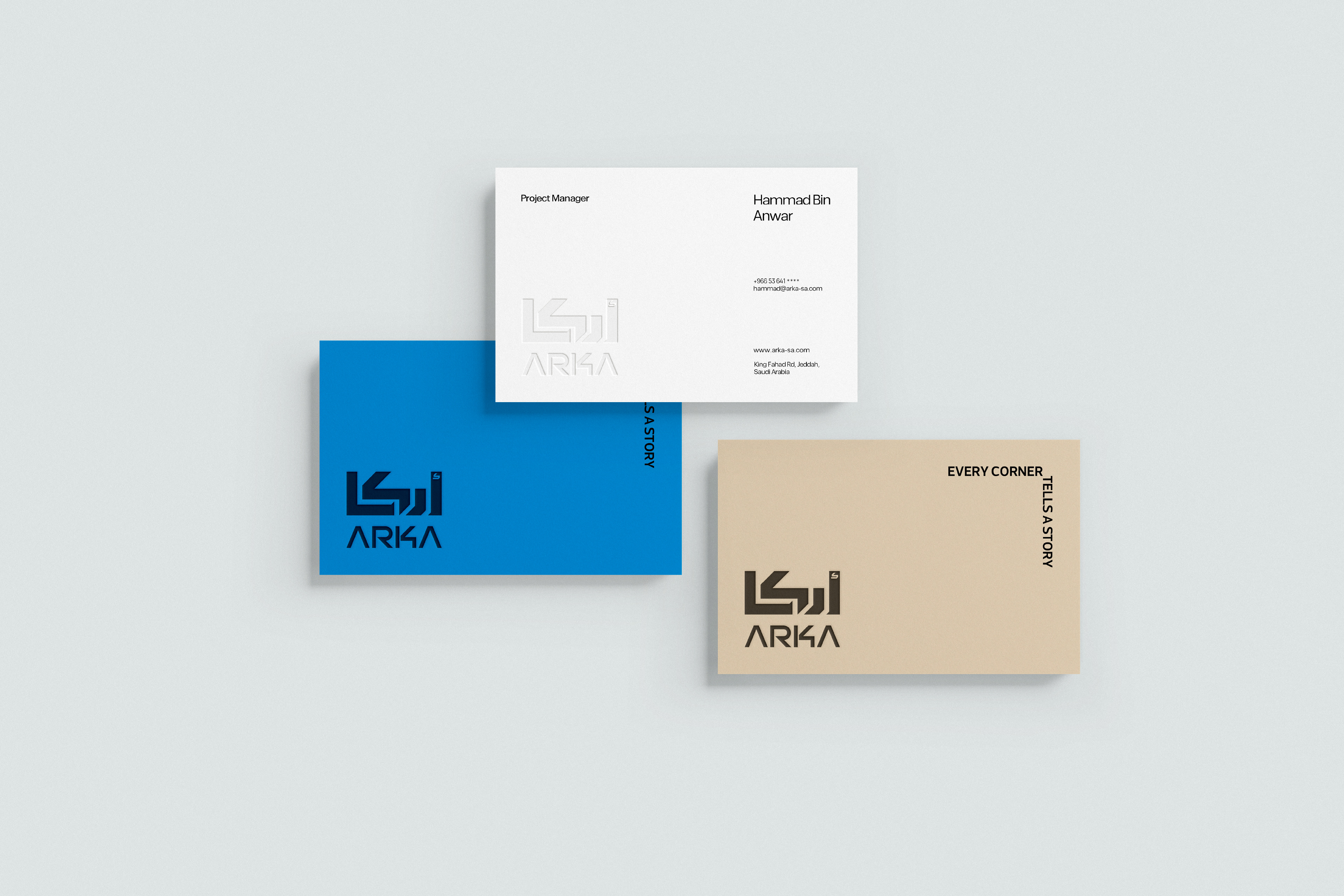
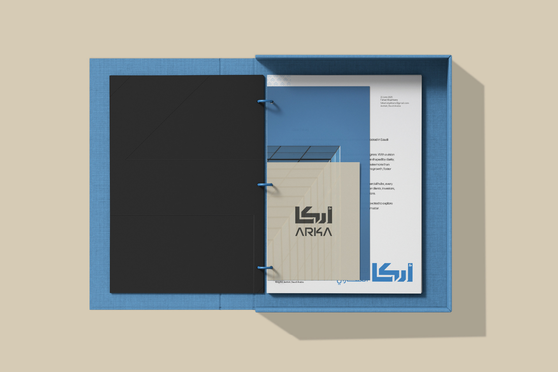
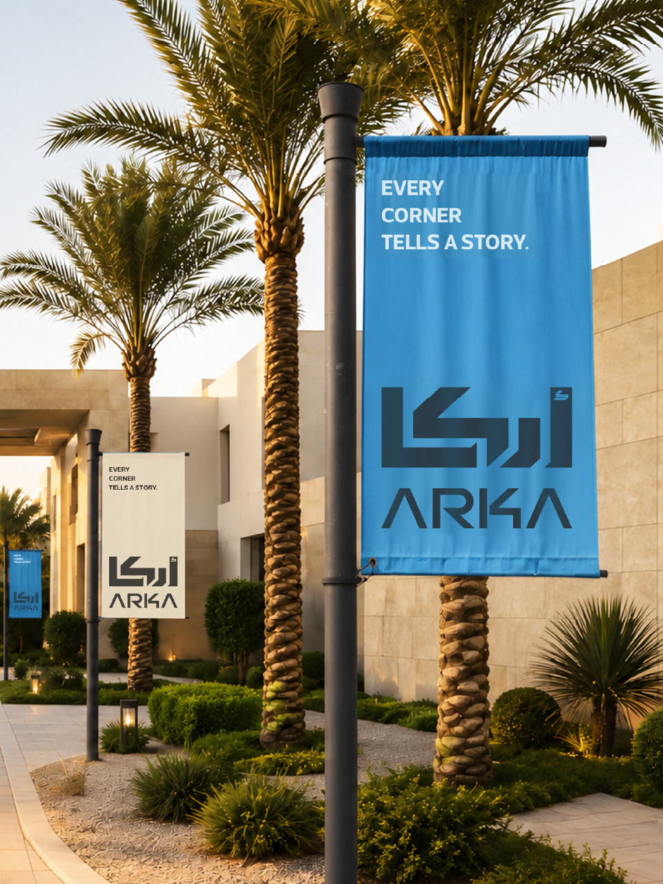
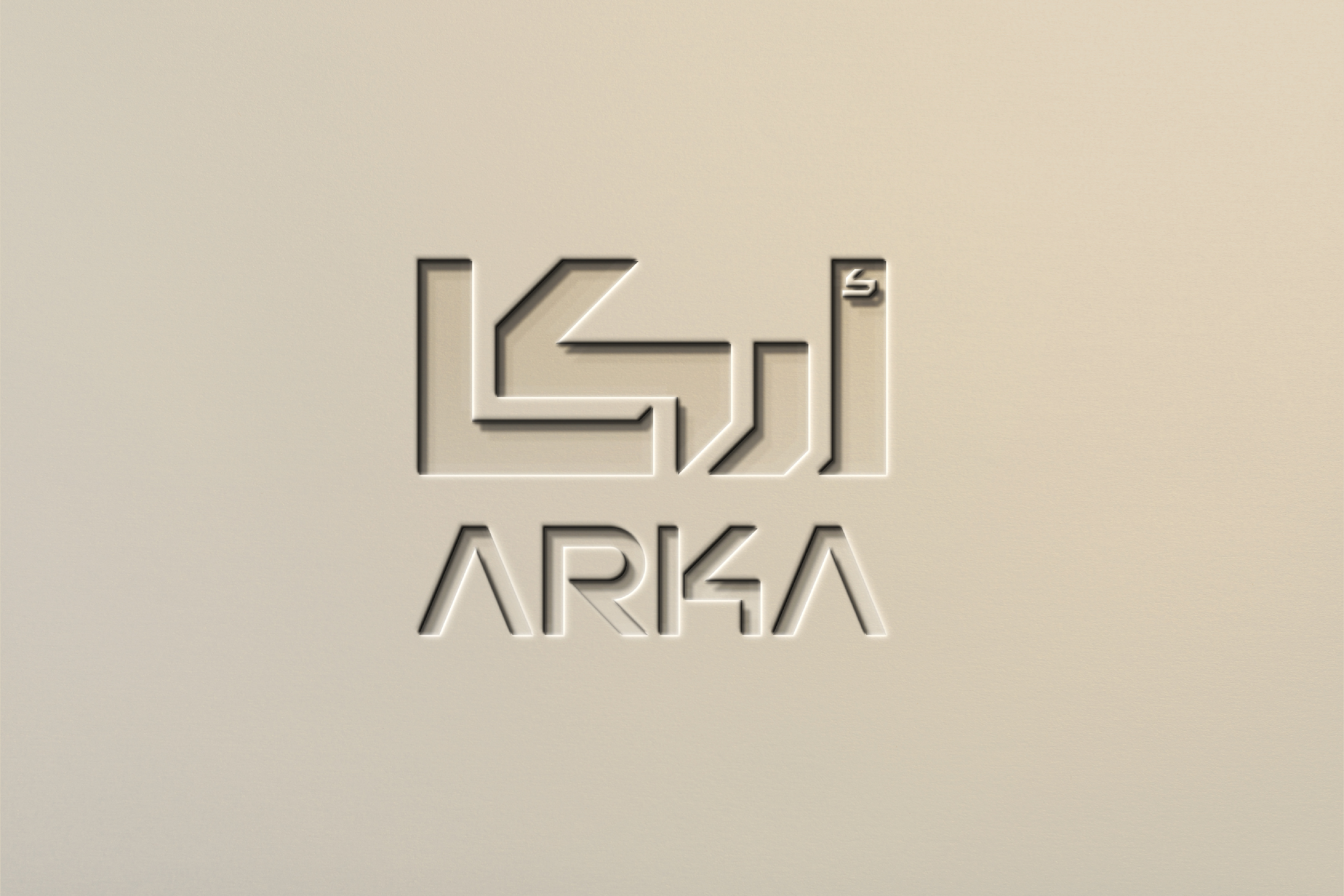
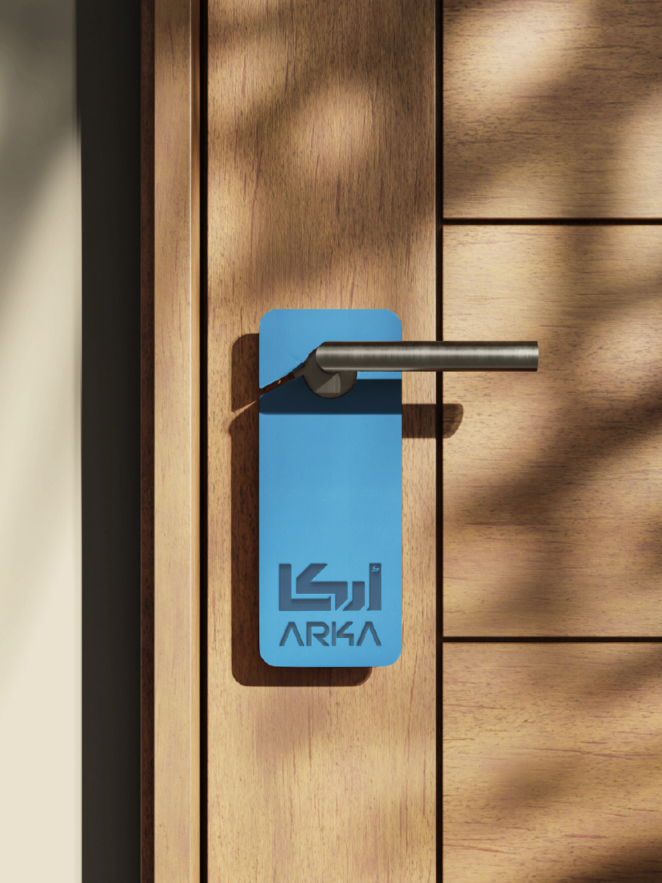
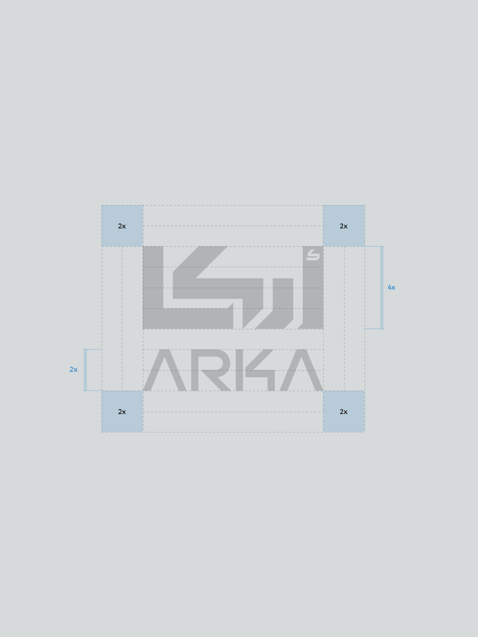
The name ARKA is derived from the Arabic word Arkan (أركان), which meaning corners and carrying a broader association with structure and foundation. This idea became the starting point for the logo. The geometry of the corner shapes both the Arabic and English wordmarks, creating a unified bilingual system with a bold and confident character. Sharp angles and connected forms give the identity a distinctive, contemporary presence while expressing stability, direction, and ARKA’s forward-looking ambition as a real estate developer.

THE LOGOMARK
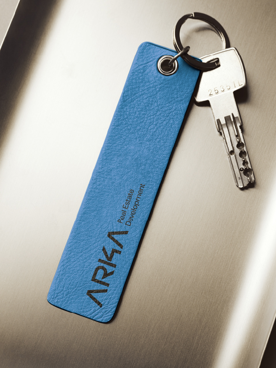
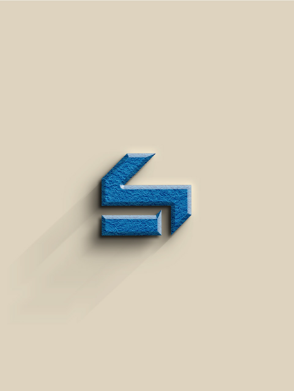
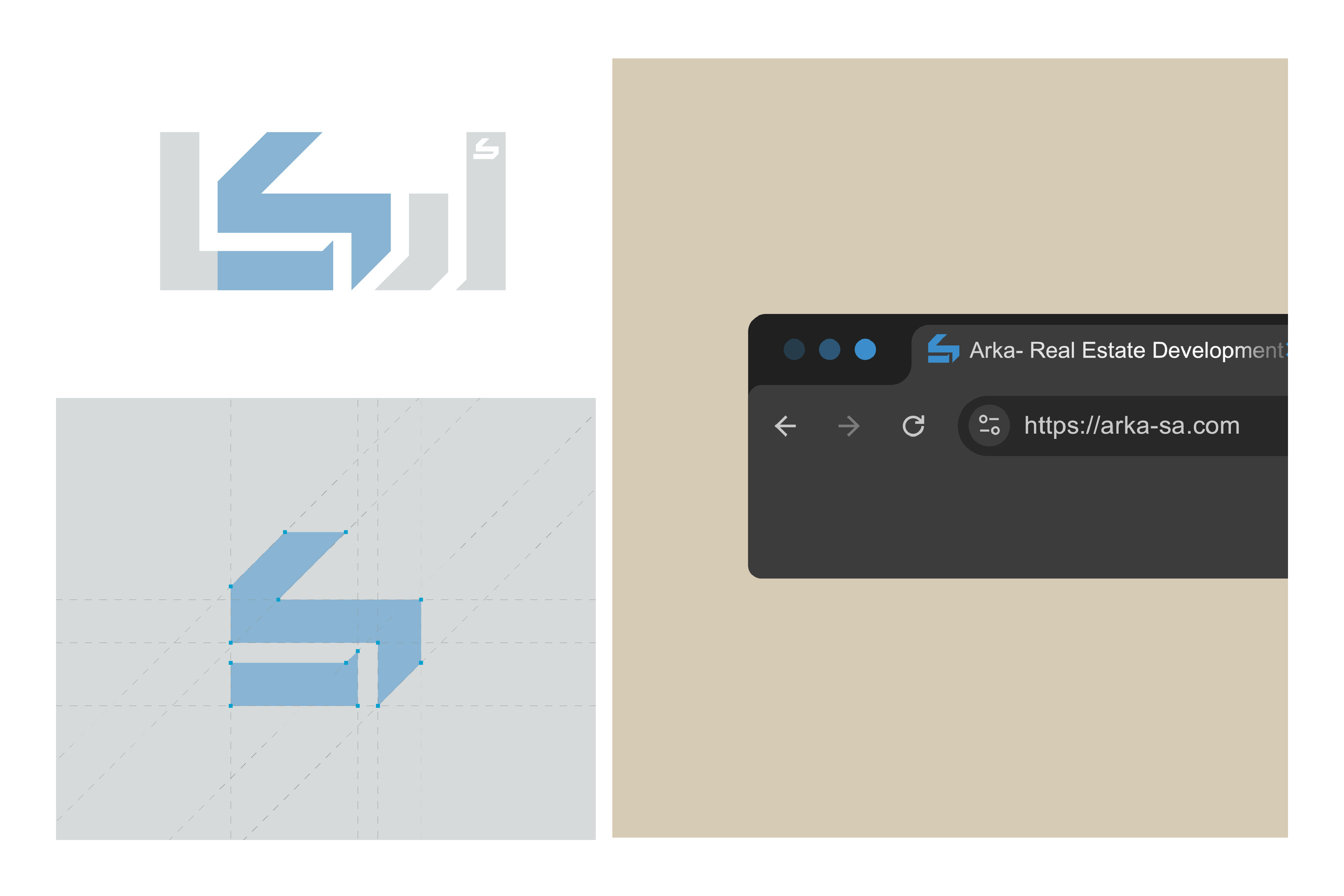
Derived from the letter Kaf (ك) within the Arabic wordmark, the ARKA logomark condenses the identity into a compact and recognizable symbol. Its geometry can be read as both the Arabic letter ك and the Latin letter K, reinforcing the brand's bilingual character. The mark was designed for smaller formats and applications where the full wordmark would be less practical, while maintaining ARKA’s distinctive visual presence.
COLOR & TYPOGRAPHY
Skyline Blue brings a sense of clarity and ambition, while warm sand and charcoal tones give the identity balance and a grounded architectural character. Paired with Somar Sans, a contemporary bilingual typeface, the system feels confident, considered, and consistent across Arabic, English, and every brand touchpoint.