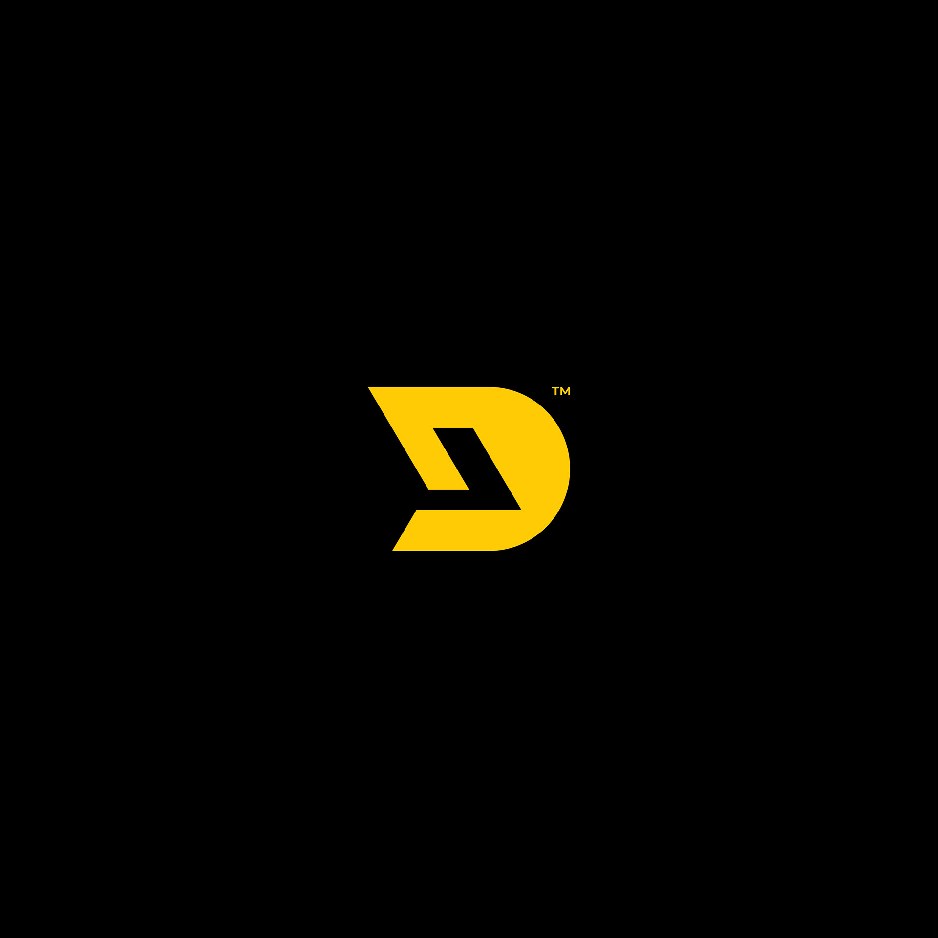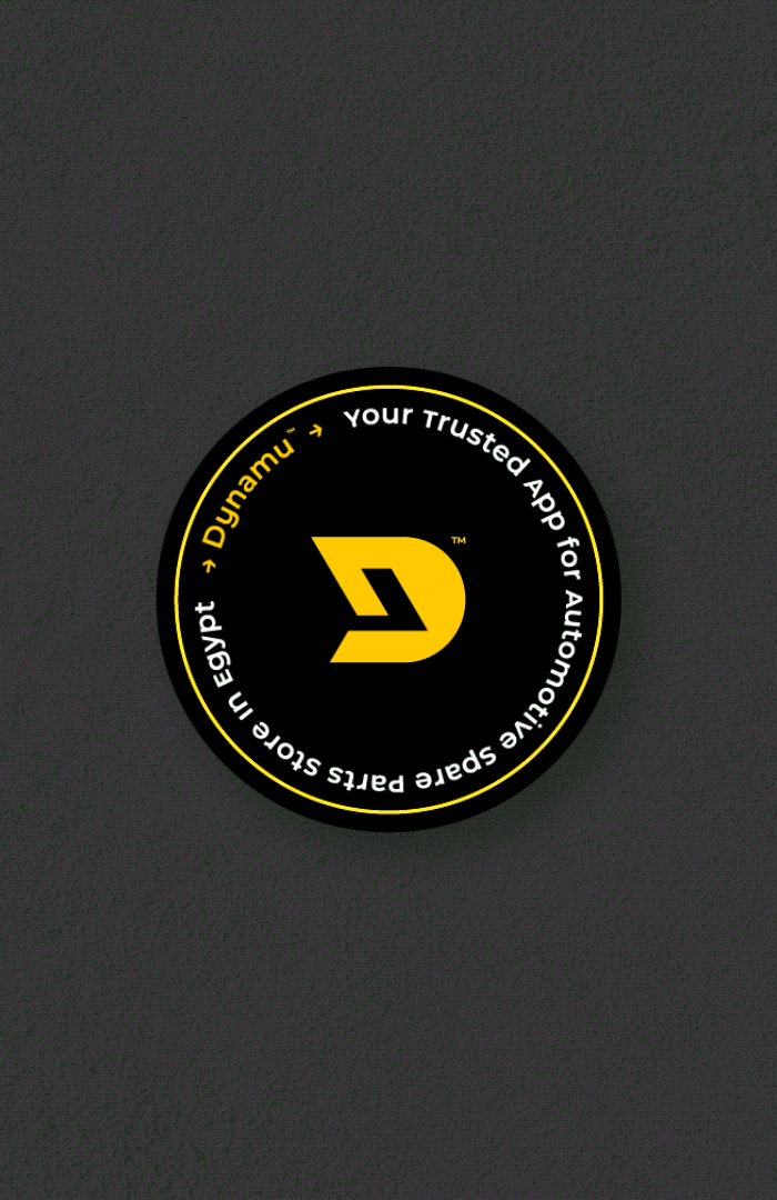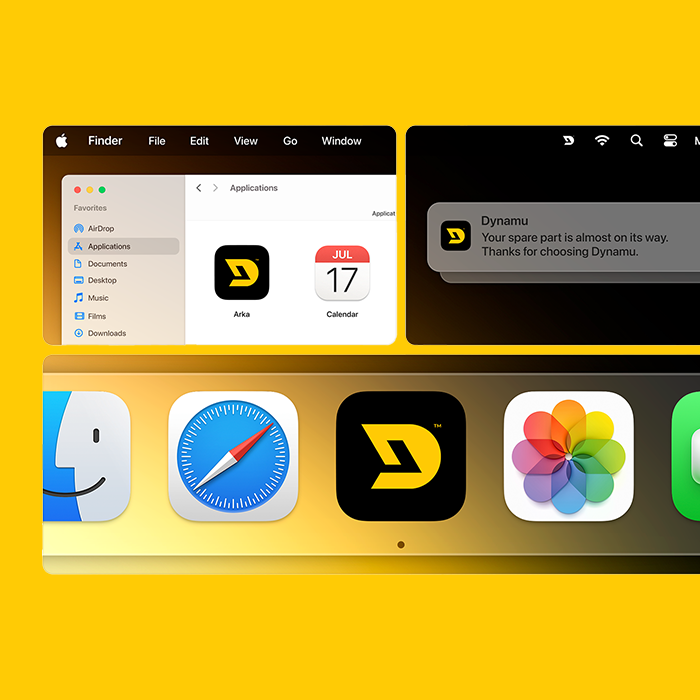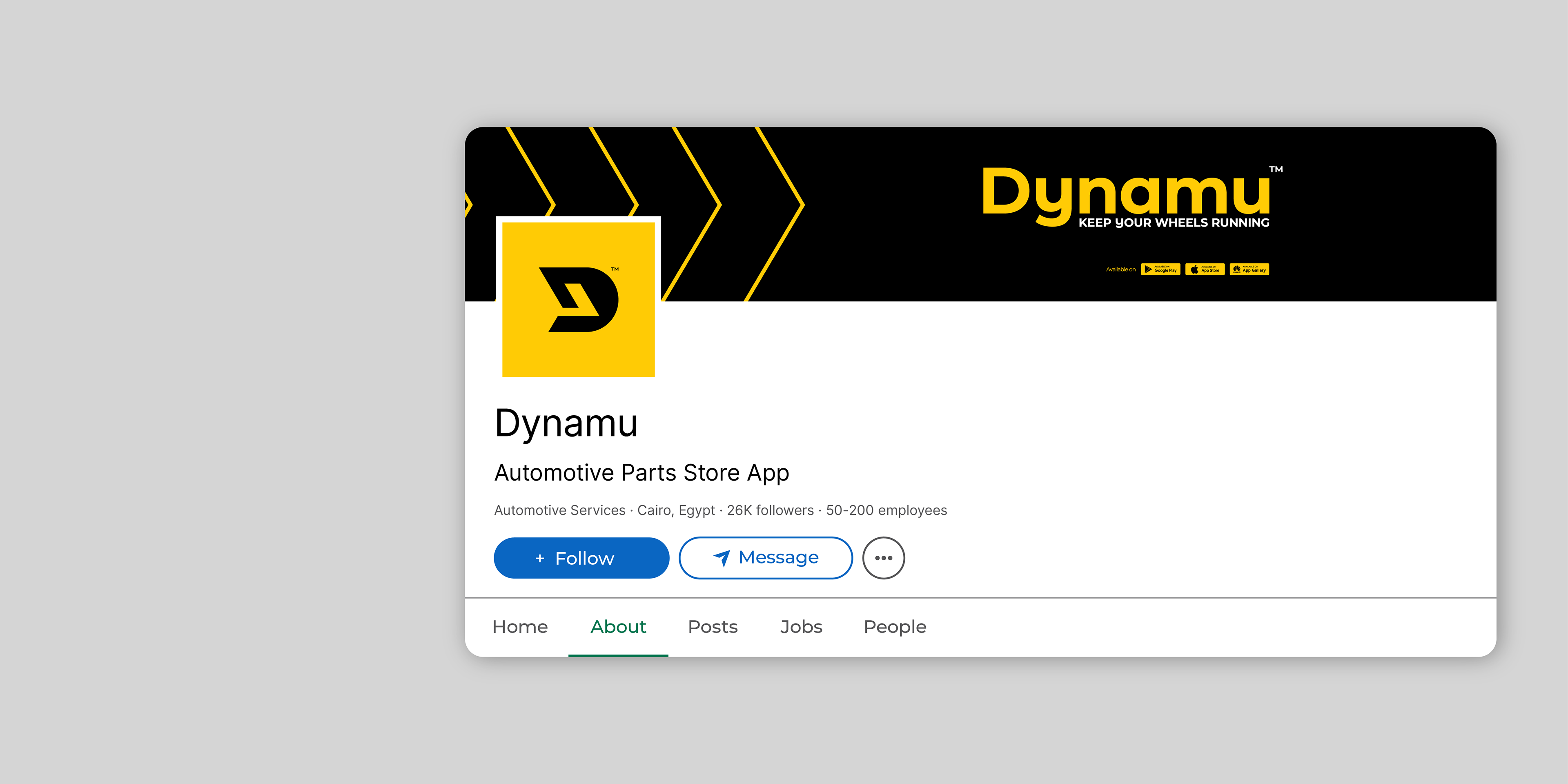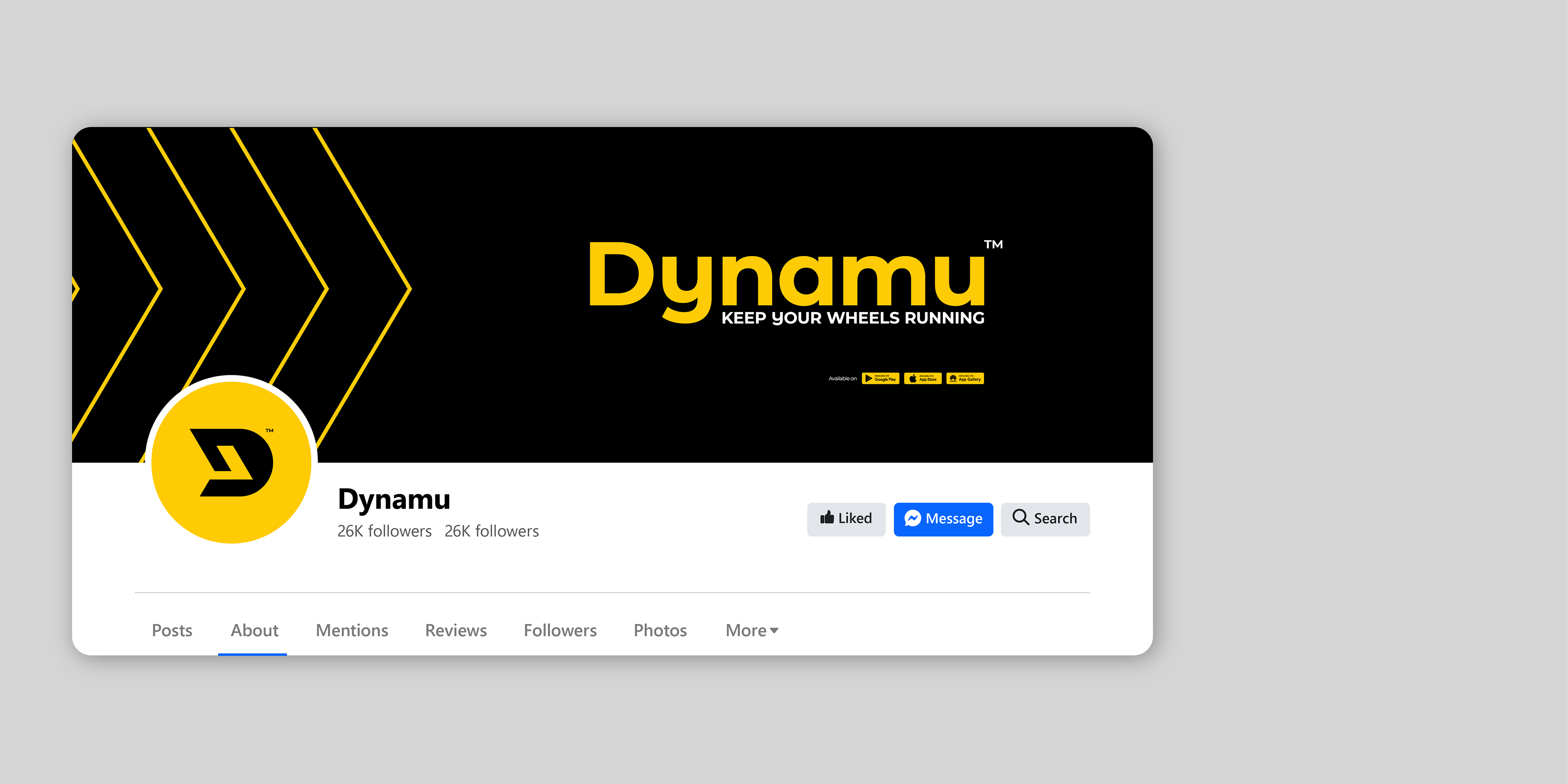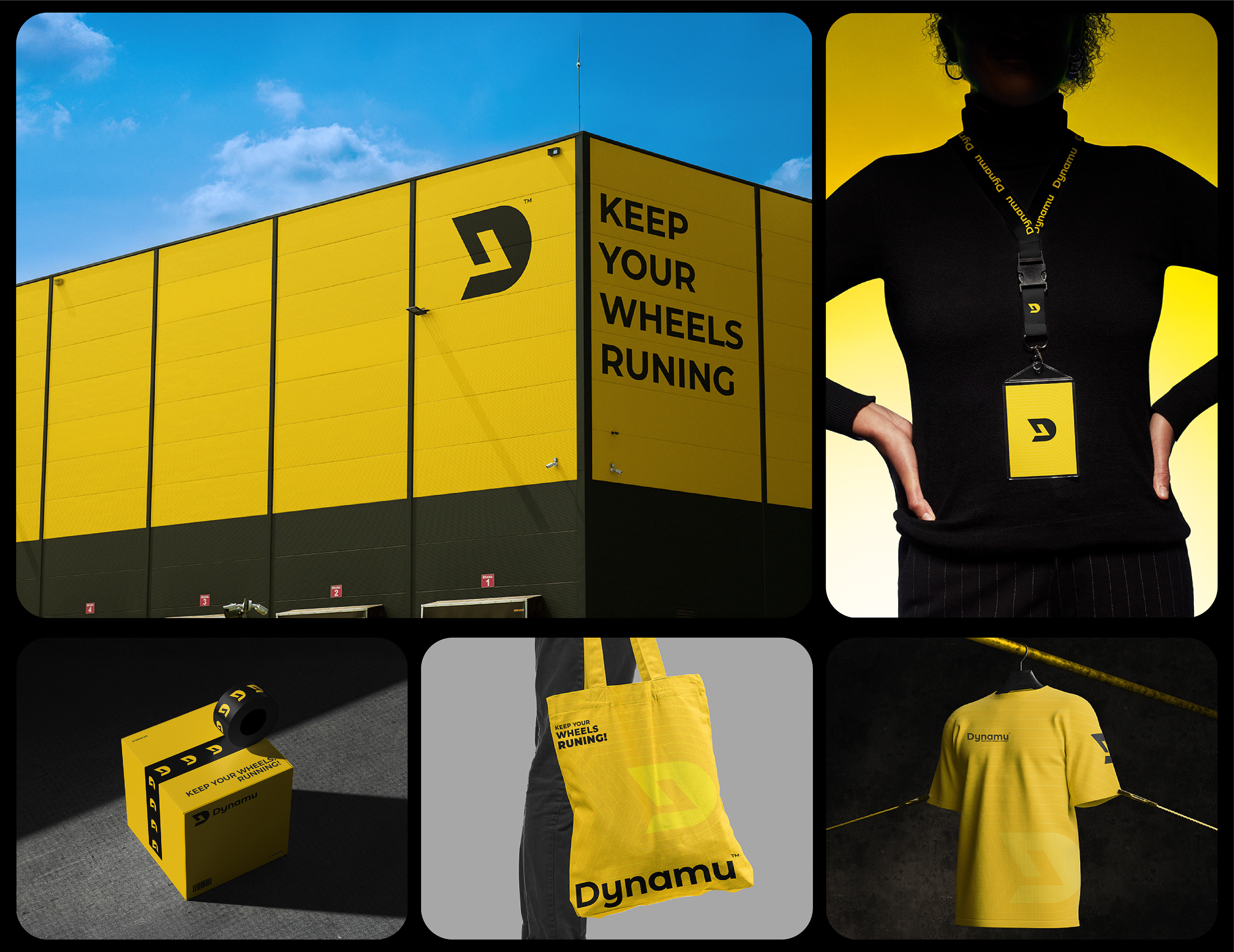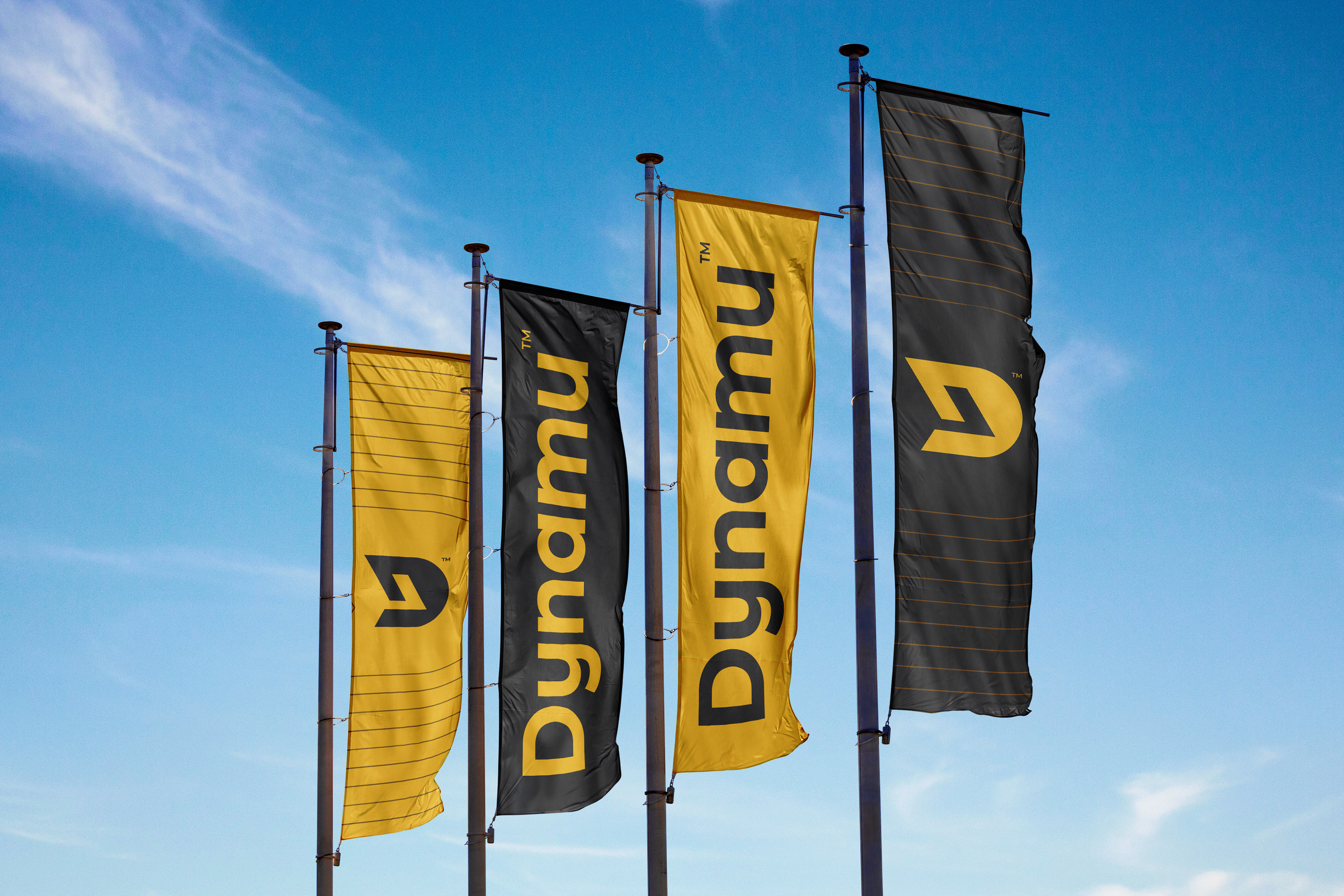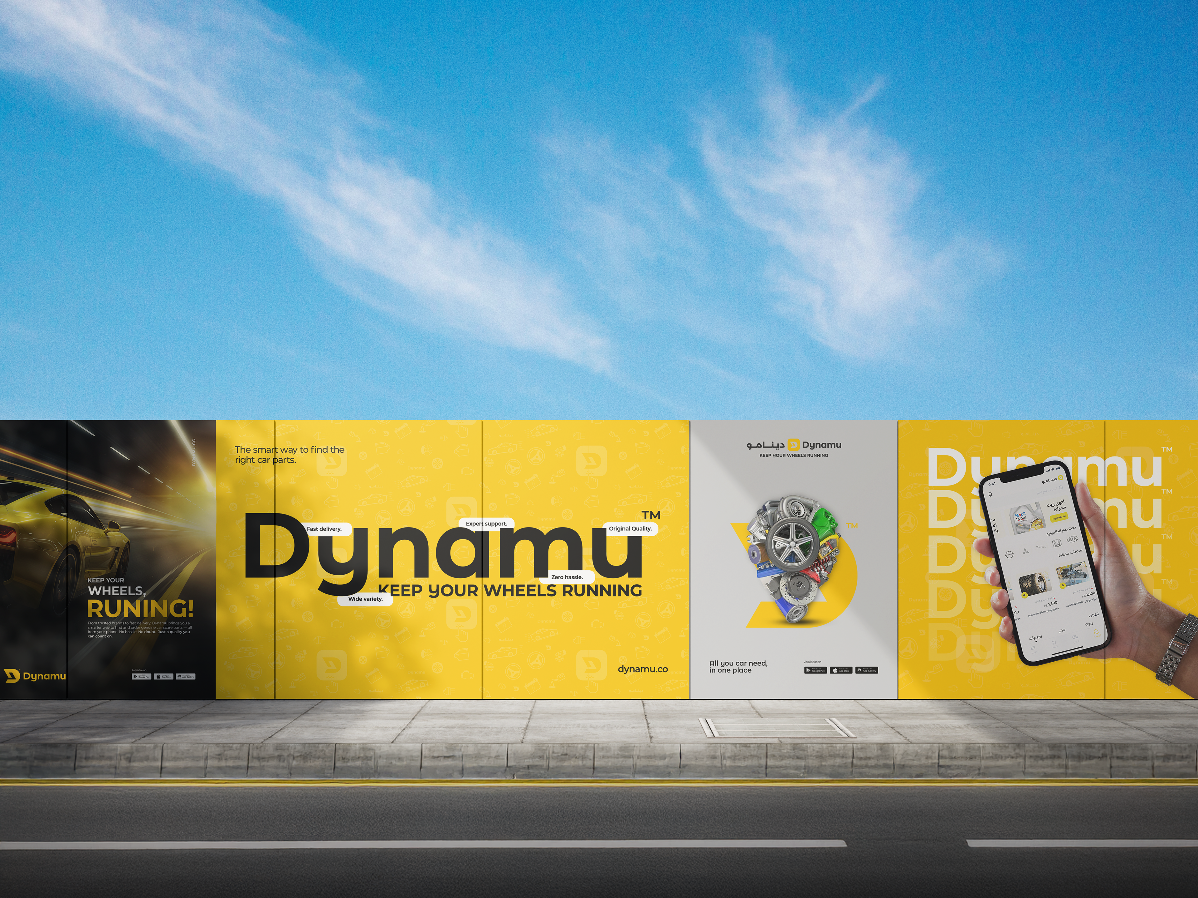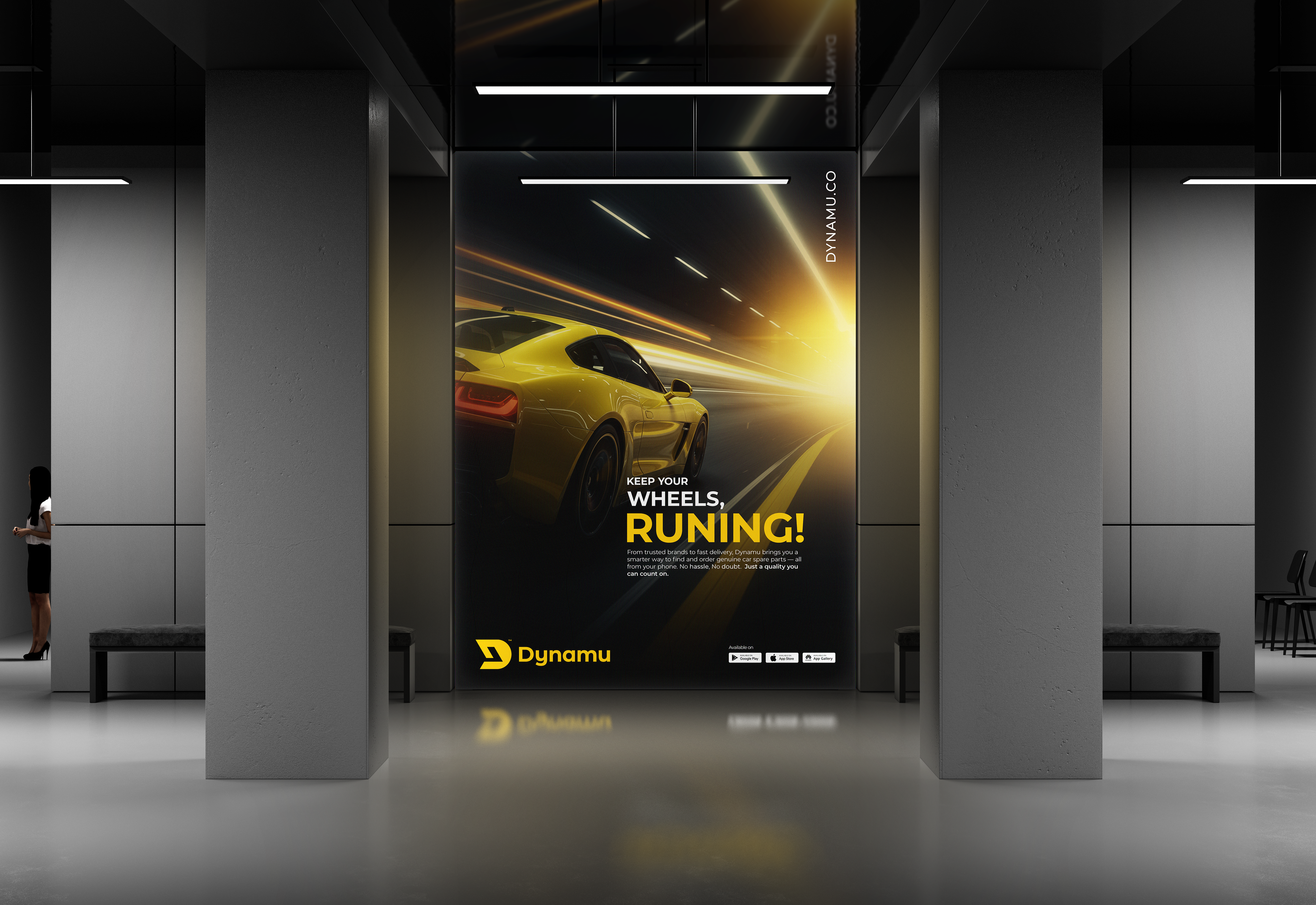
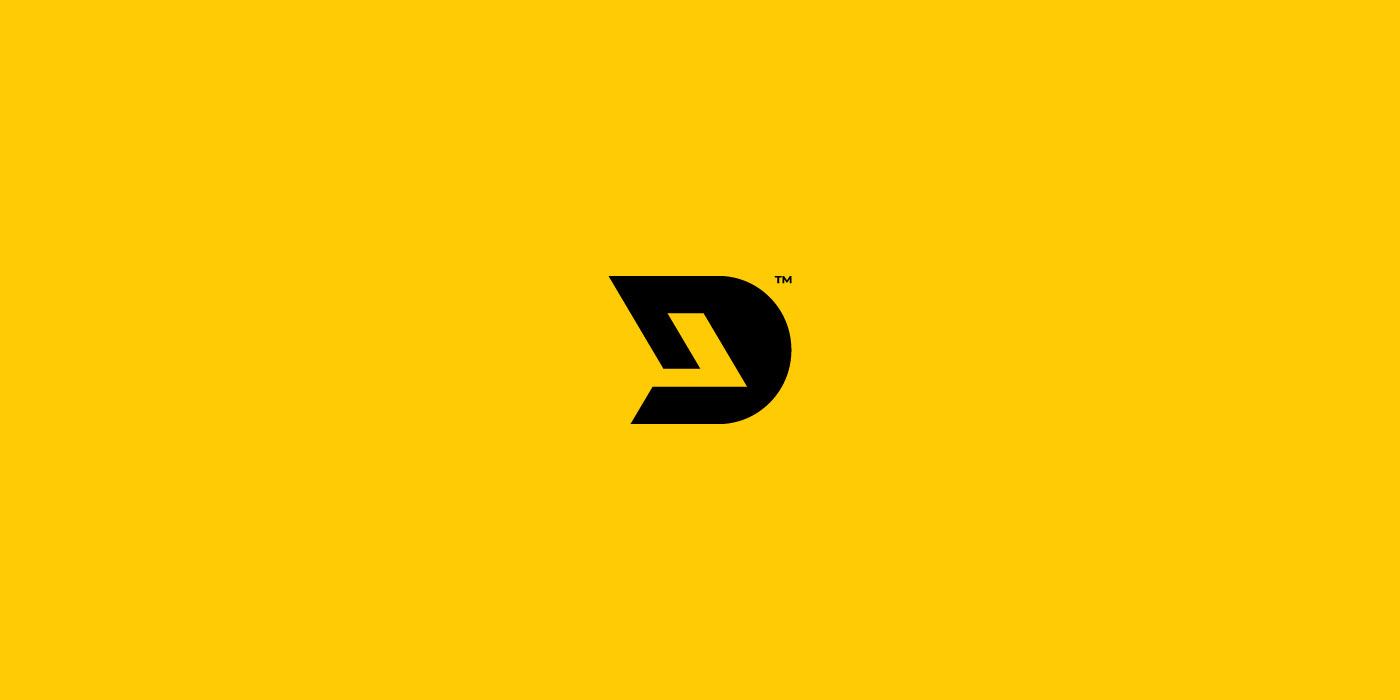
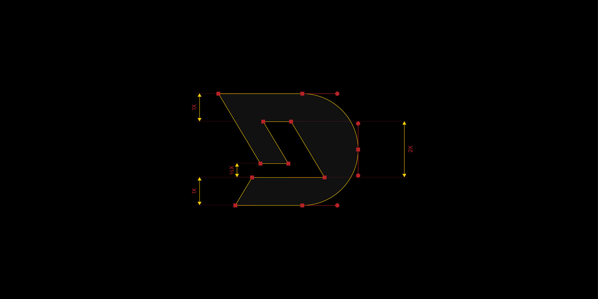
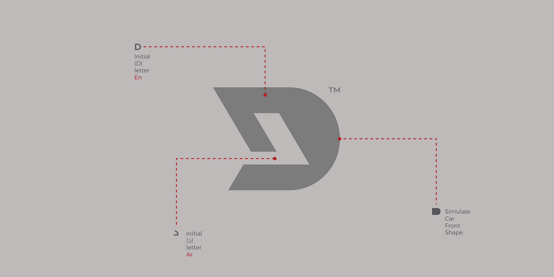
The Brand Logomark
The Dynamu logomark designed with a modern and minimalistic approach, the mark seamlessly integrates multiple elements that define Dynamu’s identity.
- At its core, the logo is a combination of the letter "D" from the English name Dynamu and the Arabic letter "د" from دينامو, unifying the brand’s bilingual identity and emphasizing its presence in the Egyptian market.
- The logomark is also inspired by the front profile of a car, symbolizing movement, efficiency, and speed. Its sharp, angular structure conveys a sense of precision and reliability, reflecting the brand’s commitment to delivering high-quality spare parts with trust and efficiency.
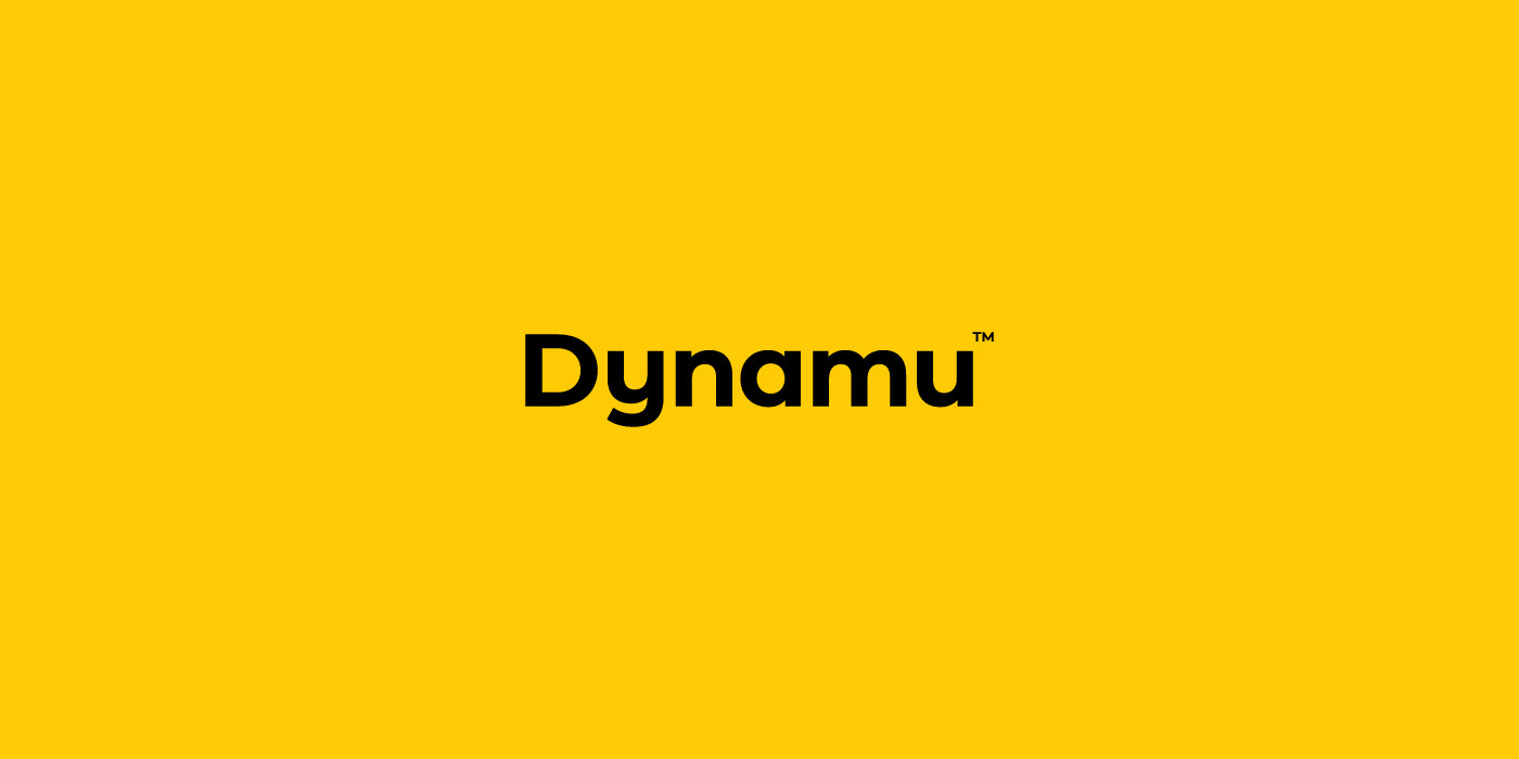
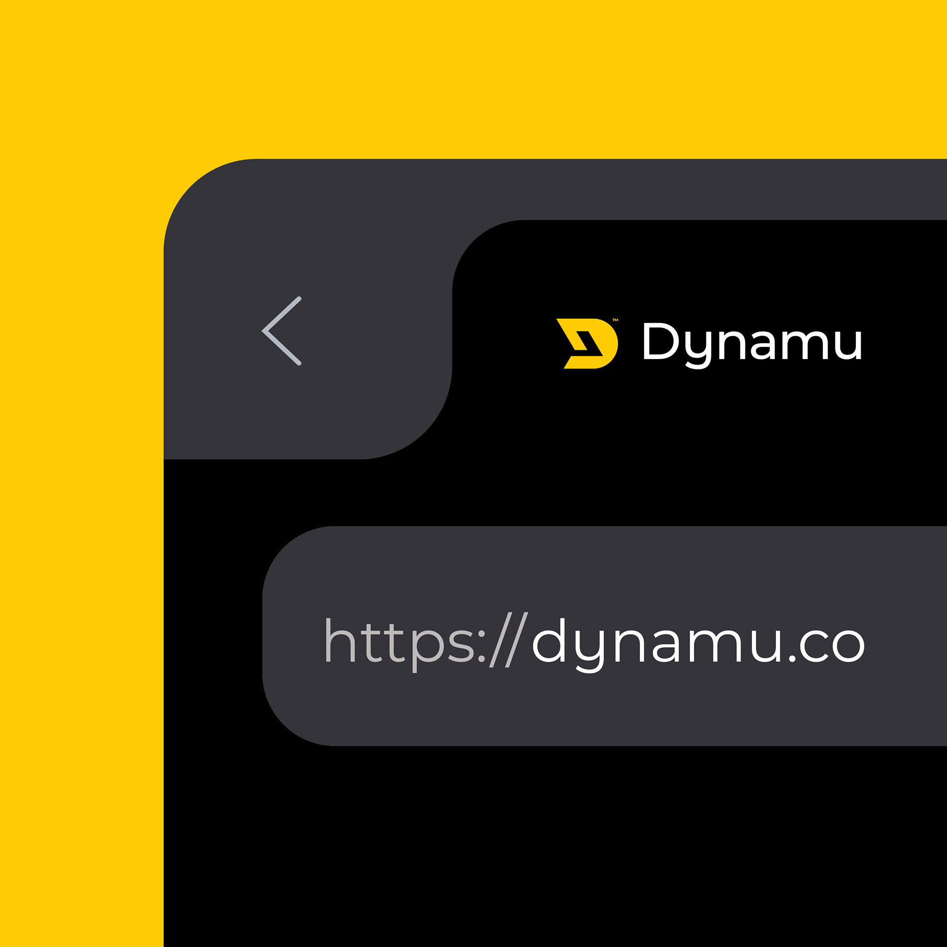
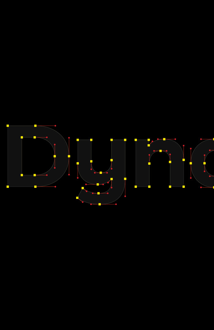
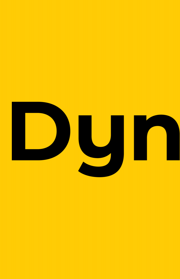
The Brand Logotype
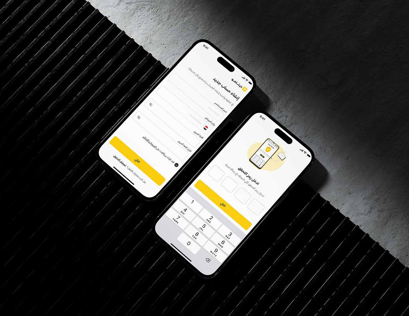
For the brand logotype, I have chosen a clean, geometric, and bold sans-serif typeface to reflect the brand’s core values of strength, reliability, and speed. The bold letters style enhances the sense of strength and reliability, while the subtle curves add a touch of approachability and flexibility. This balance ensures a modern, professional, and easily recognizable identity that aligns with Dynamu’s dynamic and customer-centric brand essence.
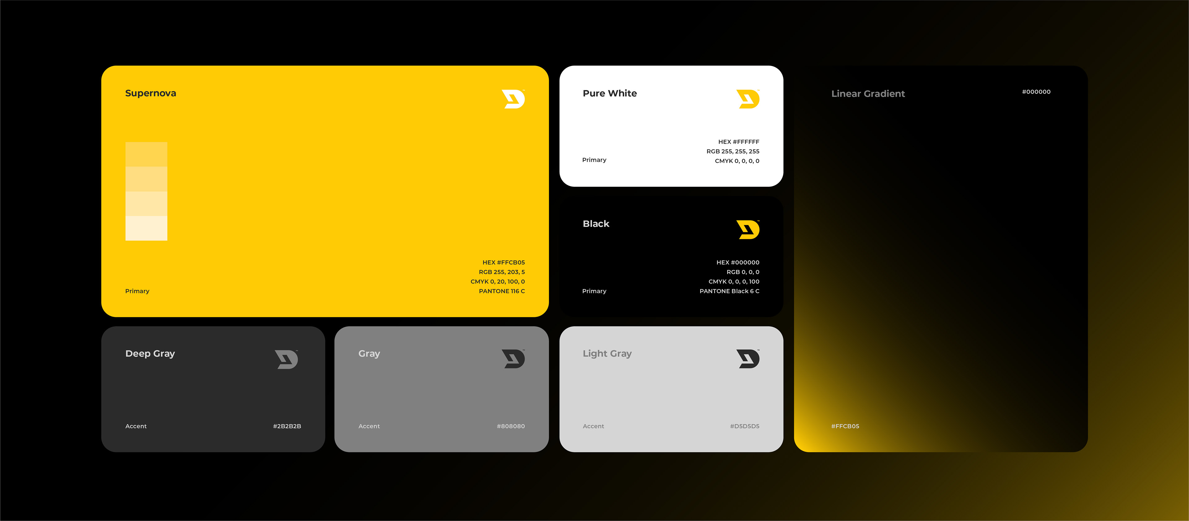
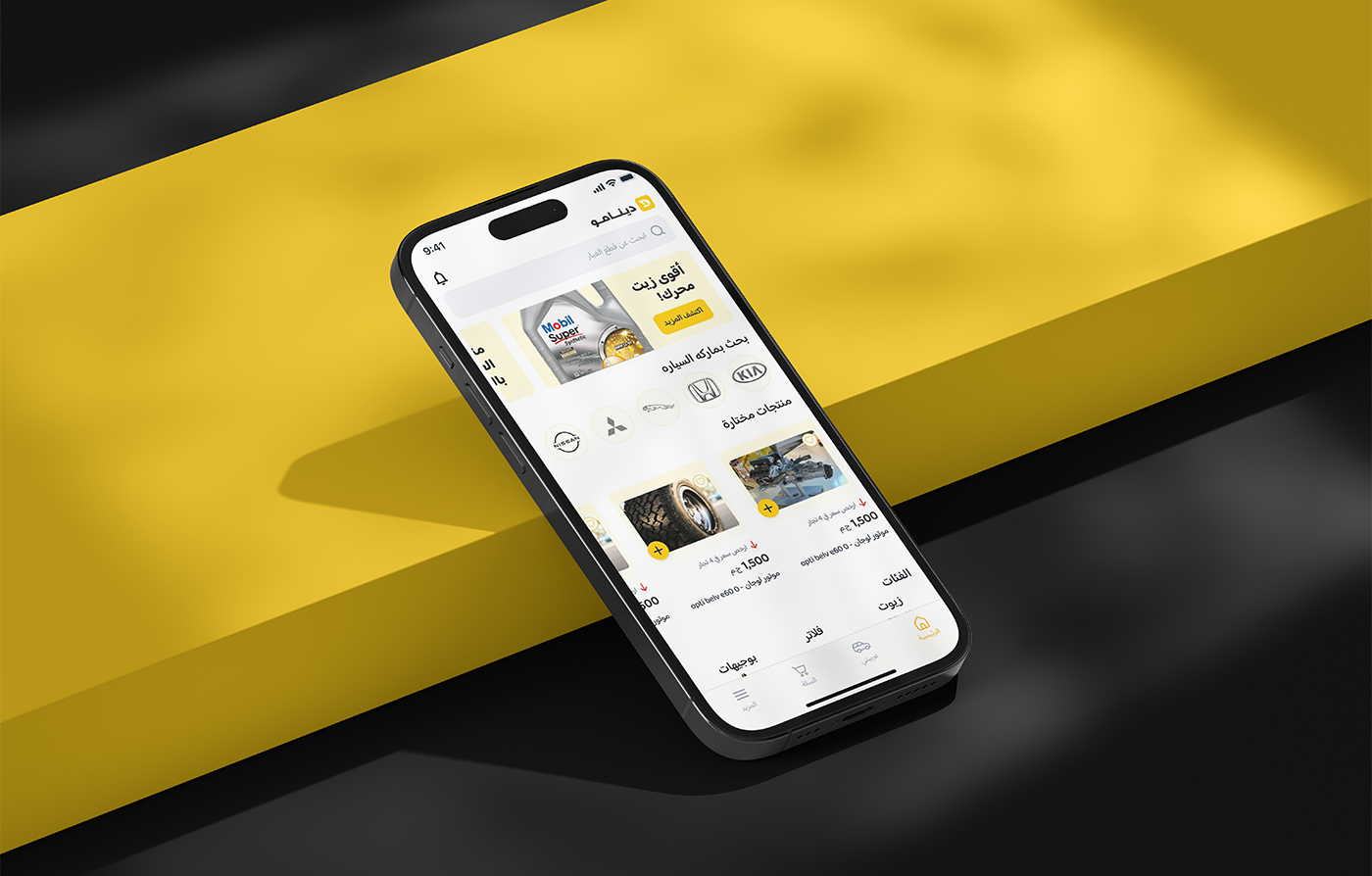
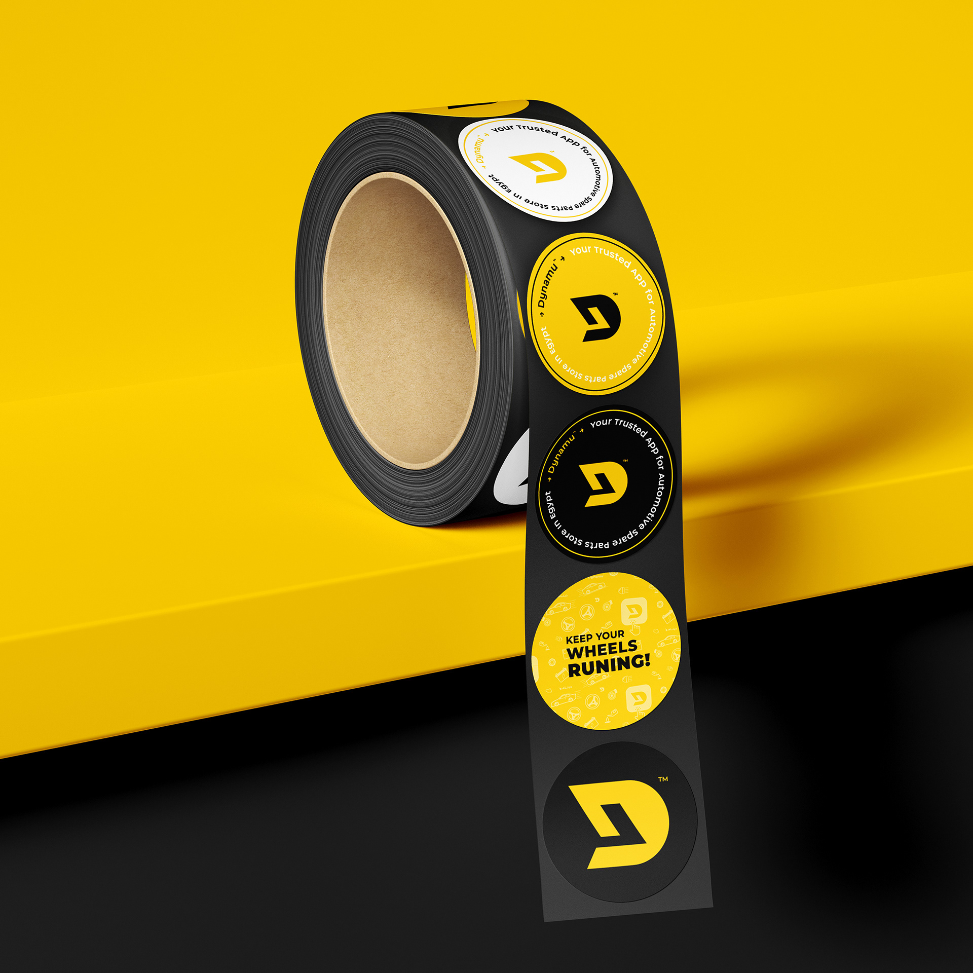
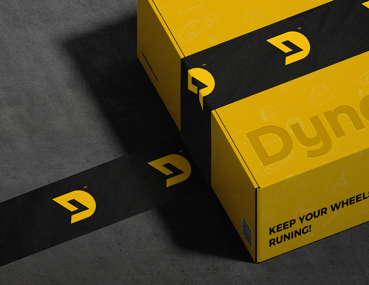
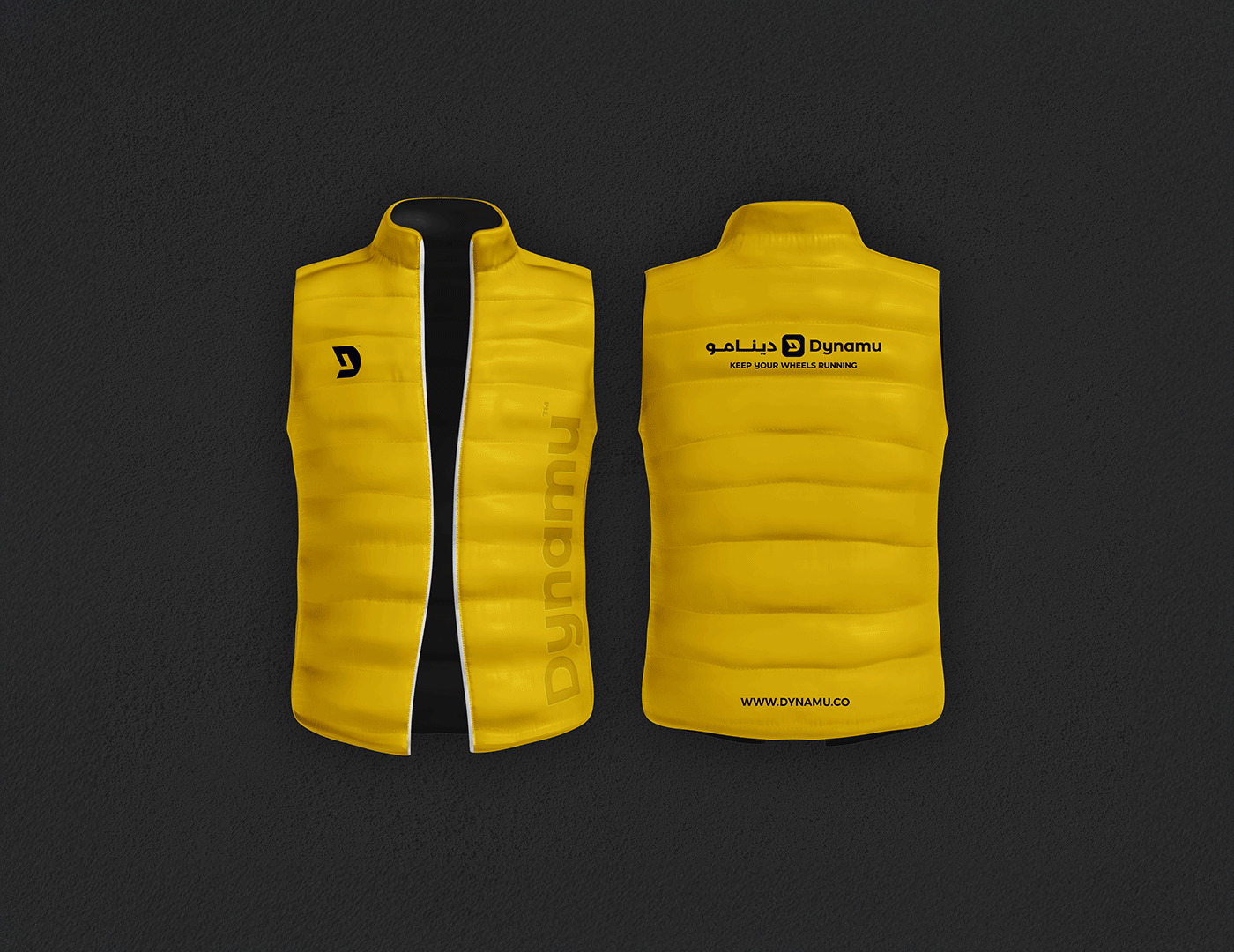
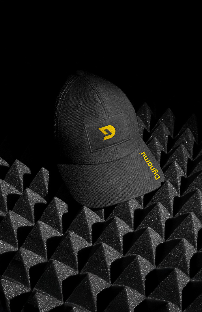
The Brand Color Palette
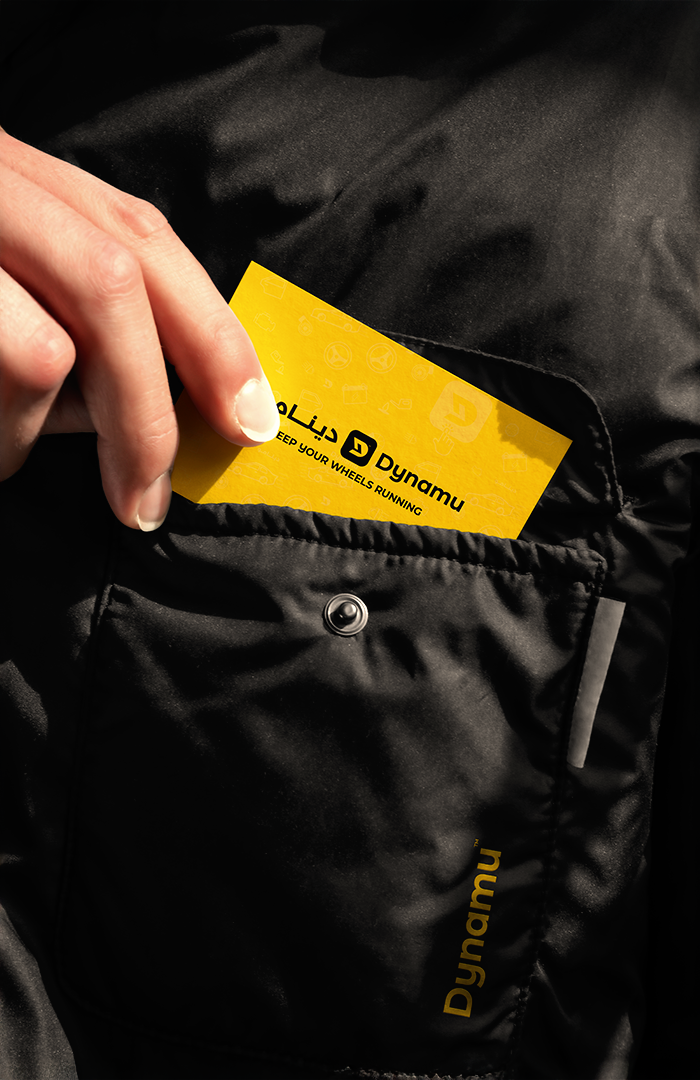
The brand color palette reflects energy, confidence, and clarity. Supernova Yellow symbolizes speed and innovation, making the brand bold and dynamic. Black conveys power and reliability, while White ensures clarity and openness. Complementary shades of yellow and gray add depth and flexibility, creating a balanced, modern, and approachable identity.