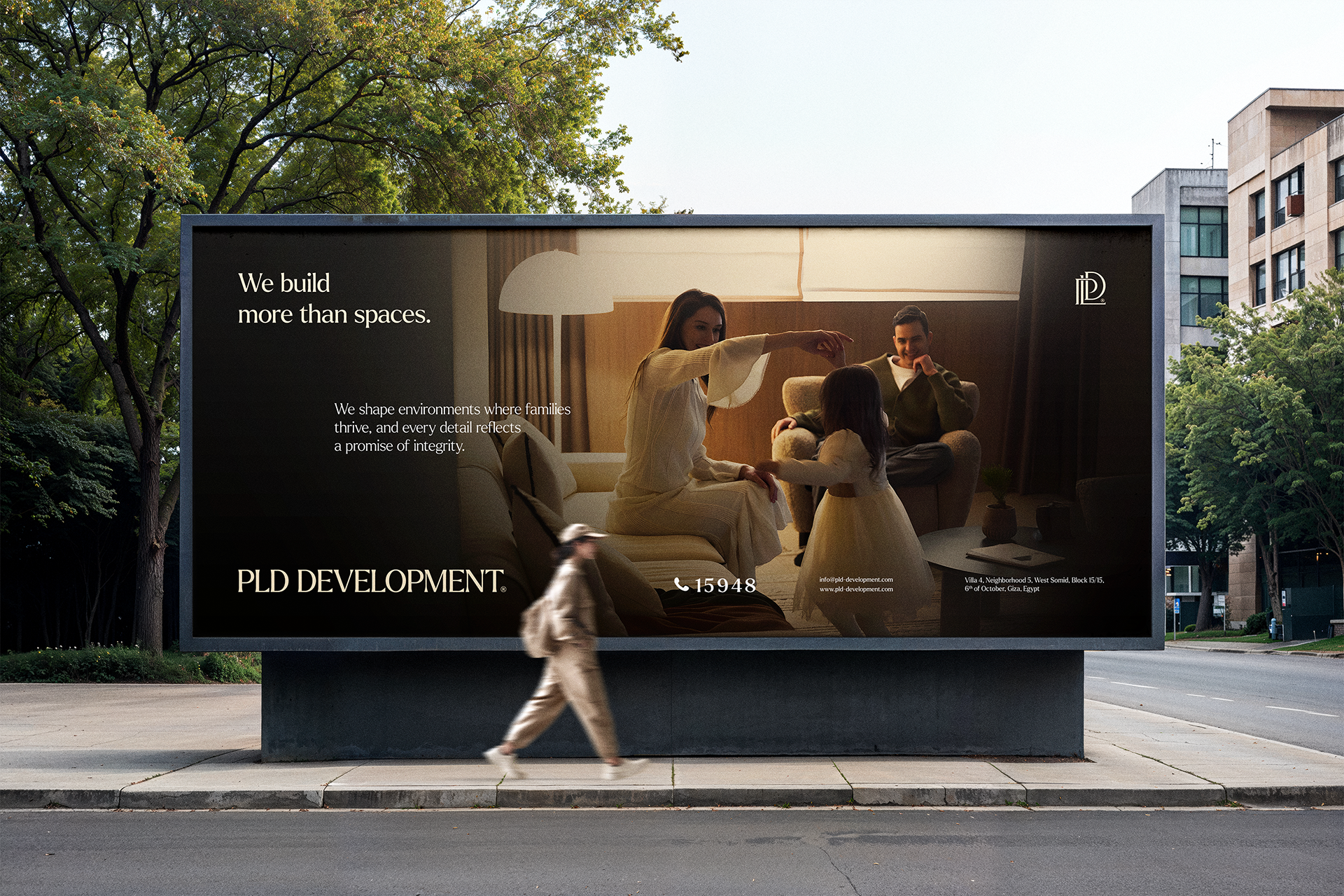

PLD Development
Case
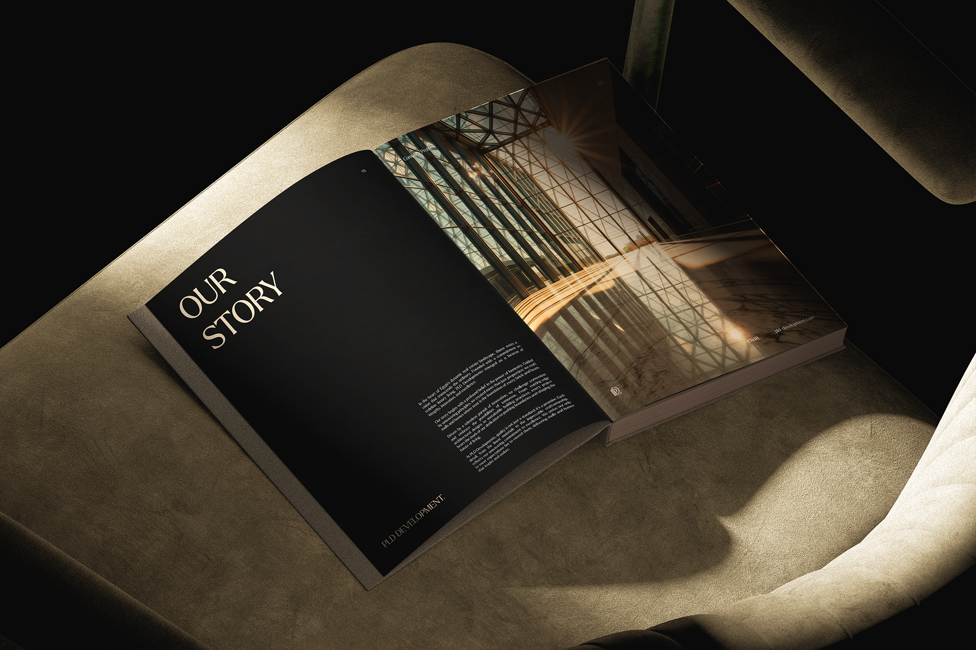
PLD Development is a real estate developer based in Egypt. Formerly known as Portland Construction, the company underwent a strategic rebrand to align with its evolving vision and market positioning. With a growing portfolio and an ambition to move beyond traditional construction, the new brand identity "PLD Development" reflects a forward-looking real estate developer committed to delivering projects that combine architectural excellence, luxury, and long-term value. The rebrand aimed to establish a stronger presence in the premium market segment while maintaining the trust and credibility built over the years.
Solution
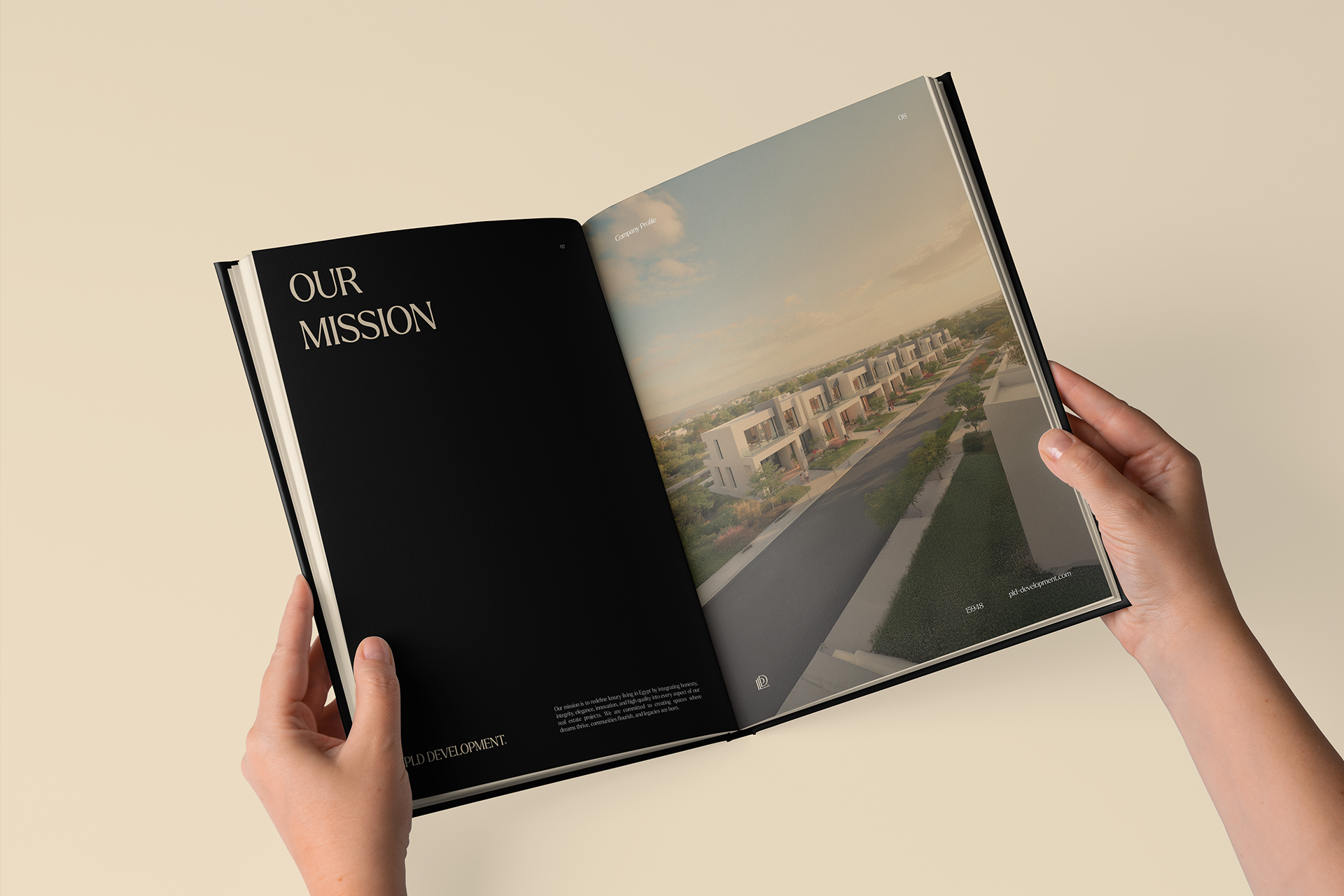
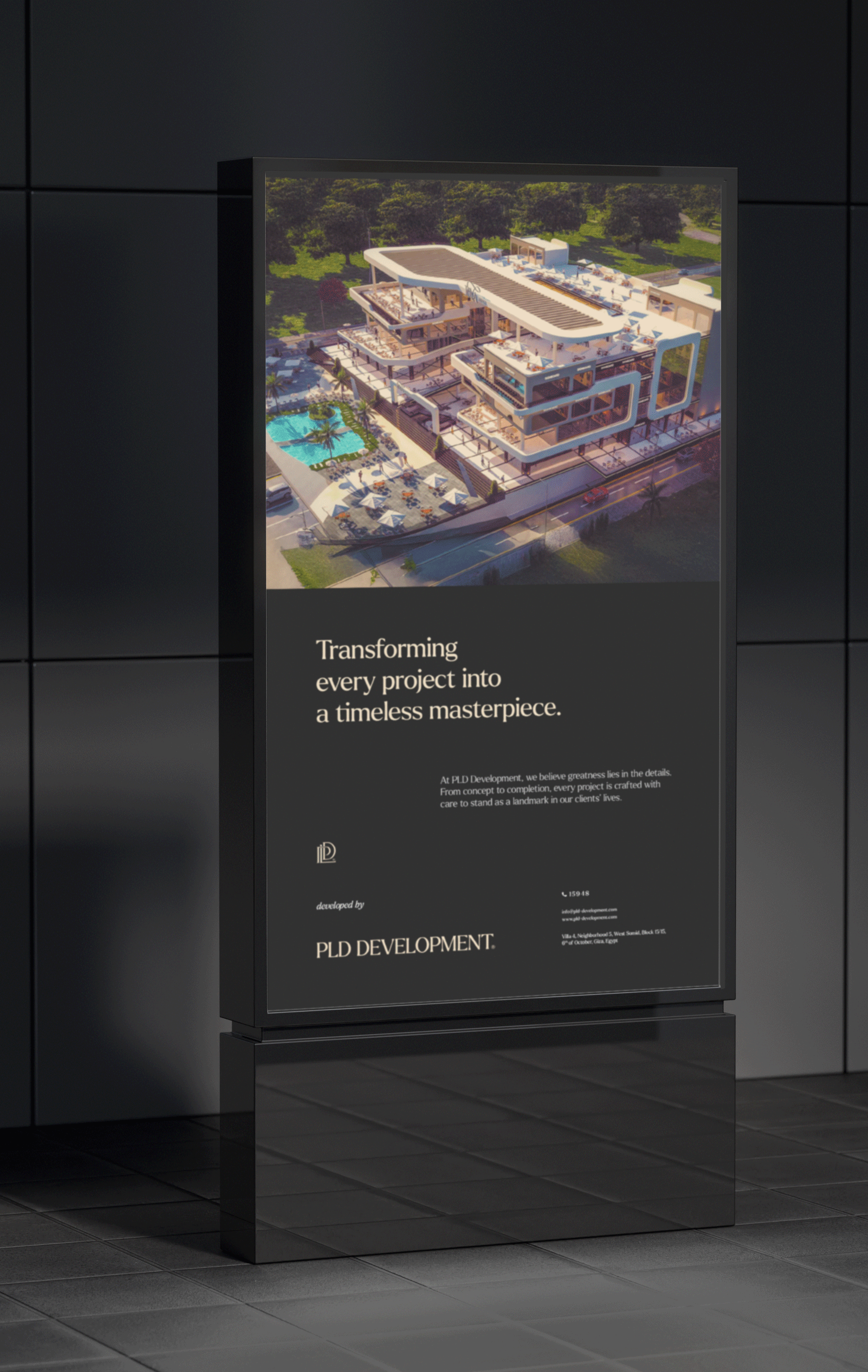
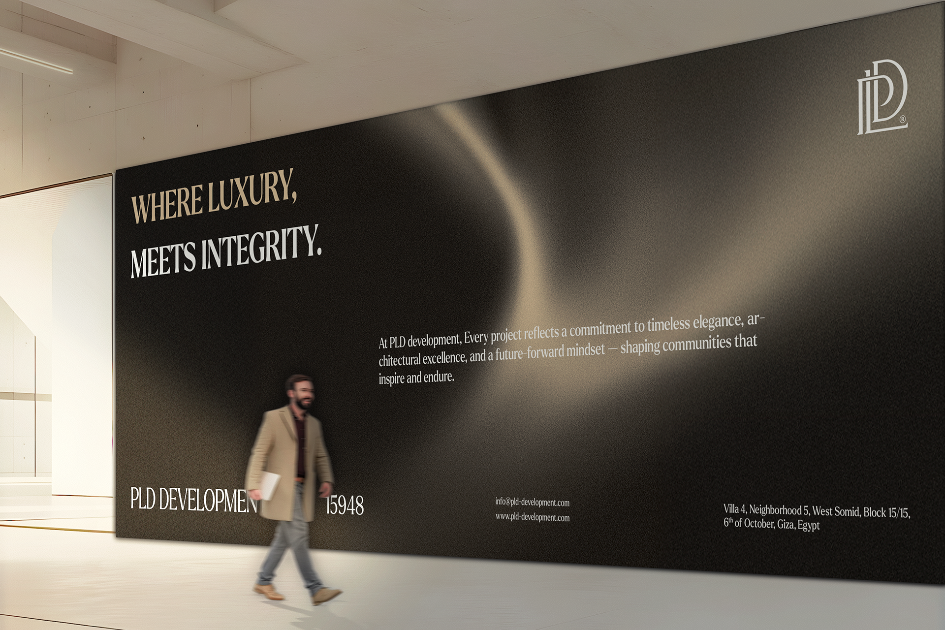
The rebranding process focused on crafting a brand identity that communicates sophistication, integrity, and innovation. The name PLD Development was chosen to modernize the company’s image and resonate with both local and international audiences. The visual identity was designed to emphasize elegance and clarity: a timeless monogram logo, a refined color palette inspired by luxury and minimalism, and typography that balances authority with approachability. This transformation positions PLD Development as not only a developer of spaces but a creator of communities that embody aspiration, trust, and enduring value.
Client
PLD Development
Industry
Real Estate Developer
Location
Egypt
Service

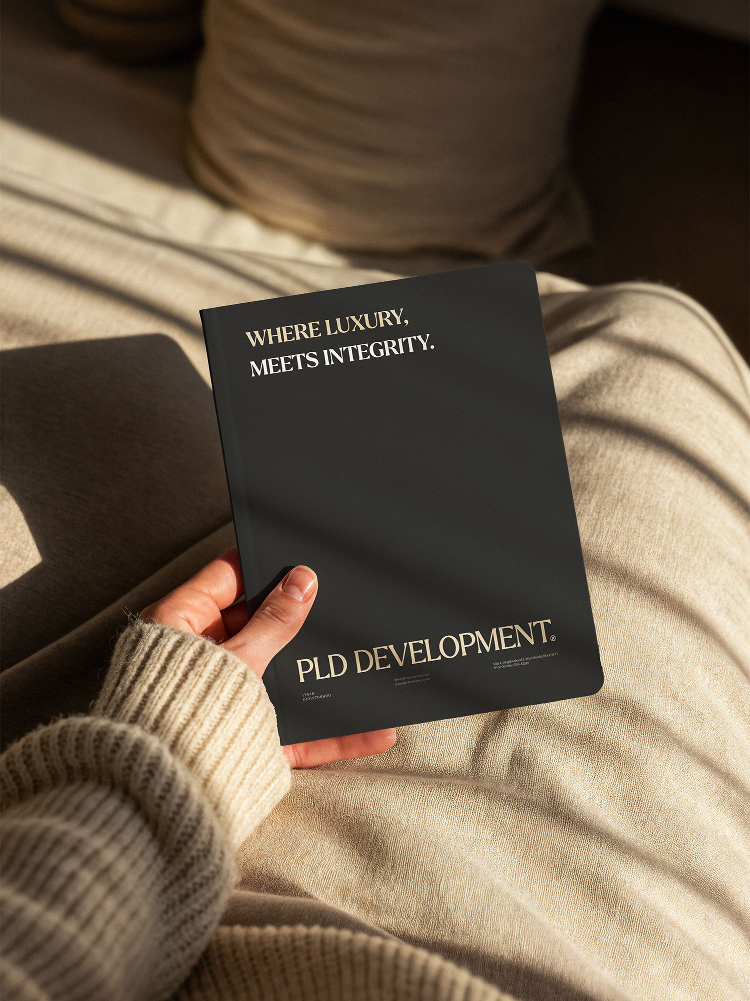
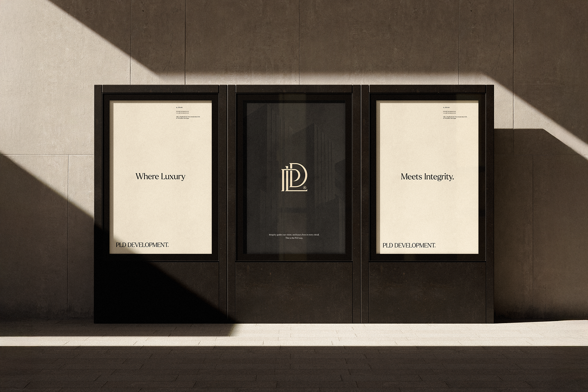
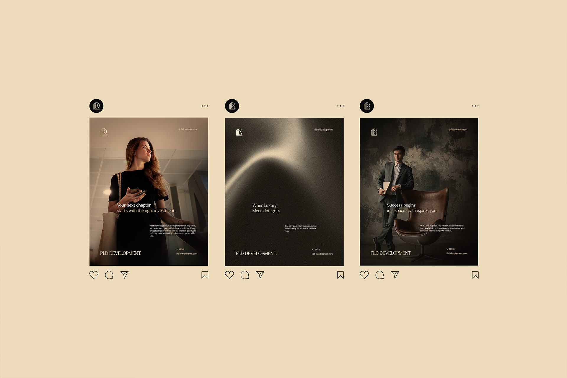
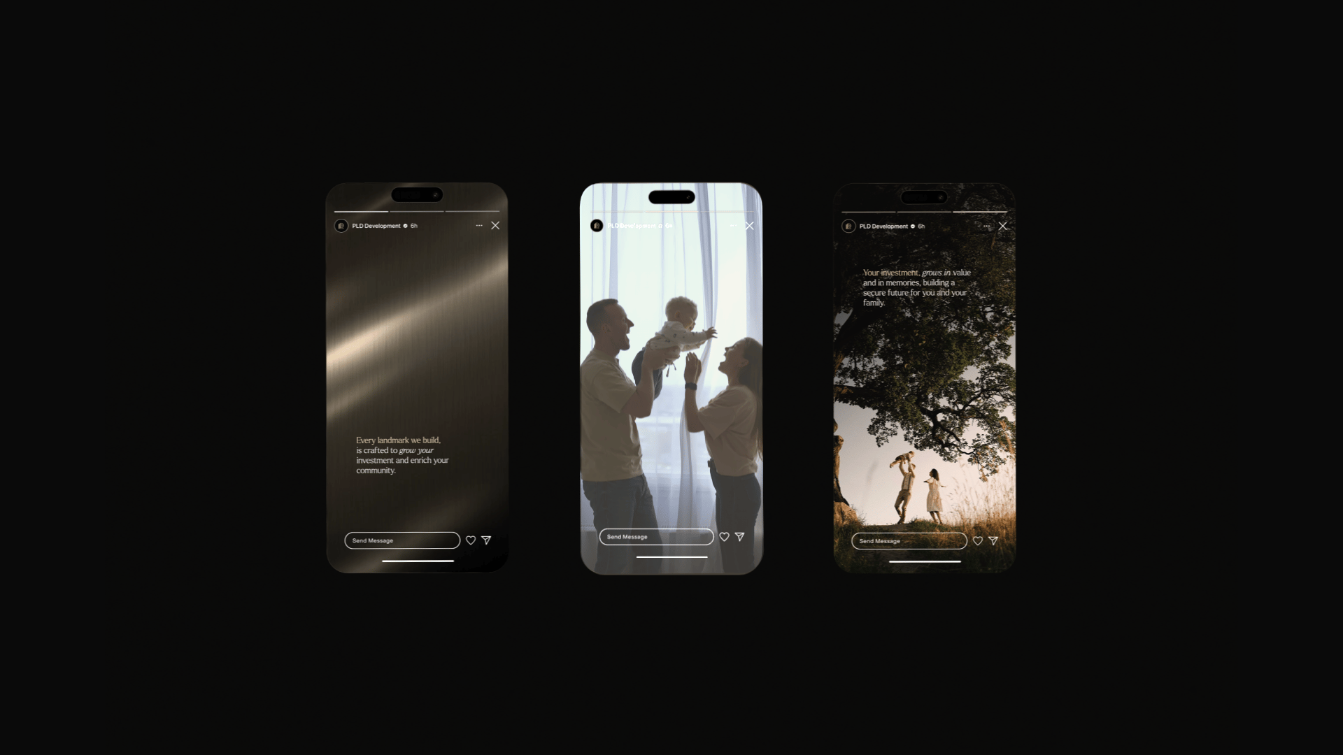
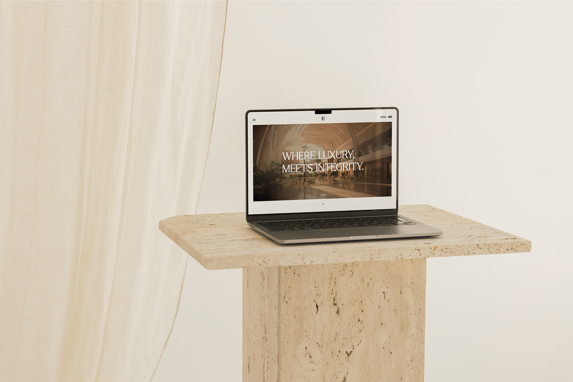
Our visual language embodies PLD Development’s commitment to blending luxury with integrity.
Each choice of color, typography, and symbol reflects a confident and contemporary identity designed to inspire trust and long-term value.

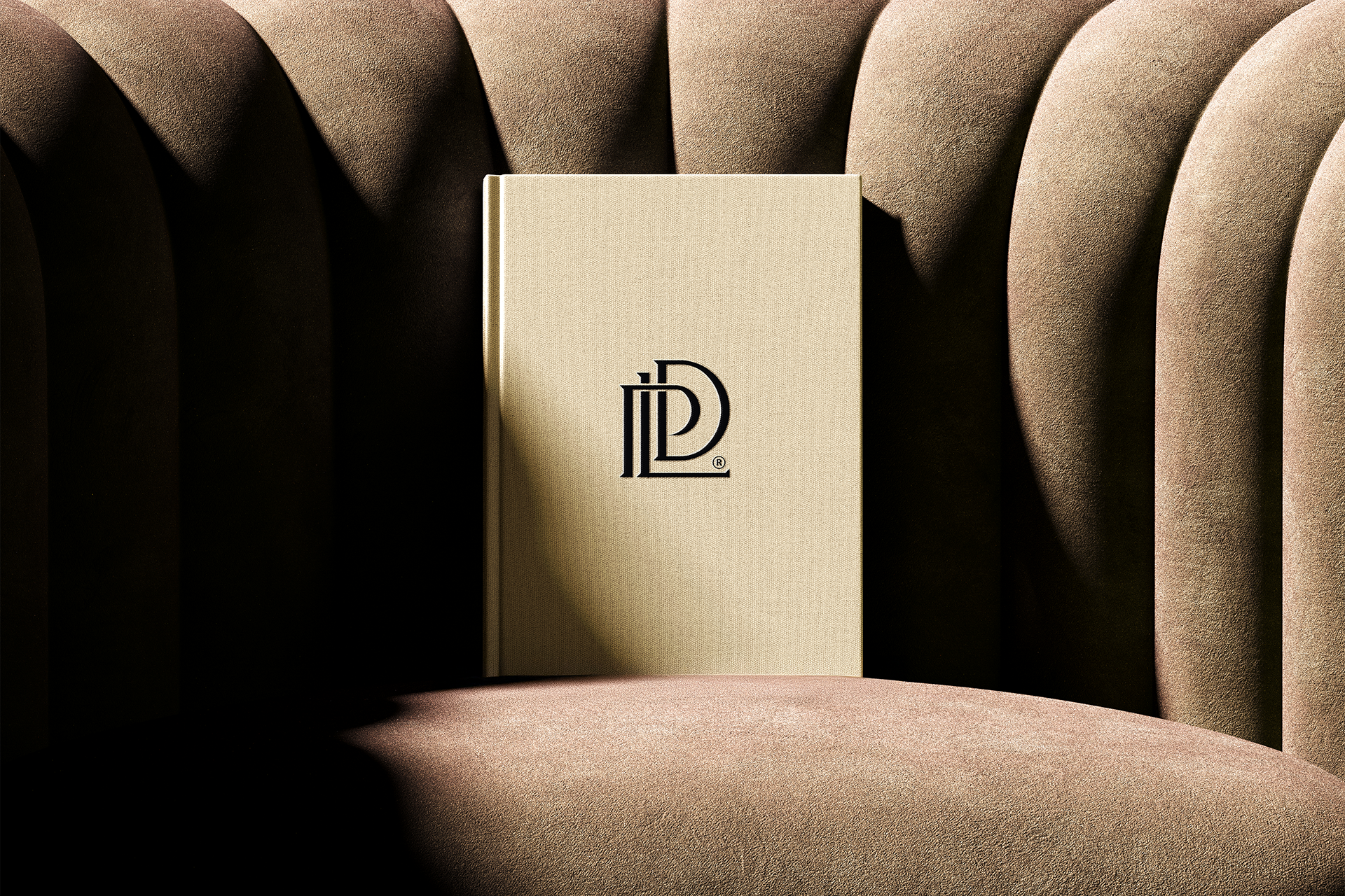
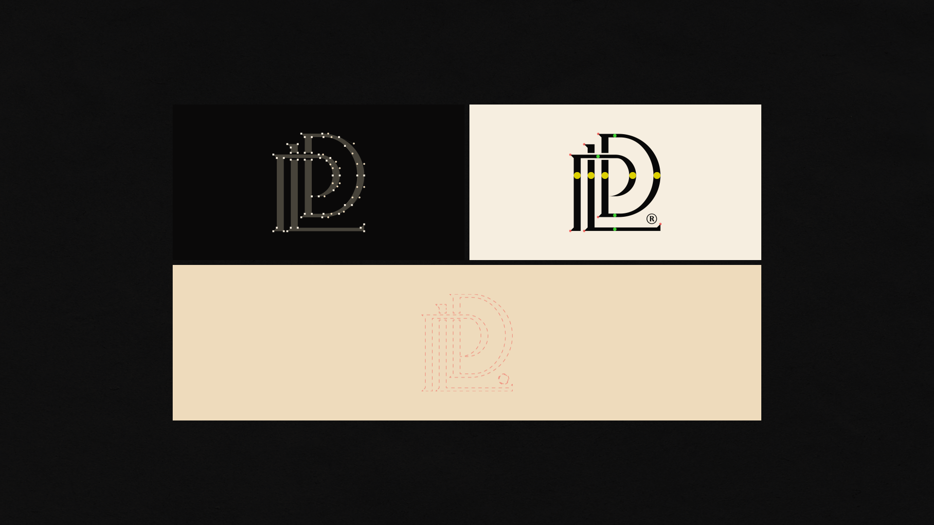
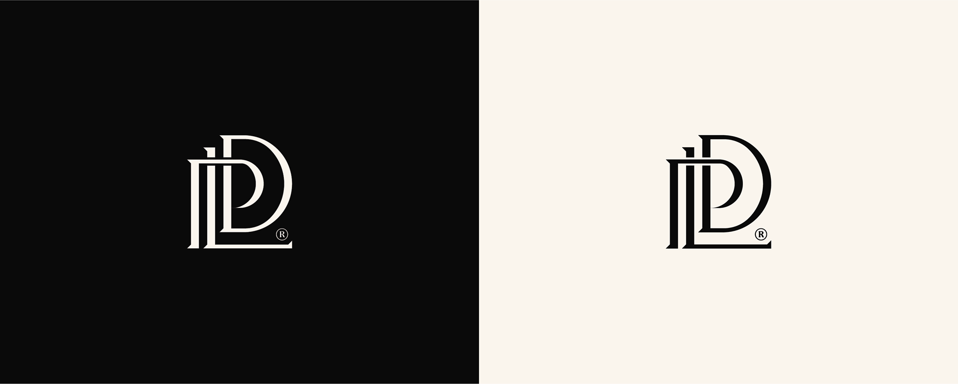
Logomark Rationale
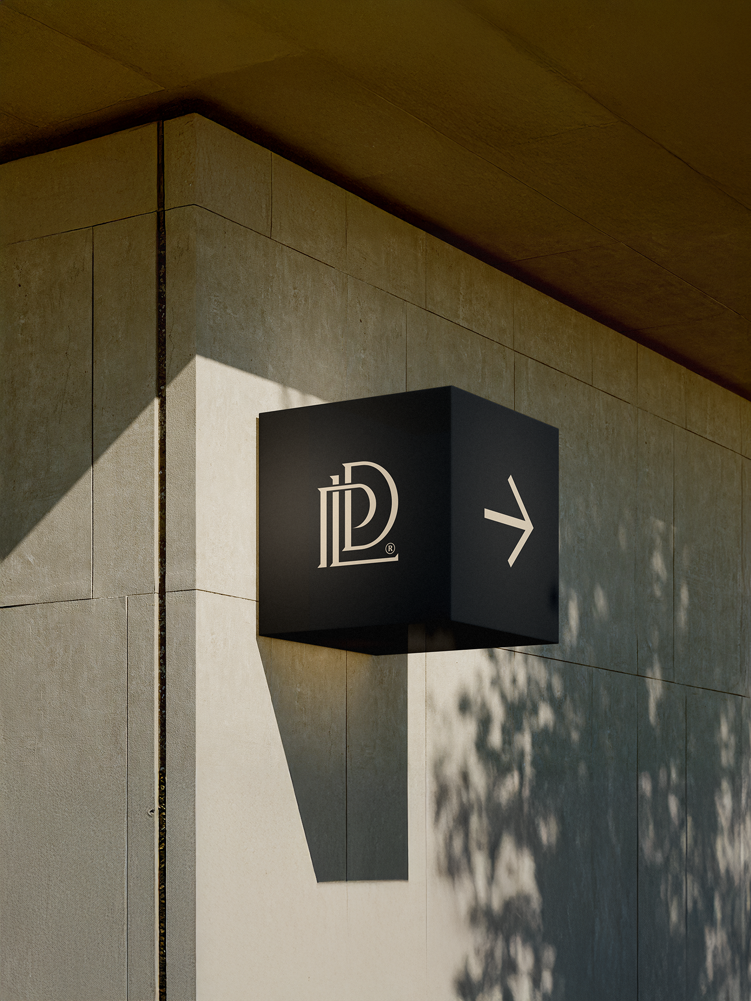
The PLD symbol is formed from the seamless union of its three initials: "P, L, D". This integration creates a mark that embodies unity, strength, and elegance, representing a brand that connects ideas, people, and opportunities. Its upward flow reflects ambition and progress, while the balanced structure conveys stability and trust.
As a real estate development company, these attributes are important to inspire confidence among investors and partners, positioning PLD as a brand driven by growth and a clear vision for the future.
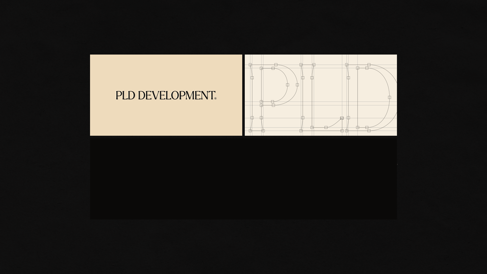
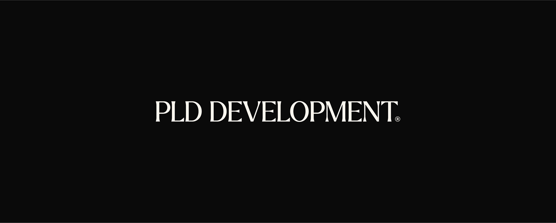
Logotype Rationale
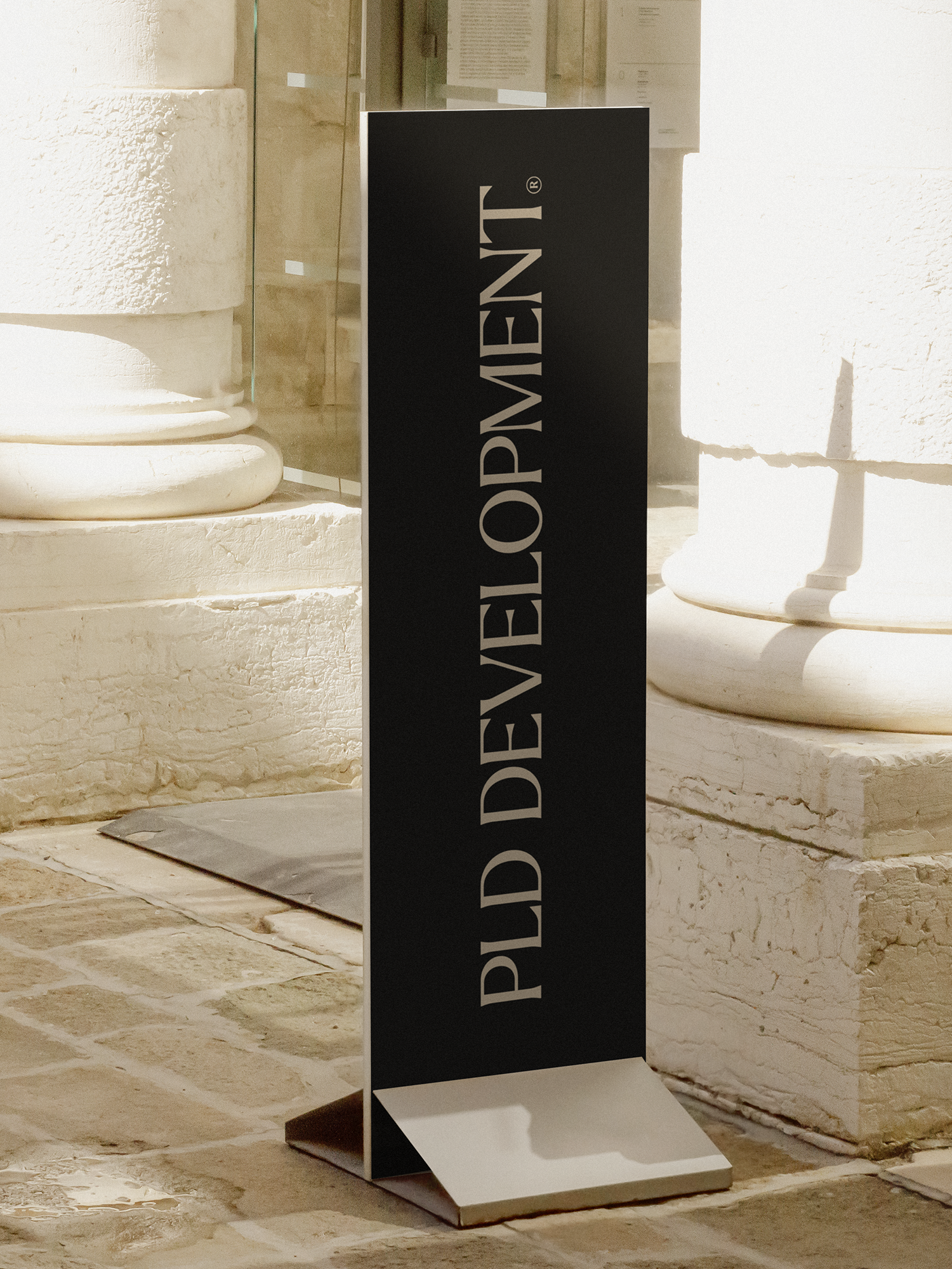
The PLD logotype was crafted to complement the strength of the symbol with a touch of sophisticated elegance. Its clean, modern lines express clarity and professionalism, while its balanced proportions ensure readability and timelessness.
Brand Typography
The chosen typefaces reflect PLD’s balance between modernity and elegance.
The serif font adds a touch of sophistication and timelessness, while the sans-serif ensures clarity, functionality, and accessibility across applications. Together, they create a confident typographic voice that communicates trust, professionalism, and forward-looking vision.
The serif font adds a touch of sophistication and timelessness, while the sans-serif ensures clarity, functionality, and accessibility across applications. Together, they create a confident typographic voice that communicates trust, professionalism, and forward-looking vision.

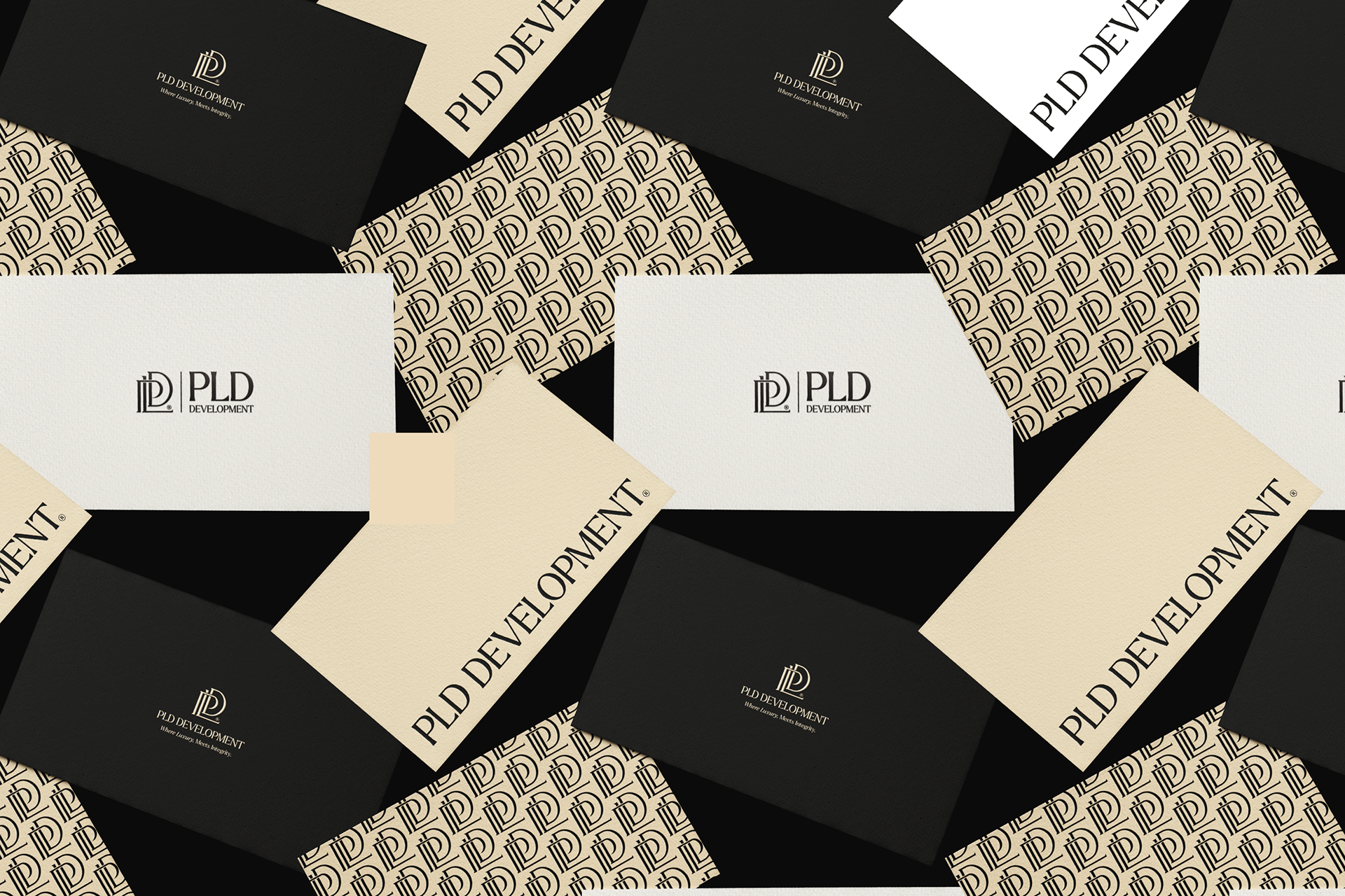
Brand Colors
The chosen color palette was carefully selected to balance sophistication and warmth.
The deep tones express stability, trust, and strength, while the lighter neutrals bring a sense of elegance, approachability, and modernity. Together, they create a timeless harmony that reflects PLD’s vision of building spaces with integrity and luxury.

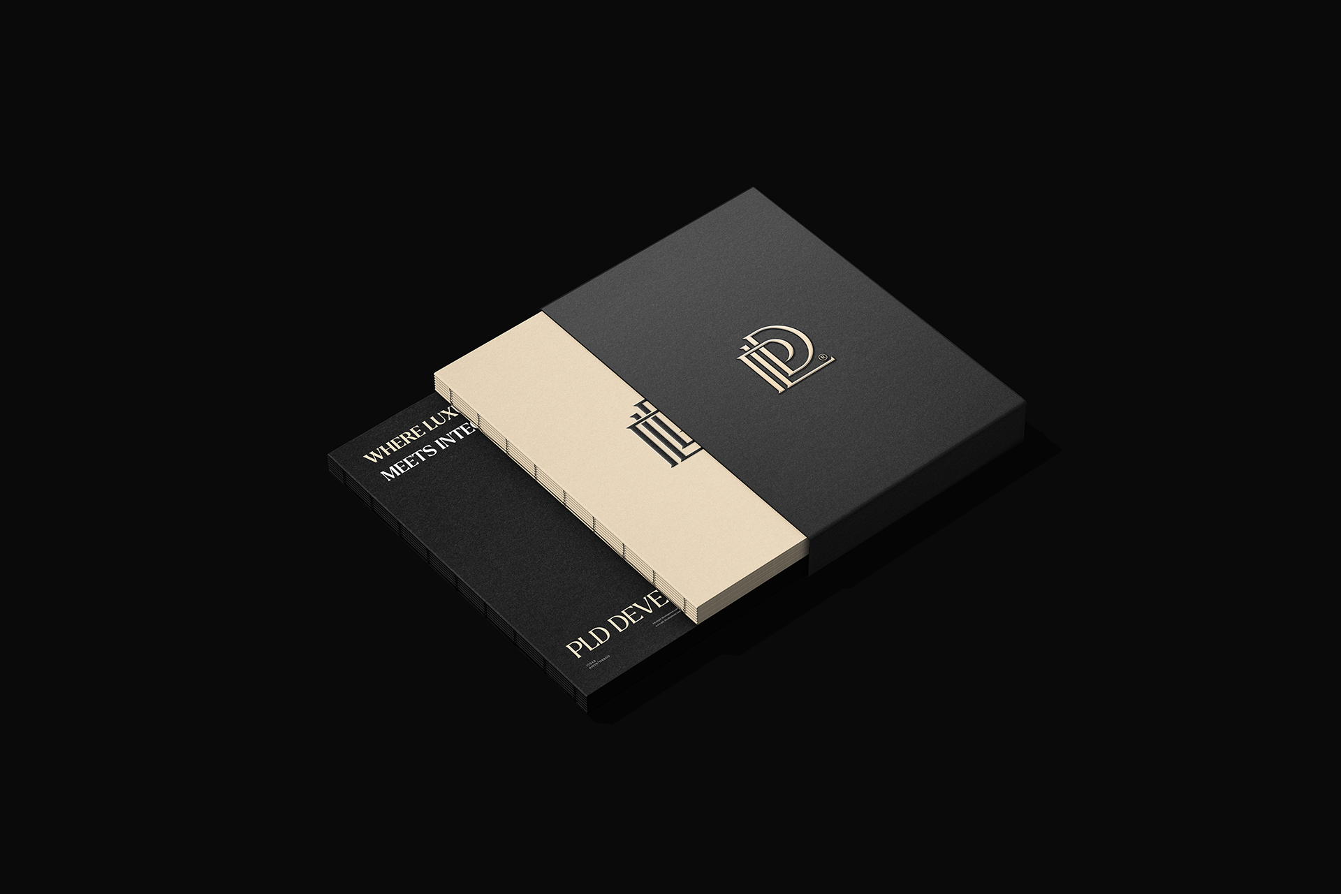
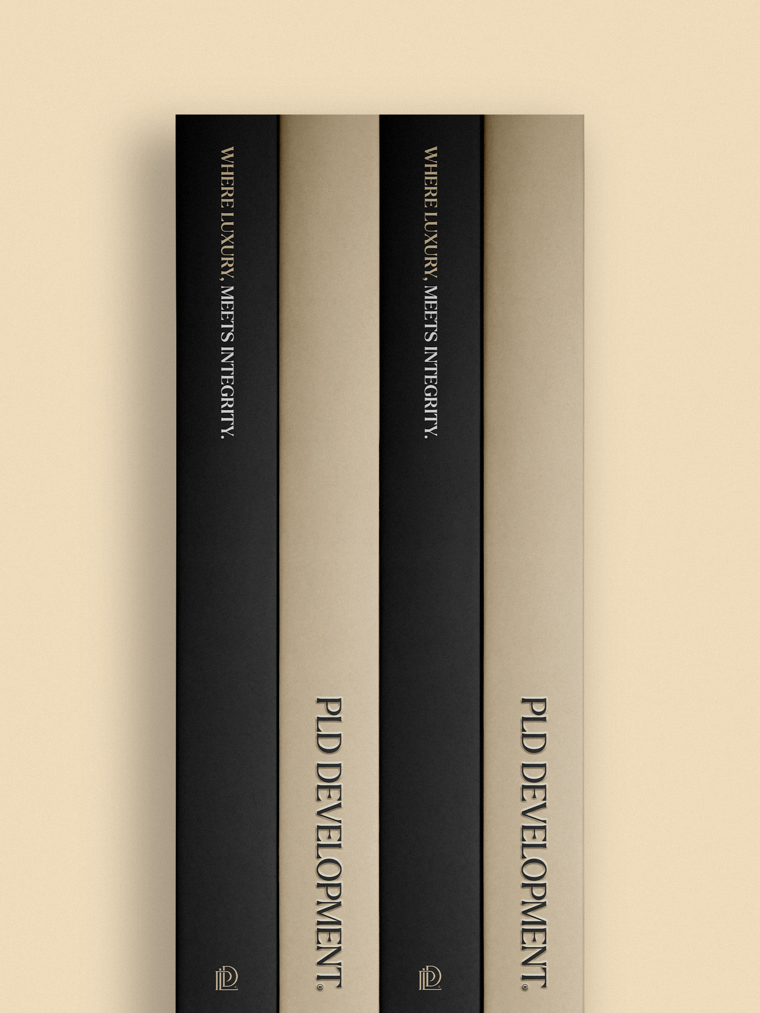
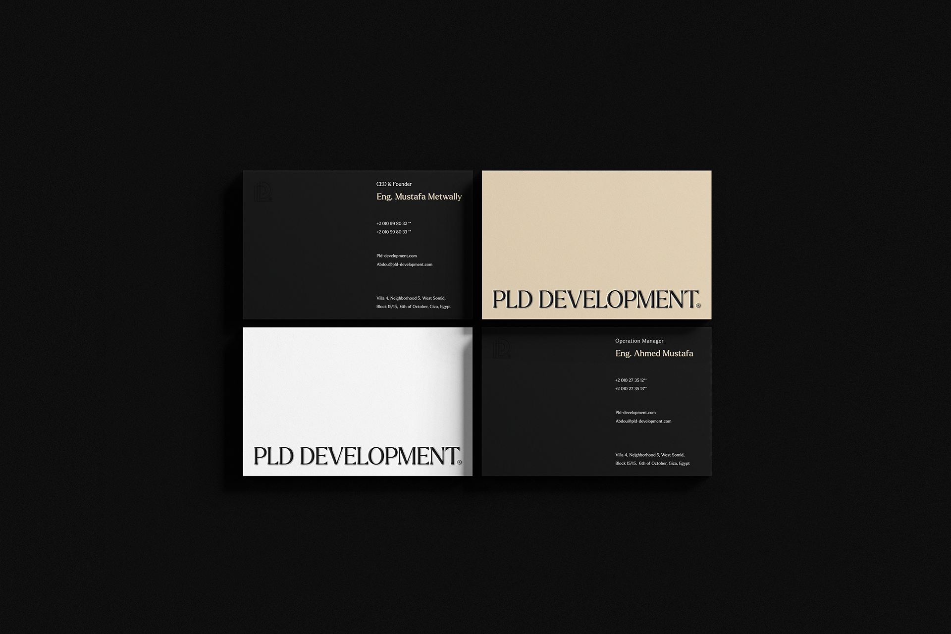
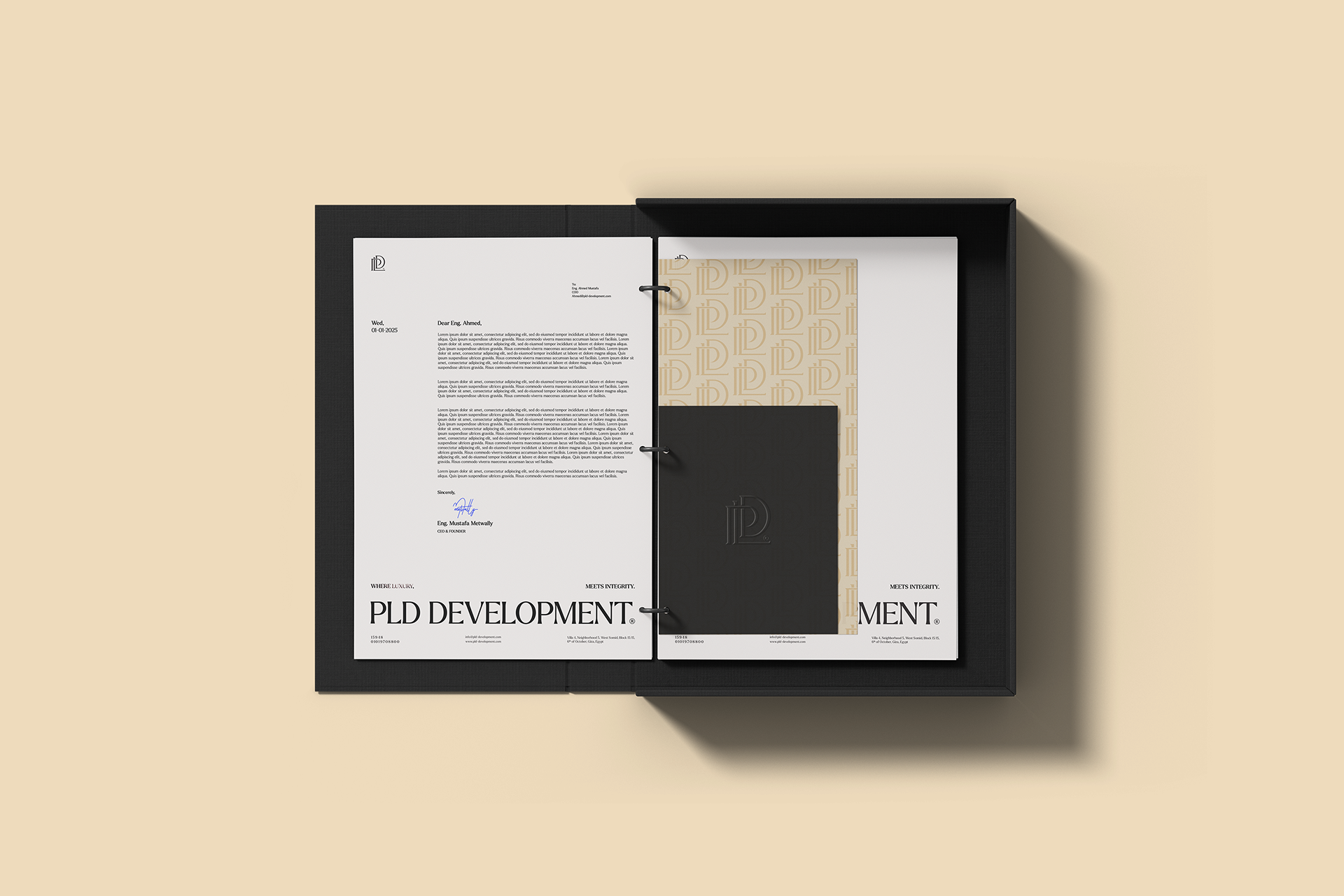
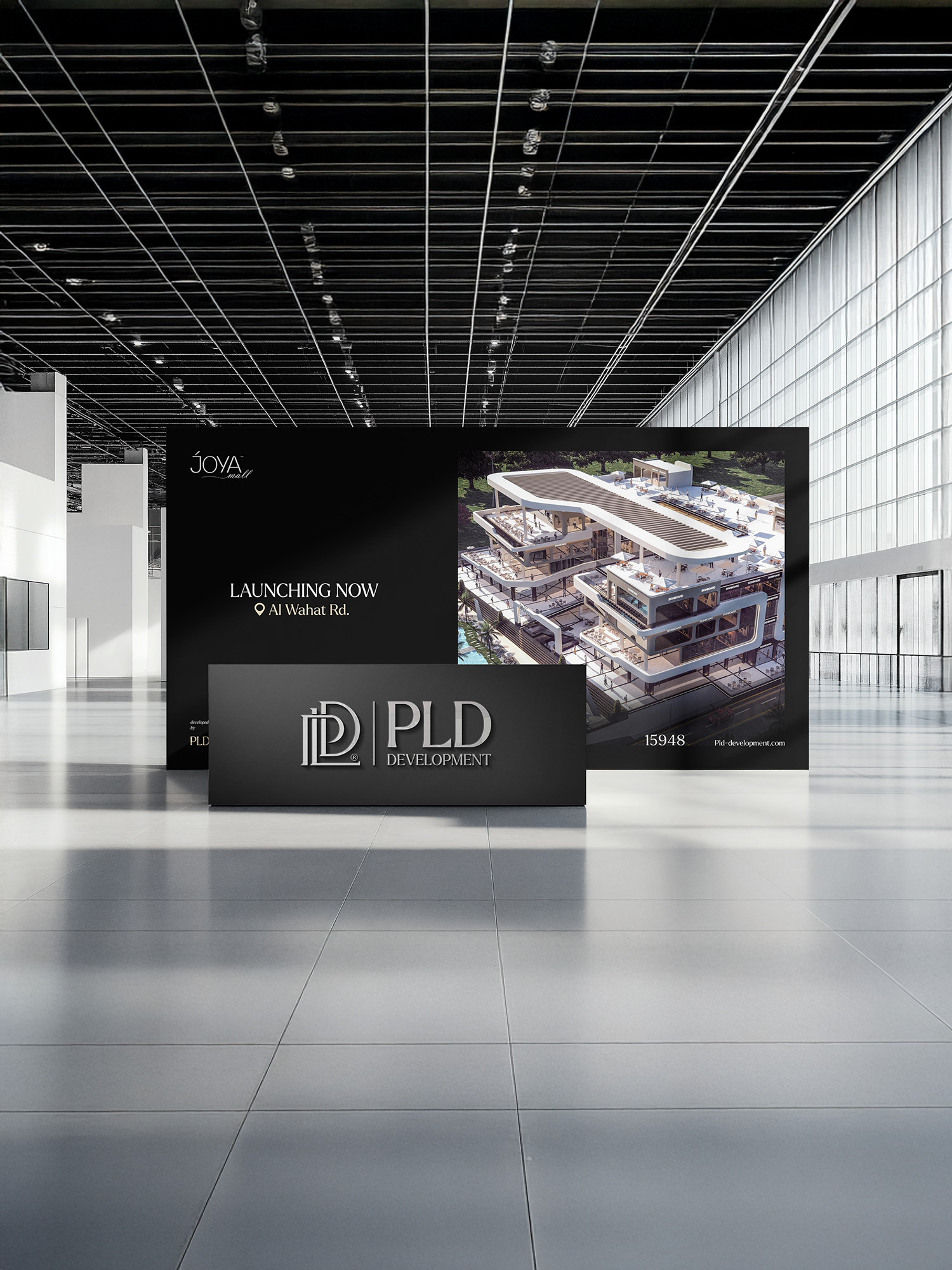
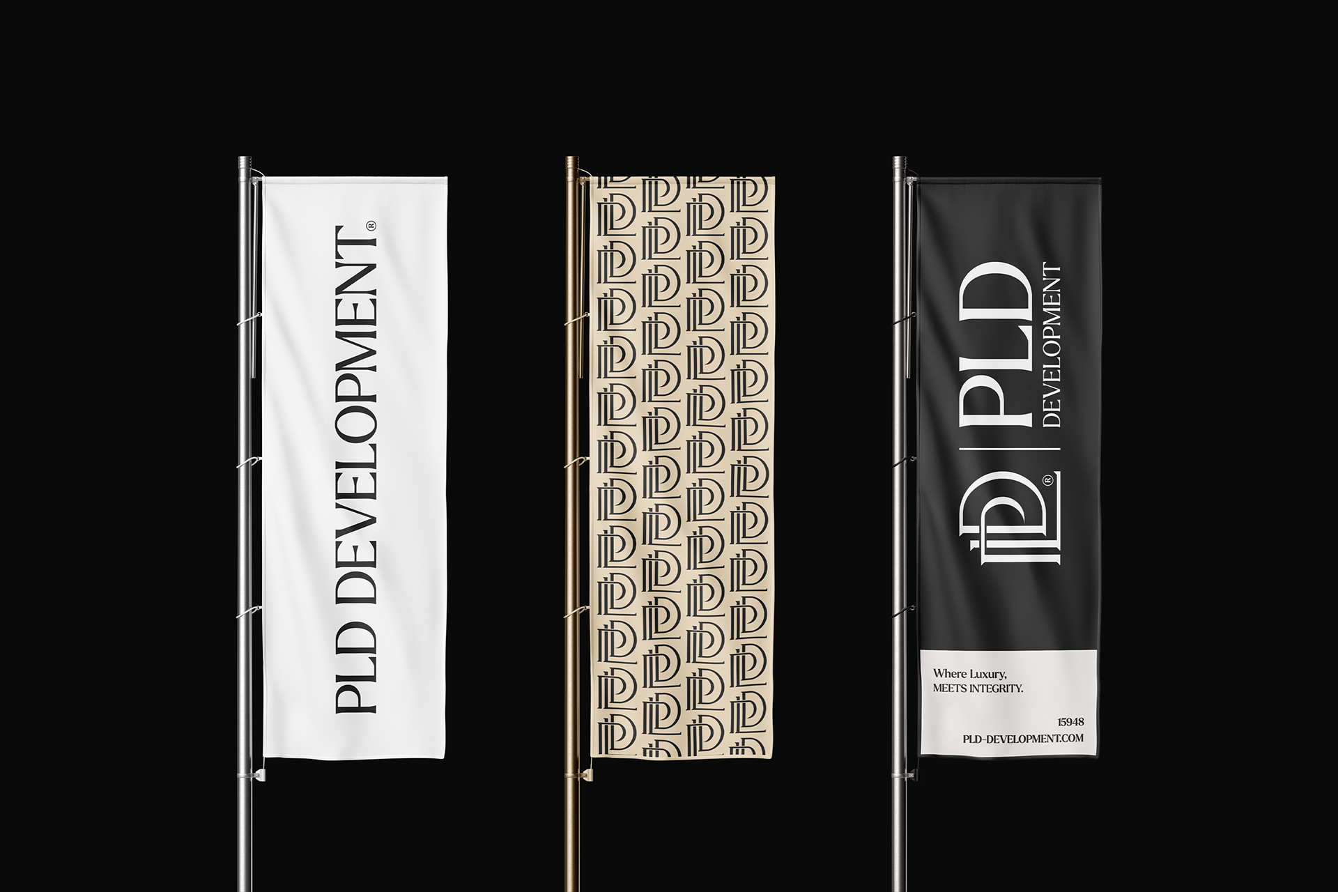
To ensure flexibility and consistency across all applications, the PLD identity was designed with multiple logo lockups. This approach allows the brand to adapt seamlessly to diverse contexts while maintaining a sophisticated and cohesive presence.