Engineered around the automotive world.
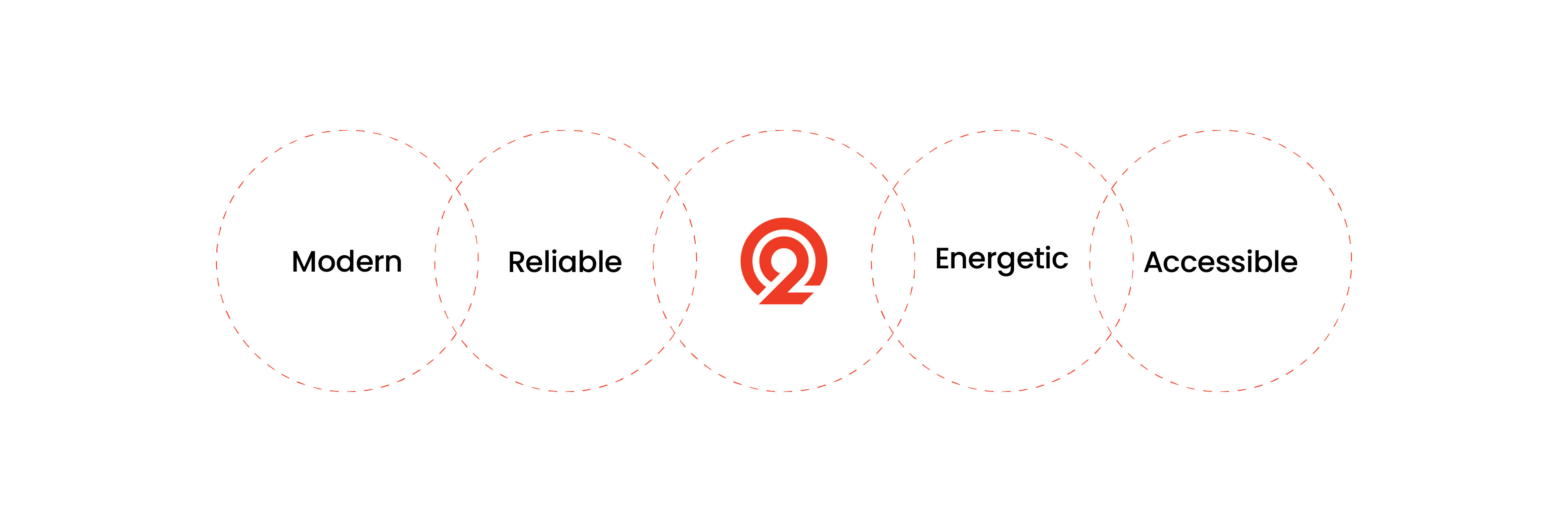
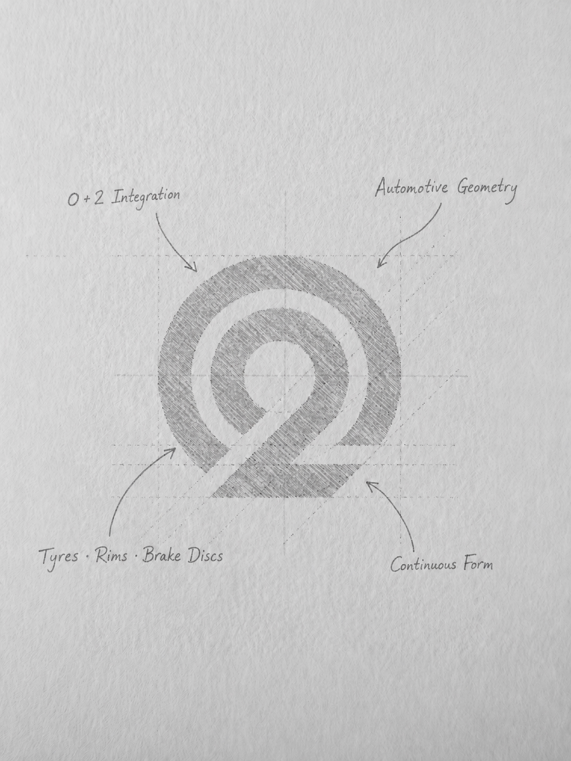
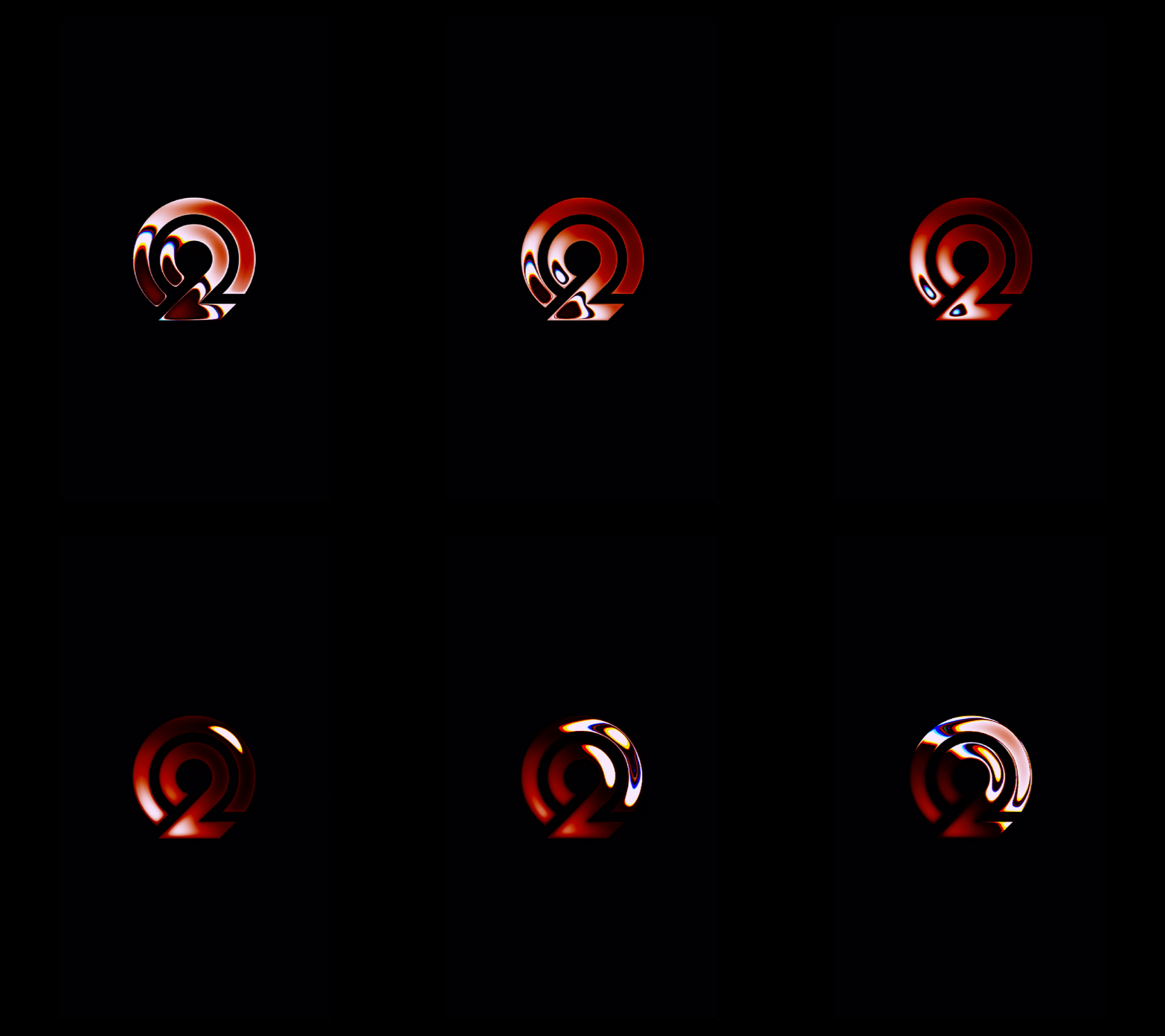
The O2Mart symbol combines the letter “O” and the number “2” within one continuous, distinctive form. Its concentric geometry draws inspiration from circular structures found throughout the automotive world "from tires and rims to brake discs" without limiting the brand to one specific product category.
The bold, interconnected construction communicates movement, reliability, and O2Mart’s role in bringing a wide range of automotive parts together within one accessible marketplace.
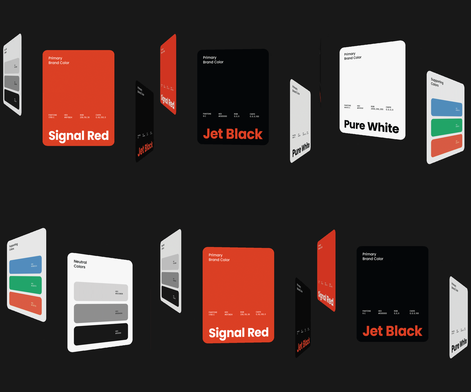
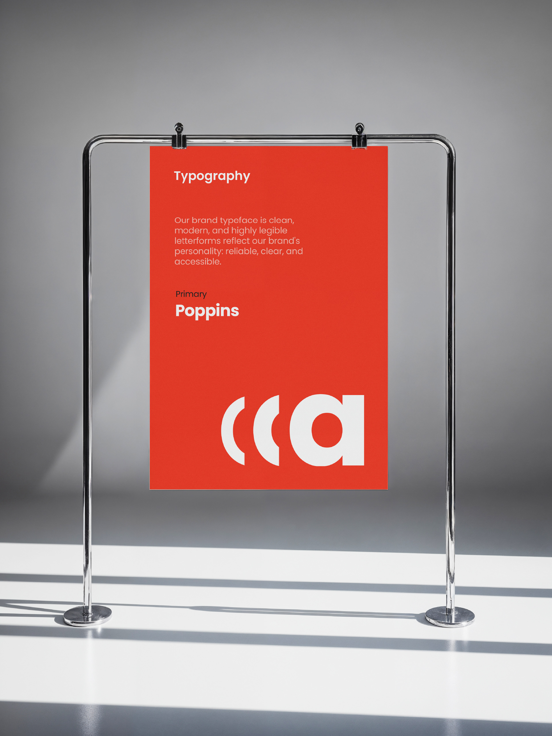
Bold in color. Clear in every word.
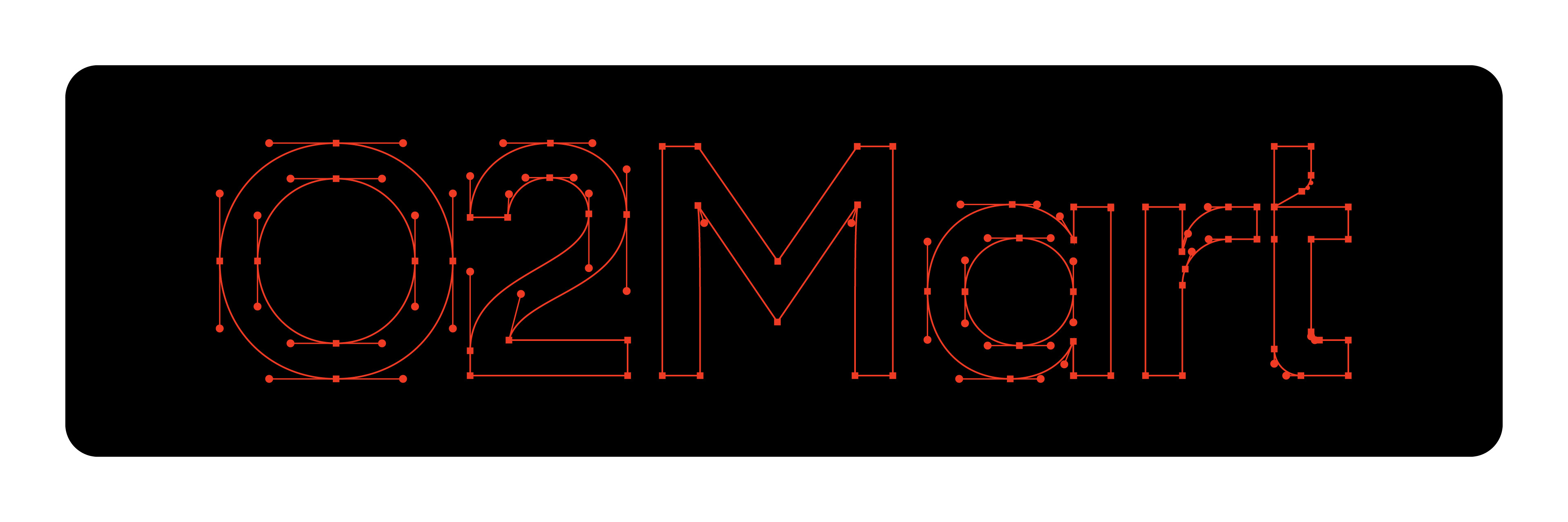
The color palette and typography were carefully selected to reflect O2Mart’s energetic, modern, and reliable character. Together, they create a bold, approachable, and consistent visual language across every brand touchpoint.

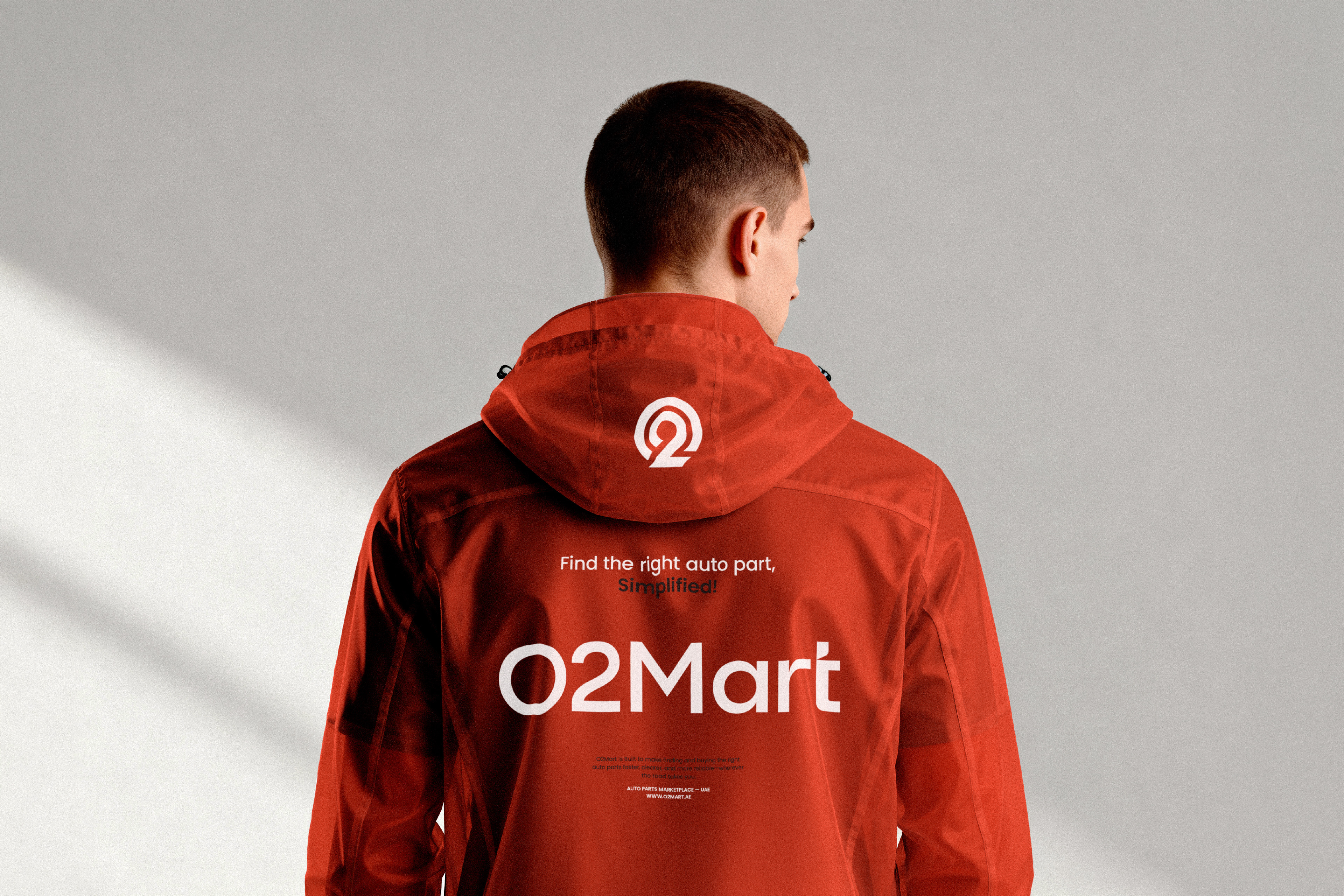
One identity. Built to adapt.
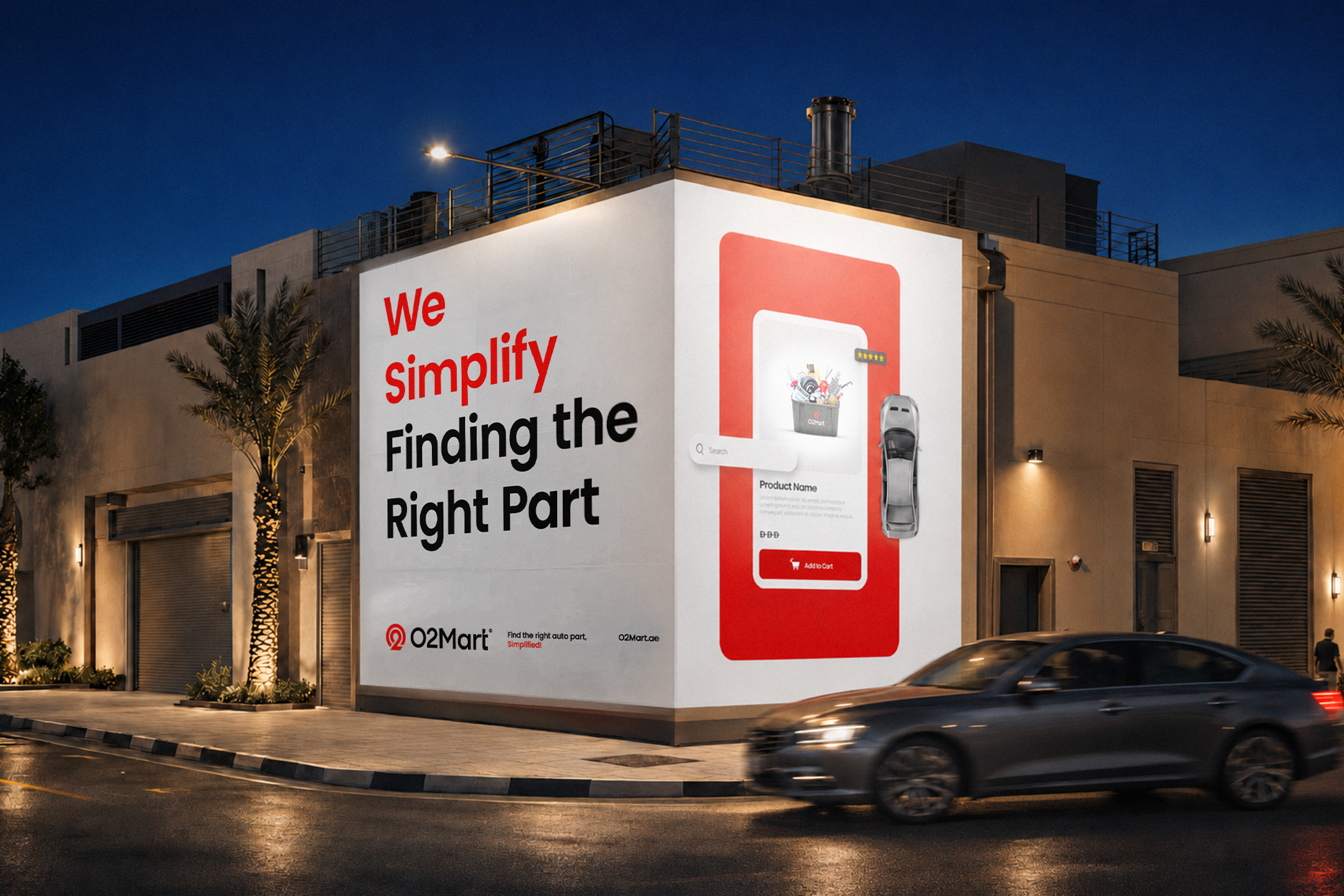
From a distinctive logo and bold color palette to a clear typographic system, O2Mart is designed to stay consistent, recognizable, and flexible across every digital touchpoint.


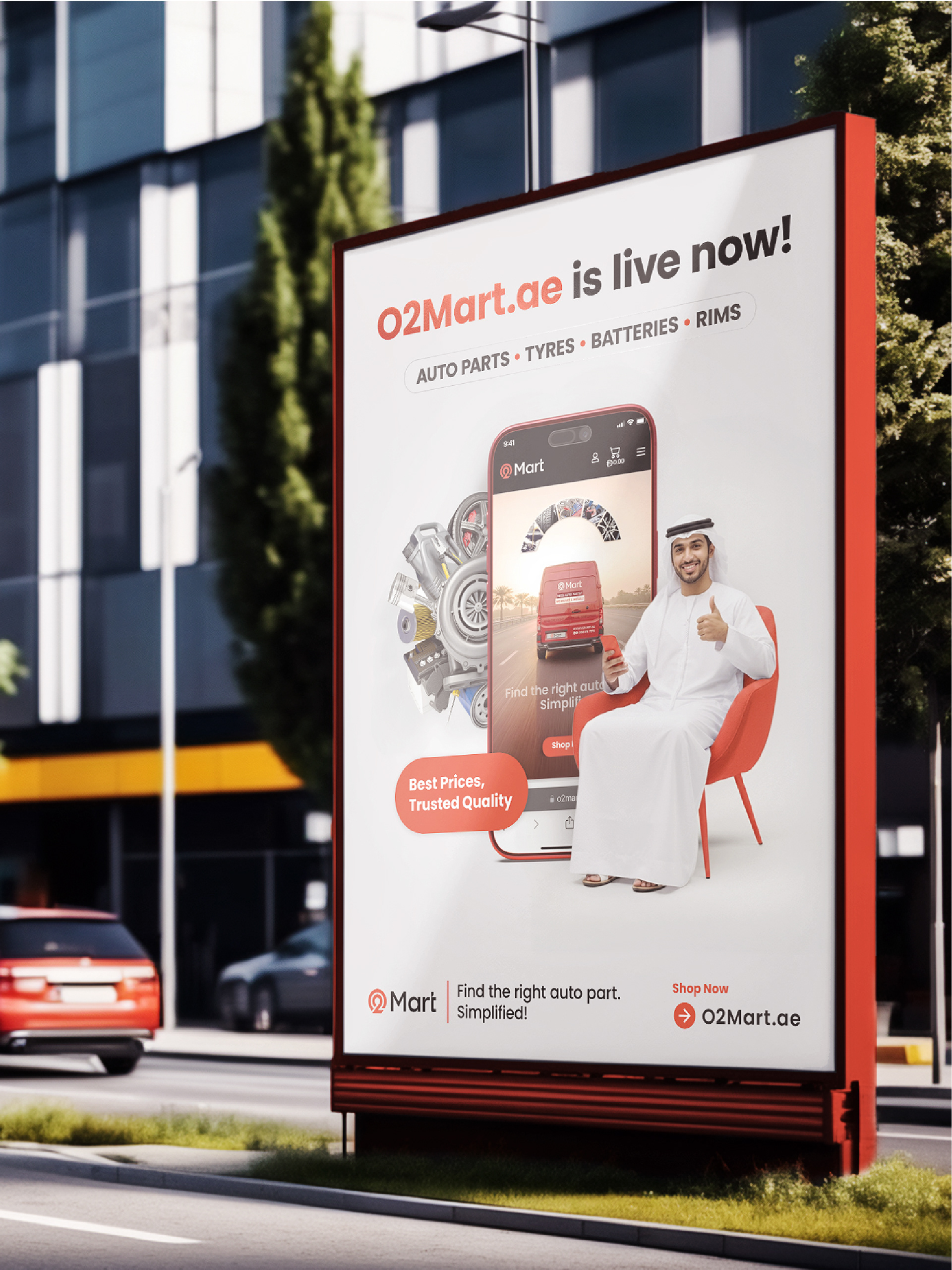


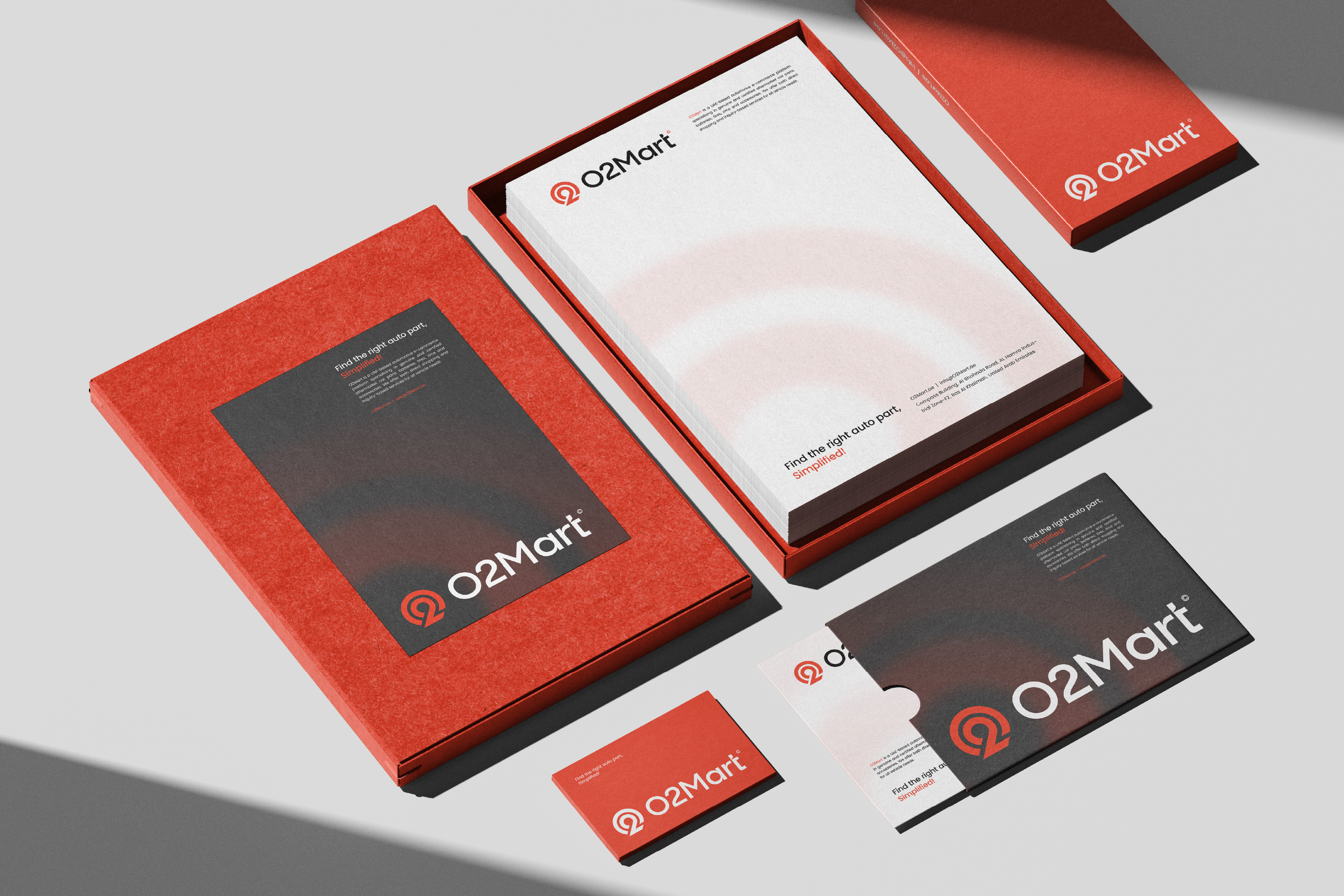
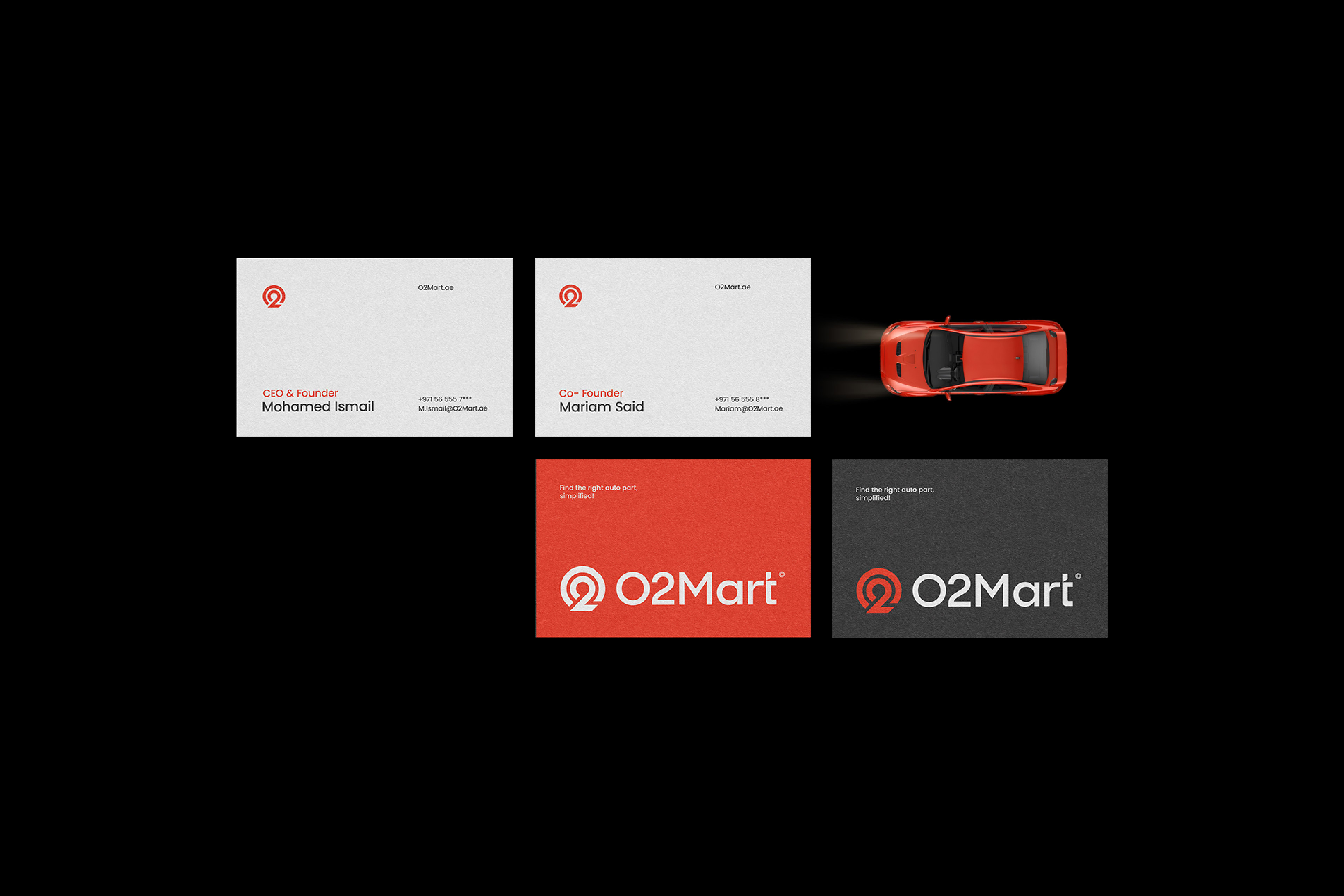




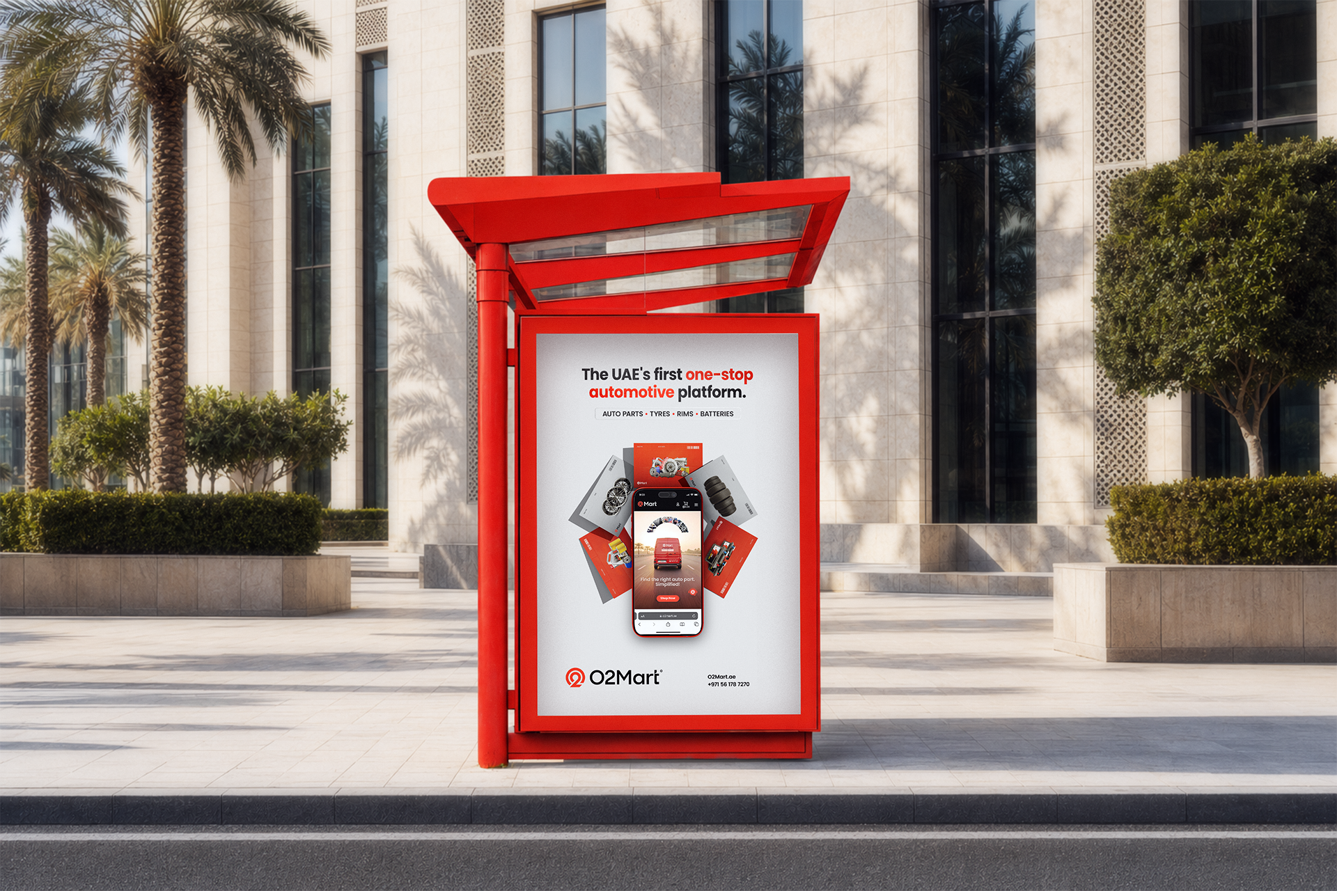
Extending the identity into a flexible digital system, O2Mart’s social media was designed to perform across both always-on content and campaign-led communications. From educational posts and product highlights to promotional campaigns, every layout maintains a clear visual hierarchy, bold brand presence, and direct messaging—making information about car parts and promotional offers easier to understand and act on.